Table of Content
Divi, the most popular WordPress theme, with almost 1,000,000 downloads.
It includes the following features :
Are you eager to explore the best business website examples, seeking inspiration for your own entrepreneurial journey? You’re in the right place!
In this blog post, we’ve meticulously curated a list of the best business websites, brimming with priceless insights and resources to fuel your success in the dynamic realms of entrepreneurship and commerce.
Whether you’re a seasoned pro or a newcomer to the business landscape, these websites are your ultimate destinations for expert advice, industry updates, and stories of triumph.
Remember, you can swiftly create a similar website using a business WordPress theme.
Ready to dive into this treasure trove of business wisdom? Let’s get started!
Amazing Business Websites Examples
THE FOLLOWING AFTER THIS AD
Willow Spa – Holistic care Website
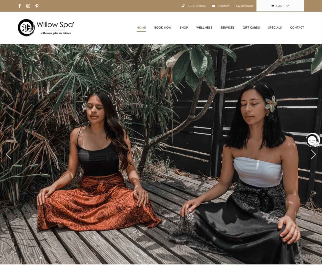
Willow Spa website’s homepage welcomes you with a clean and serene slideshow, free from any distractions like text or CTA buttons.
At the top, you’ll find a convenient bar with essential business information, ensuring you have easy access to the details you need. This business website example header boasts a drop-down menu that sticks to the top of your screen, making navigation effortless.
For quick answers and support, their live chat widget is strategically placed in the bottom right corner.
As you explore the website, you’ll notice a pretty large Instagram feed grid that opens each post in a new tab, allowing you to take a deep dive into their visual experiences.
Altrock – Decoration Website
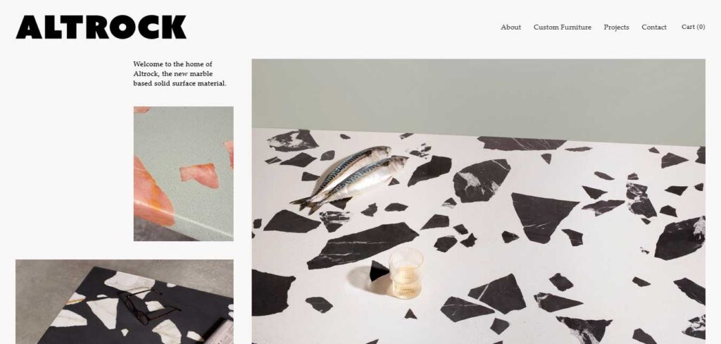
Simplicity is at the heart of Altrock website design. Their homepage is a visual masterpiece, featuring a captivating collage-like layout. It’s an intriguing mosaic of images, where some are clickable, inviting you to explore further, while others remain static, offering a carefully curated browsing journey.
This business website header is clean and unobtrusive, allowing you to focus on the content that matters most. And the footer follows suit, keeping the essentials neatly organized and accessible without distractions.
American Leather – Custom Furniture Website
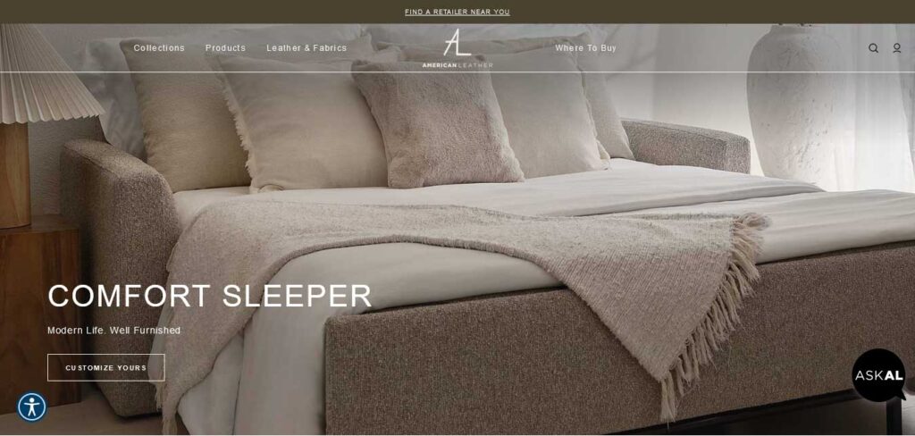
American Leather website features a sticky top bar and header/navigation, keeping all the essential links at your fingertips.
For immediate support and inquiries, they have incorporated a live chat widget, ensuring that you can find quick answers to your questions in real time. Additionally, for those who prefer a direct conversation, there’s a clickable phone number in the footer, offering an alternative means of contact.
As you explore this business website, you’ll notice an abundance of images, allowing you to get a quick glimpse of their products and offerings.
Beginner Bank – Digital Agency Website
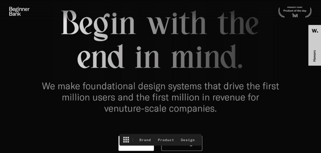
With Beginner Bank’s innovative website, dark design meets an immersive scrolling adventure that’s tailor-made for a one-page structure.
The website is all about providing you with a streamlined and captivating experience. The transparent header is your constant companion, making it a breeze to jump from one section to another with a single click.
As you explore this business website, you’ll notice the majority of it is enrobed in a sleek, dark theme, setting the stage for a sophisticated and immersive journey. The footer, in contrast, offers a refreshing touch of light, infusing the site with a dynamic and engaging feel.
And that’s not all, it included a floating CTA button in the bottom right corner.
Bliss – Skin Care & Beauty Products
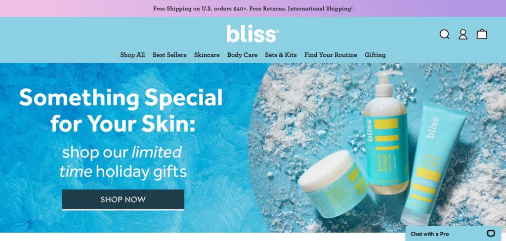
From the very top to the bottom, Bliss business website example exudes an energetic brand vibe that’s sure to captivate your attention.
At the top, you’ll find a standout top bar notification with a gradient background, ensuring that it grabs your attention and conveys important information effectively.
Their header is packed with features to enhance your experience. A mega menu provides quick access to all the essential links. Icons for the search bar, login, shopping cart, and more are readily available, making your navigation a breeze.
The Instagram slider showcases their delighted customers using Bliss products, adding a personal touch to your browsing experience.
Byredo – Perfumes, Candles & Body Care
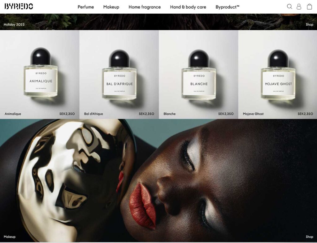
Byredo website’s design is a masterpiece of sophistication and practicality.
Their homepage is arranged in a visually engaging grid-style layout. While most grid elements remain static to maintain an elegant appearance, one element comes to life with subtle animation to add a touch of excitement.
At the top, you’ll find a sliding text top bar notification, which can be easily closed, ensuring you stay informed without disruption.
This business website header features a mega menu, providing a comprehensive guide to their content and products, helping you navigate and find what you need more efficiently.
In the footer, they have organized four columns of useful links and information, including a language switcher to personalize your experience. You’ll also find a newsletter widget that keeps you connected with the latest updates and offers.
ETQ – Online Store
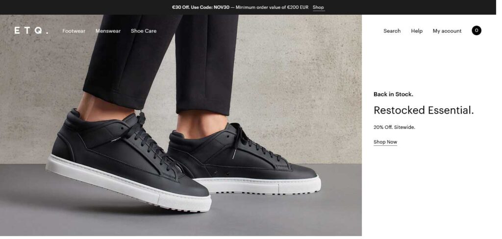
With ETQ, every detail is meticulously crafted for your browsing pleasure.
This business website example opens with a friendly newsletter popup, extending a warm welcome with an exclusive discount offer.
As you delve deeper, their full-screen hero section greets you with a striking 2/3 image background, setting the stage for a visually captivating experience. The remaining 1/3 boasts essential text and links set against a solid backdrop, offering a harmonious blend of style and substance.
The website header gracefully disappears as you scroll down, allowing your content to take the spotlight. When you’re ready to explore further or return to the top, the header effortlessly reappears, ensuring a smoother and more user-friendly appearance.
Fred Perry – Online Store
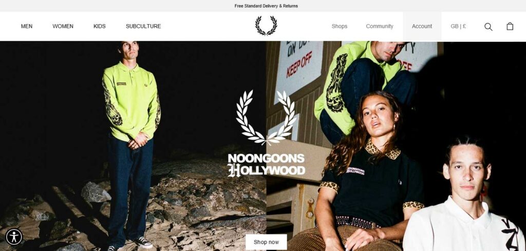
Fred Perry is among best business websites examples. It is designed with a range of features to ensure that your visit is both convenient and enjoyable.
As you arrive, a thoughtful popup greets you, allowing you to select your region and language for a tailored experience.
The website boasts a disappearing/reappearing header, offering seamless navigation as you explore their products.
For those looking to stay updated, their sticking bottom newsletter subscription widget is always accessible, making it easy to stay connected with Fred Perry.
The multi-column footer is a hub of information, offering a comprehensive guide to their website’s content. And, of course, their product carousels showcase their offerings in a visually appealing and interactive manner.
Linnaean – Beauty and Lifestyle Website
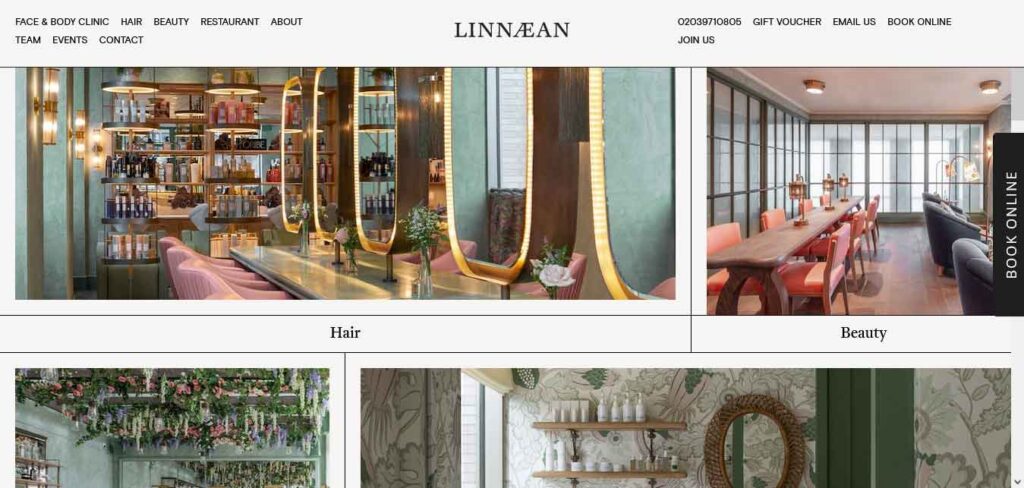
Linnaean website design philosophy is centered around providing a seamless user experience.
Upon your arrival, you’ll be greeted by a newsletter popup that invites you to stay connected with them. But don’t worry, it is easy to close the popup – simply click the “x” or anywhere outside the popup to continue your journey without interruption.
As a service-oriented platform, this stunning business website takes a strategic approach to make your experience as convenient as possible. A sticky Call-to-Action (CTA) button is thoughtfully placed, allowing you to access their online booking system without having to leave the current page.
They have incorporated clickable images that represent each aspect of their space. These images provide you with a visual tour, without overwhelming you with a sales-focused approach.
Minna – Showcase Website
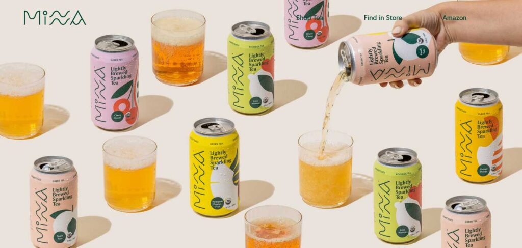
Minna homepage welcomes you with a full-screen parallax image background above the fold, creating an immersive and visually appealing introduction. The minimalist and transparent header complements this design, achieving a refined and uncluttered look that sets the stage for your journey.
As you scroll down, the homepage is split into multiple sections, with each section dedicated to presenting a single item. These sections are accompanied by carefully curated backgrounds, adding a dynamic and engaging element to your exploration.
In addition, you’ll discover a three-post Instagram feed that keeps you connected with their community and products. Their footer provides you with useful links, social icons for easy connections, and a subscription widget to stay updated.
THE FOLLOWING AFTER THIS AD
MinRims – Showcase Website
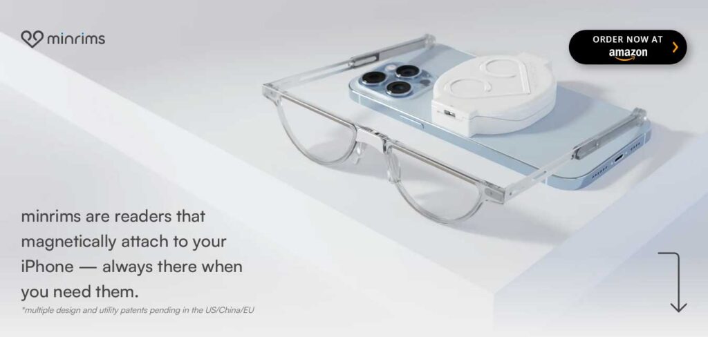
MinRims website welcomes you with a full-screen image background, where text at the bottom provides context and a CTA at the top encourages you to embark on this unique scrolling experience. An animated downward-pointing arrow is your guide, inviting you to dive into the immersive journey.
As you scroll, the presentation of their product unfolds, immersing you in a world of details and views that are bound to excite your curiosity. It’s a tantalizing exploration that will leave you eager to join their waitlist.
MinRims is more than just a business website; it’s an invitation to a unique and immersive experience.
Nespresso – Online Store
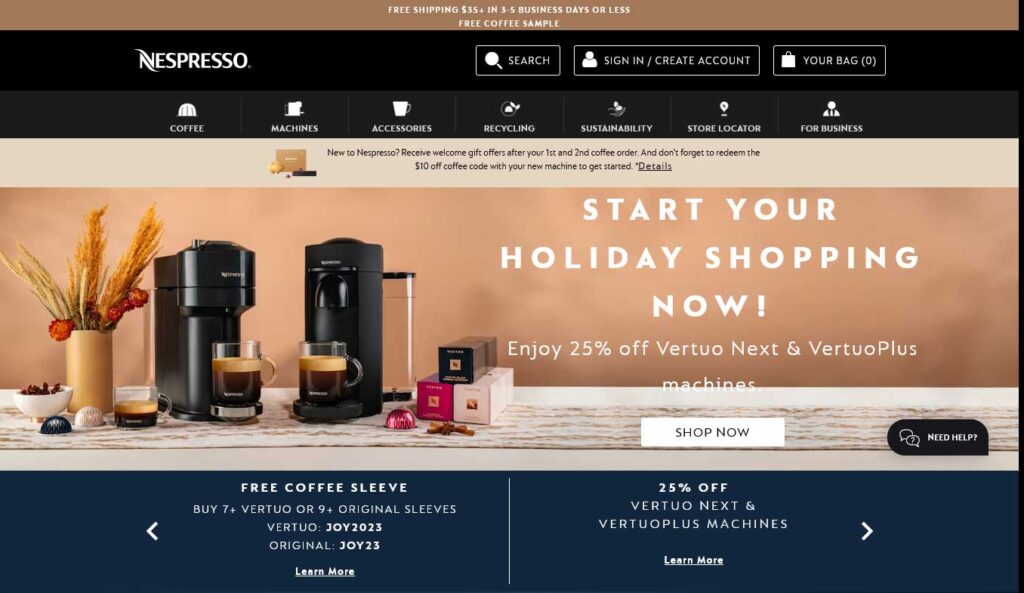
Nespresso business website features a harmonious blend of engaging content that doesn’t overwhelm you, making it easy to find and explore the information you need.
One of their standout features is the “perfect coffee finder,” a three-part wizard that guides you through a personalized coffee recommendation journey.
As you explore further, you’ll come across a shippable Instagram feed just before the footer. This grid not only showcases their products but also allows you to view them in detail through lightbox functionality.
Notarize – Online Notarization
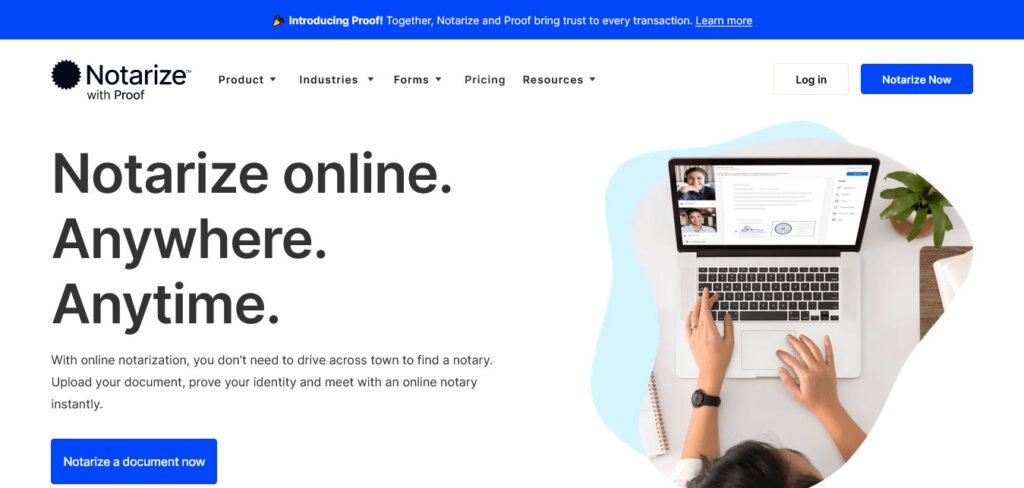
Notarize business website is a true embodiment of modern web design, offering a responsive layout and an array of user-friendly features.
Their homepage welcomes you with a captivating hero section that includes a striking title, informative text, and a compelling call-to-action (CTA) button.
Their transparent header adds a touch of elegance and ensures seamless navigation. As you scroll, the header transforms into a solid bar, staying with you and providing easy access to all the information you need.
Their FAQ section incorporates convenient accordions, making it easy for you to find answers without cluttering the page.
Objective – Lifestyle & Home Products
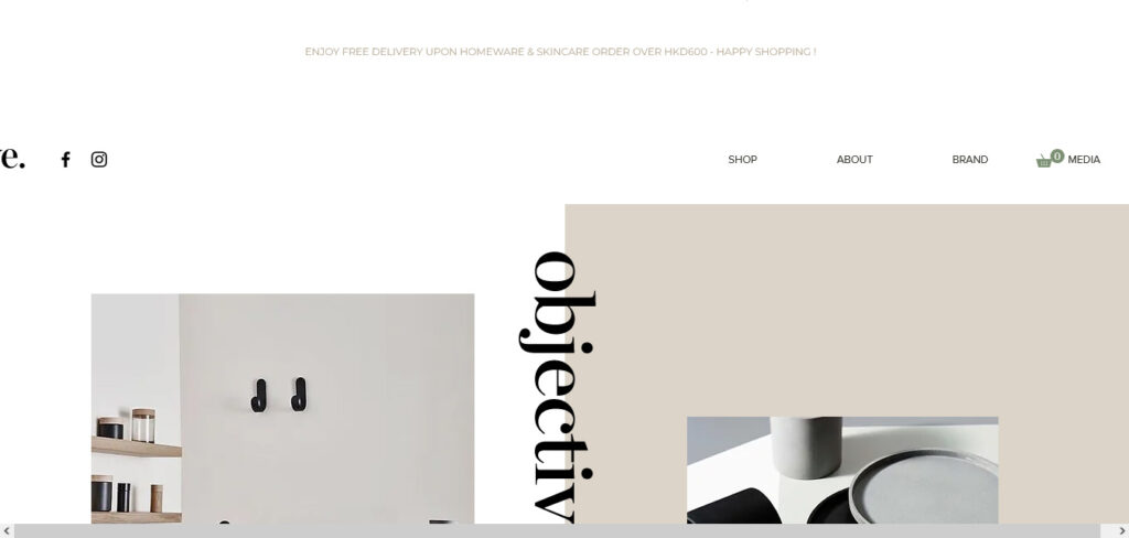
Objective website is where innovation and functionality blend seamlessly to redefine your browsing experience.
One of their most unique elements is the floating “Objective” text that hovers gracefully in the middle of your screen. This serves as a practical back-to-top button, ensuring that your navigation is smooth and effortless.
This business website example is an image-rich environment, capturing your attention and enhancing your engagement. They have implemented a lightbox gallery that allows you to explore their visuals in a user-friendly manner, providing an immersive journey through their content.
Navigation is made easy with a well-designed drop-down menu, offering swift access to the information you seek.
At the bottom, the two-column footer provides a hub for important elements. One column features menu links, ensuring you can easily access key sections of the site. The other column includes a newsletter subscription widget, allowing you to stay connected and informed with just a few clicks.
Skullcandy – Online Store
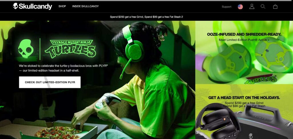
Skullcandy website strikes a perfect balance between boldness and simplicity to provide a streamlined and engaging experience.
Its homepage is bold thanks to striking images, yet simple in its brevity.
The header is exceptionally clean and unobtrusive, ensuring a distraction-free experience. But, when you explore the navigation, you’ll find a mega menu that opens up, presenting you with all the necessary links to explore their offerings.
In the footer, they have organized multiple columns with useful components. You’ll find a newsletter widget to stay updated, social media icons for easy connections, and menu links to navigate with ease.
Skullcandy business website example is designed with its visitors’ convenience in mind.
Soilboy – Online Store
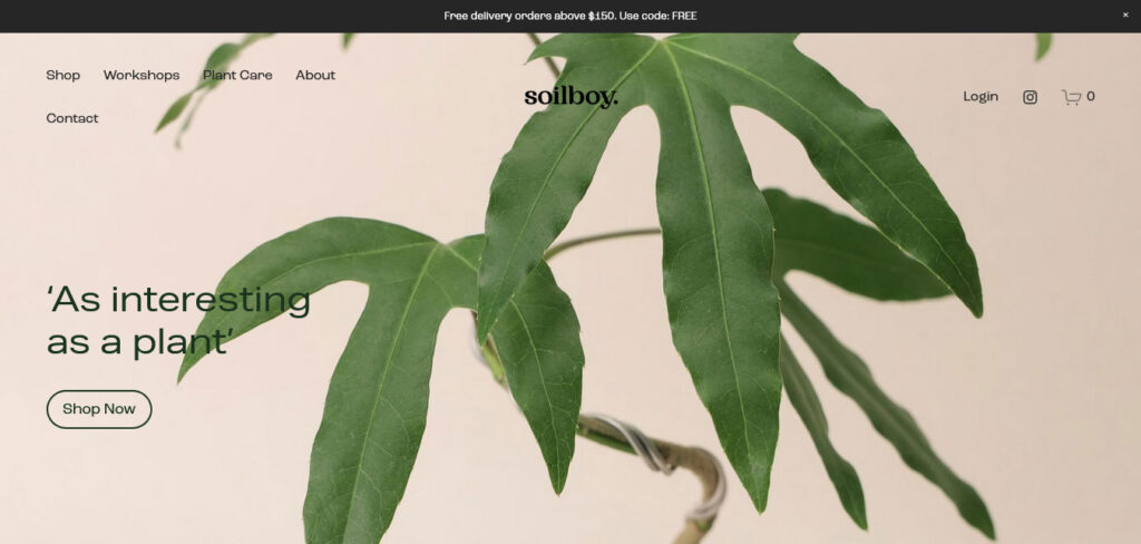
As you enter Soilboy website, you’re greeted with a full-screen image background, accompanied by text and a CTA button, inviting you to explore their shop directly.
They have incorporated a transparent header that gracefully disappears as you scroll, ensuring a clean and distraction-free experience. At the top, you’ll find a closable top bar notification, keeping you informed without intruding on your visit.
Throughout this business website, the designers maintain a minimalist look, employing ample white space that enhances readability and offers a sense of tranquility. Even the website footer adheres to this principle, offering an unobtrusive and organized conclusion to your browsing experience.
The Rafael – Real Estate Website
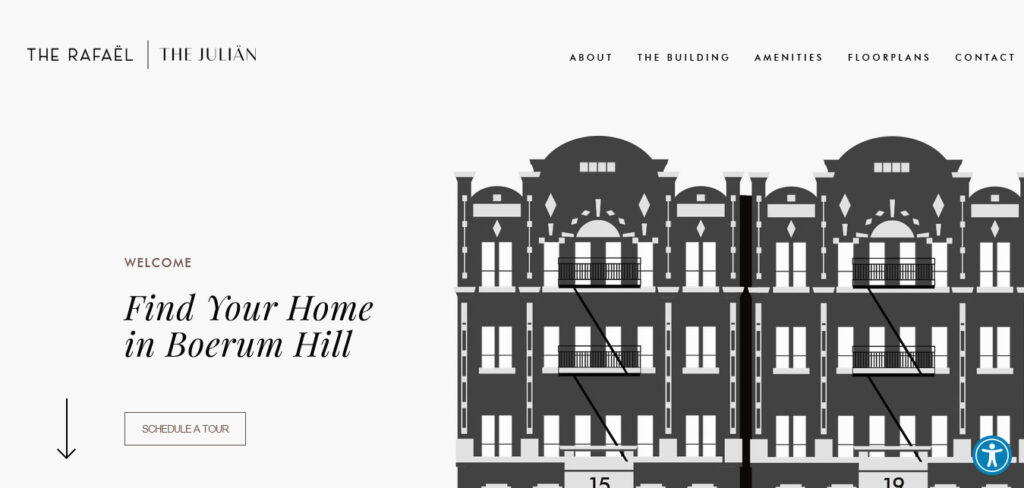
“The Rafael” or “The Julian” are a pair of elegant and minimalistic one-page business websites that redefine the art of seamless online browsing. With a focus on clean aesthetics and user-centric design, these websites guarantee a delightful browsing experience.
They feature a thoughtful approach to navigation. The sticky navigation bar remains your trusty companion as you explore the single-page layout, eliminating the need for excessive scrolling.
It’s a sleek and practical solution that keeps essential information at your fingertips.
Traackr – Data-Driven Influencer Marketing Software
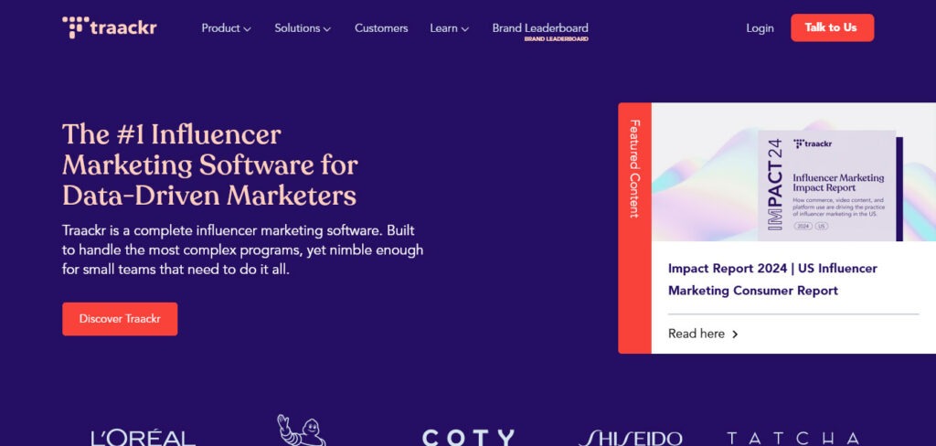
Traackr is a gateway to a world of content and information thoughtfully designed for an optimal reading experience.
Their homepage is a treasure trove of content, yet they have ensured that it remains a pleasure to read. Slightly larger text and generous white space combine to maintain pleasant readability, making your exploration effortless.
They have added animated elements that bring their content to life, enhancing visitor’s engagement as he navigates through their offerings. The mega menu at the top provides a comprehensive guide to their extensive resources, while CTAs in the navbar are strategically placed to guide toward meaningful actions.
At the bottom, you’ll discover a language switcher, making their content accessible to a diverse audience.
One of this business website standout features is a dynamic “popup” that promotes their featured content. As you scroll, this seamlessly transforms into a sticky sidebar CTA, ensuring that you always have quick access to their latest and most important information.
Vionaro V8 – Showcase Website
Vionaro V8 business website is more than just a digital space; it’s an immersive and entertaining journey that takes you on a captivating presentation from start to finish.
Despite the length of the page, their design ensures that your experience is far from mundane. It’s carefully crafted to engage and entertain you throughout your visit. To help you keep track of your progress, they have included a handy progress bar at the top, so you always know where you are on the journey.
The dark-ish design adds a touch of elegance and sophistication, giving the website a premium and high-end feel.
Vivobarefoot – Online Store
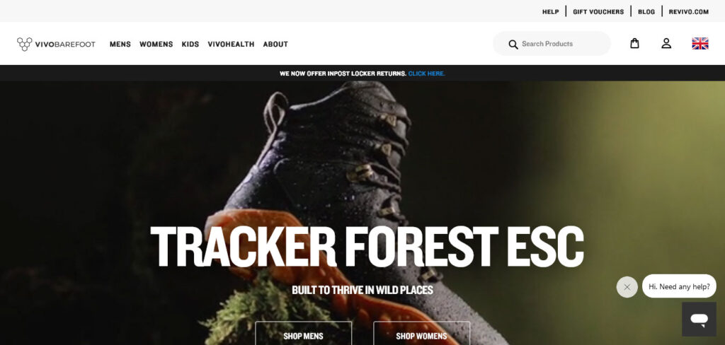
Vivobarefoot business website’s homepage features a captivating full-width slideshow, showcasing some of their featured products with two CTA buttons on each slide.
For quicker navigation and easy access to the right products and information, they have implemented a mega menu with links and images.
To make your shopping experience even more comfortable, they have included country and currency selectors.
THE FOLLOWING AFTER THIS AD
Conclusion
These business websites exemplify a wide range of design philosophies and user-friendly features to enhance your online experience. Whether you’re seeking inspiration for your own entrepreneurial journey or looking for expert advice, these websites offer valuable insights and resources. Remember, you can swiftly create a similar website using one of these amazing business WordPress themes.
