Table of Content
Divi, the most popular WordPress theme, with almost 1,000,000 downloads.
It includes the following features :
Are you ready to explore some of the most stunning hotel websites crafted by hoteliers worldwide? In today’s digital era, a hotel website has evolved into an indispensable tool for all hotels.
Establishing an online presence is essential to connect with potential customers, offering them a platform to access crucial information, peruse reviews, and make advance room bookings.
The design of your hotel website plays a pivotal role, as it must captivate travelers from the first interaction, sustain their interest, and ultimately persuade them to book. Consider utilizing a hotel WordPress theme with online booking for seamless website creation.
In this exploration, we showcase compelling examples of exceptional hotel websites globally, shedding light on key elements that can make your own hotel website stand out.
Essential Elements for Exceptional Hotel Website Designs
THE FOLLOWING AFTER THIS AD
A hotel’s online presence is often the first point of contact between the business and potential guests. A well-designed hotel website not only serves as a digital storefront but also plays a crucial role in shaping the overall guest experience. To stand out in the crowded online landscape, hoteliers must prioritize certain key elements in their website design.
Here are the essential elements for creating exceptional hotel website designs:
- Intuitive Navigation: Streamlined navigation is paramount for a positive user experience. Visitors should be able to easily find essential information such as room options, rates, amenities, and contact details. Implement a clear and intuitive menu structure with well-labeled categories, ensuring users can effortlessly explore the website.
- Visually Engaging Imagery: High-quality, captivating visuals are essential to showcase the hotel’s unique personality and offerings. Utilize professional photographs of rooms, amenities, and surrounding attractions to create a compelling visual narrative. Consider incorporating immersive multimedia elements, such as virtual tours or videos, to provide an interactive and engaging experience for potential guests.
- User-Friendly Booking System: A user-friendly and efficient booking system is essential for converting hotel website visitors into guests. Implement a clear and straightforward reservation process, allowing users to check availability, view room options, and complete bookings with ease. Provide transparent information about pricing, policies, and any promotions to build trust with potential guests.
- Effective Calls-to-Action (CTAs): Strategically place clear and compelling CTAs throughout the website to guide visitors toward desired actions, such as booking a room, subscribing to newsletters, or following social media accounts. Use persuasive language and design elements to draw attention to CTAs, ensuring they stand out without being intrusive.
- Responsive Design: With the increasing use of smartphones and tablets, a responsive design is crucial to ensure that your hotel website looks and functions seamlessly across various devices and screen sizes. Prioritize mobile optimization to cater to the growing number of users who access websites on their smartphones.
- Compelling Content: Craft persuasive and informative content that highlights the unique selling points of the hotel. Use engaging language to communicate the hotel’s story, values, and the experience guests can expect. Incorporate guest testimonials and reviews to build credibility and reassure potential guests about the quality of their stay.
- Integration of Social Proof: Leverage social media integration to showcase user-generated content, testimonials, and real-time updates. This builds trust and allows potential guests to see the positive experiences of others. Display social media buttons prominently, encouraging visitors to follow the hotel on various platforms for updates and promotions.
- Robust SEO Strategy: Implement a robust search engine optimization (SEO) strategy to improve your hotel website’s visibility on search engines. Regularly update and maintain the website to stay current with search engine algorithms and industry trends.
Taking into account these essential elements into the design of a hotel website, hospitality professionals can create a digital presence that not only attracts potential guests but also provides a seamless and enjoyable user experience. As the first point of contact with the audience, a well-designed hotel website sets the stage for a positive guest experience and contributes significantly to a hotel’s overall success in the competitive hospitality landscape.
To simplify the creation of your hotel website, explore the advantages of utilizing exceptional hotel WordPress themes with online booking that cater to the unique needs of the industry, facilitating a smoother and more efficient design process.
Best Hotel Websites Examples
THE FOLLOWING AFTER THIS AD
Ace Hotel Portland
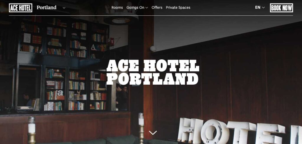
The Ace Hotel in Portland, Oregon, takes a thoughtful approach to its website design, effectively capturing the essence of the city and providing guests with a preview of the local charm.
The website cleverly incorporates a unique 4-sided navigation system, framing images of the hotel and maintaining a clean and simple aesthetic while delivering ample information.
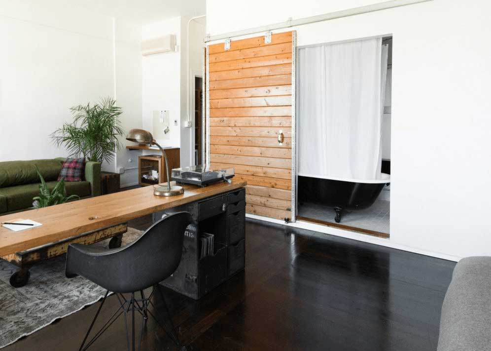
This hotel website design choice not only showcases the hotel’s features but also immerses visitors in the distinctive atmosphere of Portland, helping them form expectations for their stay.
Astra Suites Santorini
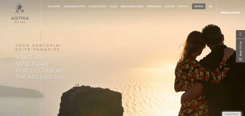
Astra Suites, located in the renowned travel destination of Santorini, Greece, boasts a website design that exudes luxury through its carefully chosen colors and captivating images.
In contrast to many other websites, Astra Suites incorporates more text, providing detailed information about its offerings. The website strategically leverages social proof by showcasing the awards and recognitions it has earned, including a prestigious spot on TripAdvisor’s Top 25 Hotels of the World. These accolades serve as powerful endorsements, likely convincing potential clients to choose the hotel.
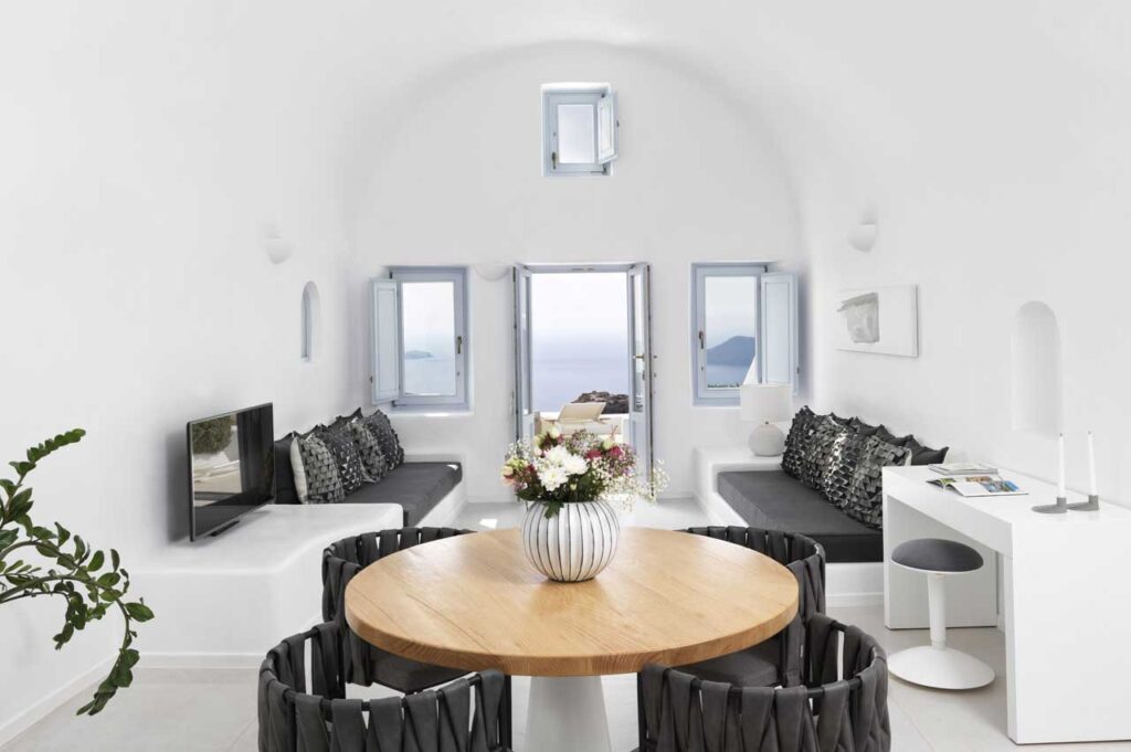
Additionally, this hotel website is accessible in three languages, catering to users from various parts of the world and enhancing its global appeal.
Basecamp Hotel
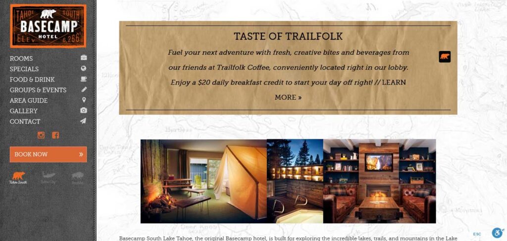
The Basecamp Hotel in Lake Tahoe, California, a boutique hotel with a camping theme, brilliantly showcases its unique identity on its website.
The site effectively captures the essence of the hotel’s brand, setting the stage for an exciting guest experience. Reflecting the property’s camping vibe, the website adopts a simple, organic approach with a hero image featuring their Instagram-worthy camping tent suite. The use of trail map backgrounds and wrinkled paper textures enhances the overall feeling of an adventurous camping excursion.
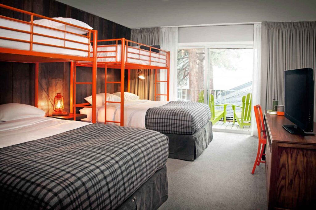
The website aligns seamlessly with the hotel’s branding, creating anticipation and excitement for potential guests.
Burj Al Arab
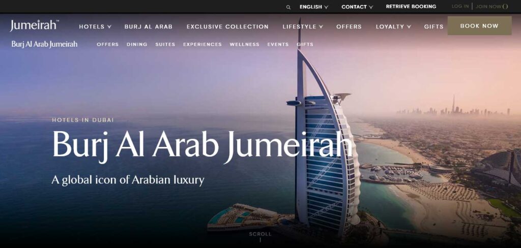
The Burj Al Arab in Dubai, an iconic presence in the city’s skyline, showcases its opulence and architectural brilliance on its website.
The hotel website design exudes elegance, featuring sweeping views of the property, luxurious imagery, and landing-page copy that encapsulates the sense of luxury. It employs captivating footage circling the property, providing a glimpse of its stunning location within Dubai’s skyline.
A visually appealing gallery highlights unique selling points, including Michelin-star dining, a private beach, spa, and architectural marvels. Selling points are seamlessly integrated as text over images, offering guests a comprehensive view of the hotel’s offerings.
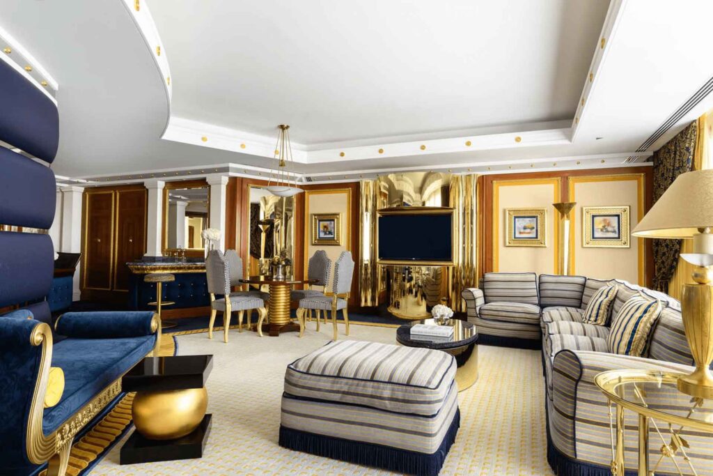
The navigation is clear, ensuring an immersive and informative experience.
Colours of Oblu Maldives
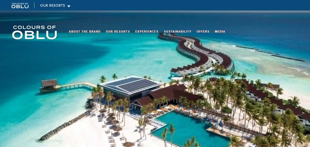
Colours of Oblu Maldives hotel website stands out with a vibrant and colorful design, creating an enticing visual experience for potential customers.
The use of a diverse color palette and captivating images takes center stage, making the website distinct from the norm. Beyond its colorful aesthetics, the design elements, including text, interactions, hover effects, and layout, are executed with elegance, giving the entire website a delightful “summer feel” – an ideal vibe for a hotel website.
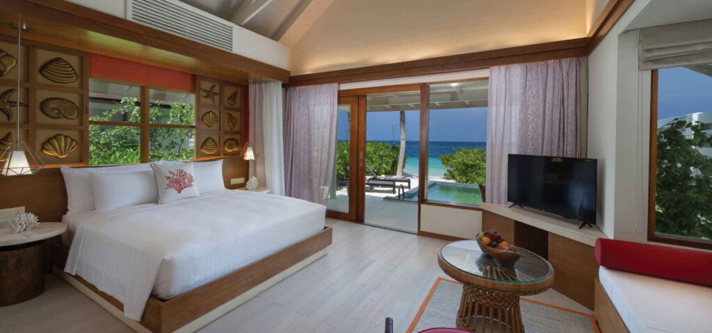
Alongside its visually appealing features, the website seamlessly fulfills the essential functions of a hotel website, allowing users to check availability, make bookings, and explore in-depth information about the hotel and its offerings.
Erakor Island Resort & Spa
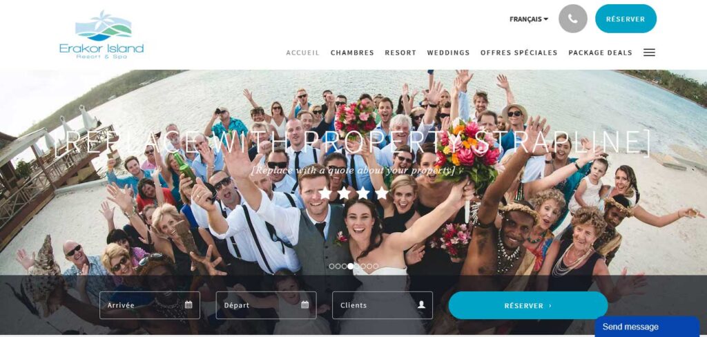
Erakor Island Resort & Spa strategically showcases one of its key offerings – hosting weddings and ceremonies.
The website features a simple yet stunning gallery with sub-categories, providing guests with a glimpse of celebratory events at the property. The omnipresent ‘Book Now’ button ensures that guests can seamlessly transition to making reservations at any point.
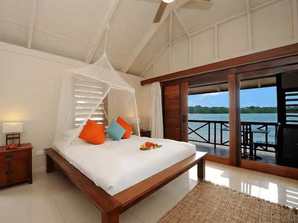
Moreover, the incorporation of a chatbot enhances the visitor experience, offering assistance with inquiries and contributing to a smooth research process, ultimately encouraging more direct bookings by ensuring easy access to information.
Exclusive Collection
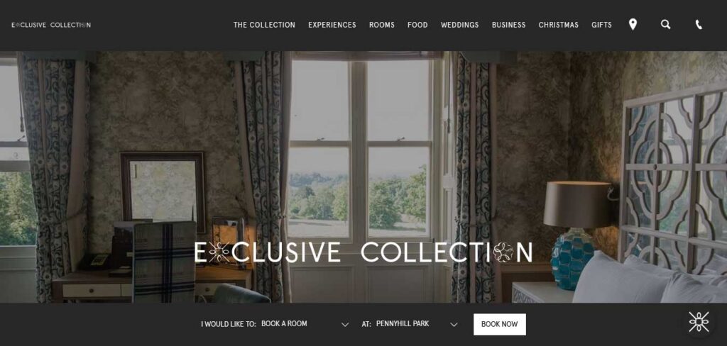
Powered by Synxis Guest Connect
Exclusive Collection prioritizes the needs of guests on every page of its website. Each property is showcased with images and summaries on the main site, aiding guests in exploring and researching which location aligns with their preferences.
The hotel website images effectively convey the unique style of each property, complemented by helpful icons indicating available amenities.
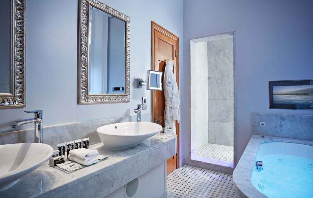
Hovering over a property provides a brief description, and clicking the image seamlessly directs the guest to the specific location’s website for further details.
Gage Hotel
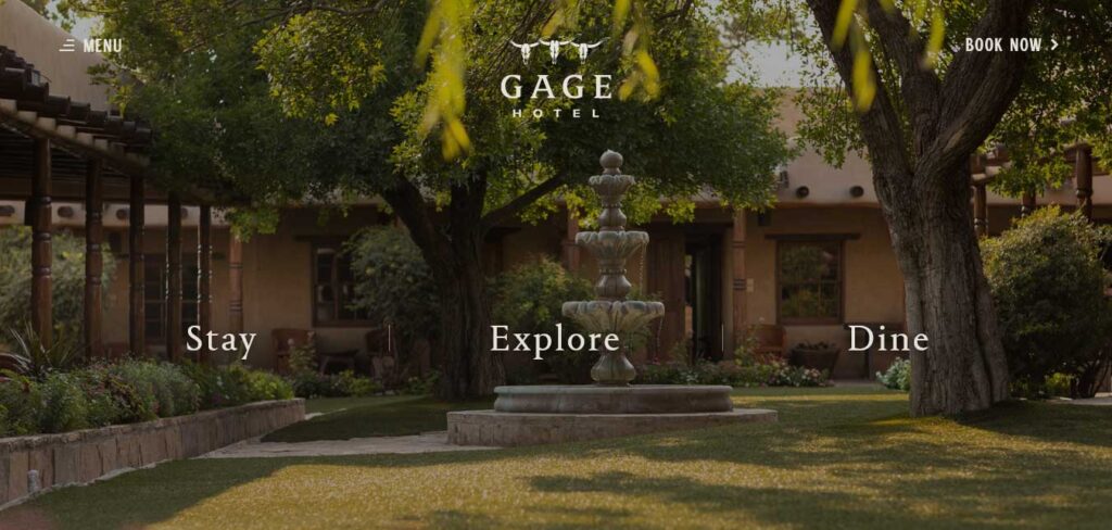
Gage hotel website employs a dynamic and interactive design strategy that immediately engages visitors. with three key action words: Stay, Explore, and Dine.
Each word, when hovered over, triggers a background image change and, when tapped, leads to a dedicated page for a seamless user experience. The Menu button, with its unique full-page cover effect, enhances navigation simplicity.
Notably, the website strategically showcases recognitions and press features, establishing credibility and creating a strong play for social proof.
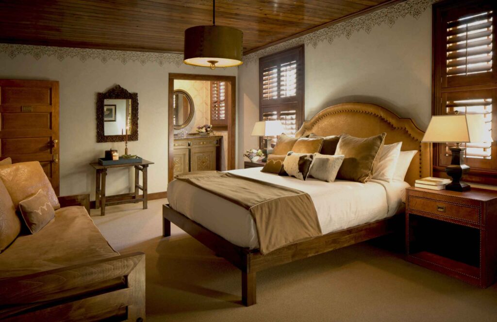
The collaboration with the reviews section that follows further reinforces the hotel’s positive image and encourages trust among potential guests.
Glenmarie Hotel and Golf Resort
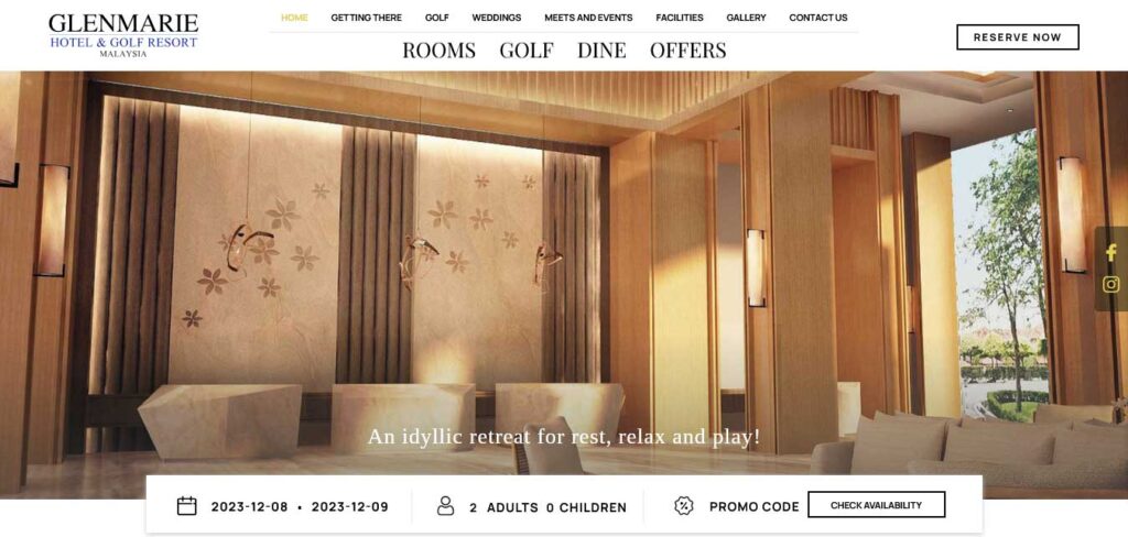
The Glenmarie Hotel and Golf Resort, situated in Shah Alam, Malaysia, is a leisure destination that adopts a simple and unpretentious approach to its website design.
Reflecting the expected style of a hotel website, it strategically incorporates compelling imagery to captivate visitors. The design embraces ample white spaces, contributing to a clean and clear layout.
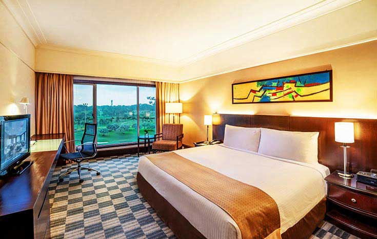
In terms of functionality, the website excels by providing essential information about the hotel, facilitating advanced room bookings, addressing visitor inquiries, and offering a seamless user experience for those seeking to explore more about the resort.
Hoh Valley Cabins
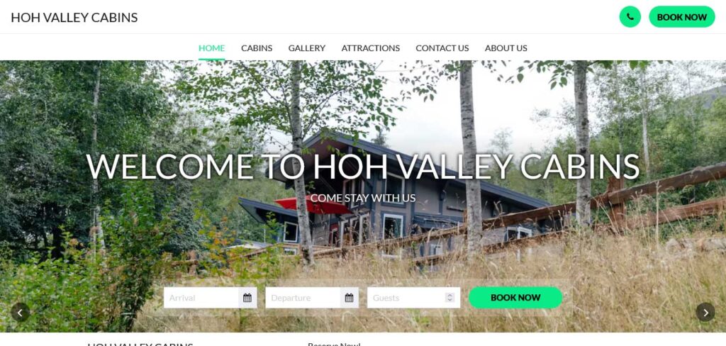
Hoh Valley Cabins hotel website is designed with a keen understanding that visitors are seeking essential information right from the moment they arrive.
In a single glance, prospective guests can discover key details about the property, explore available room options, initiate a booking, and seamlessly navigate to other sections of the site.
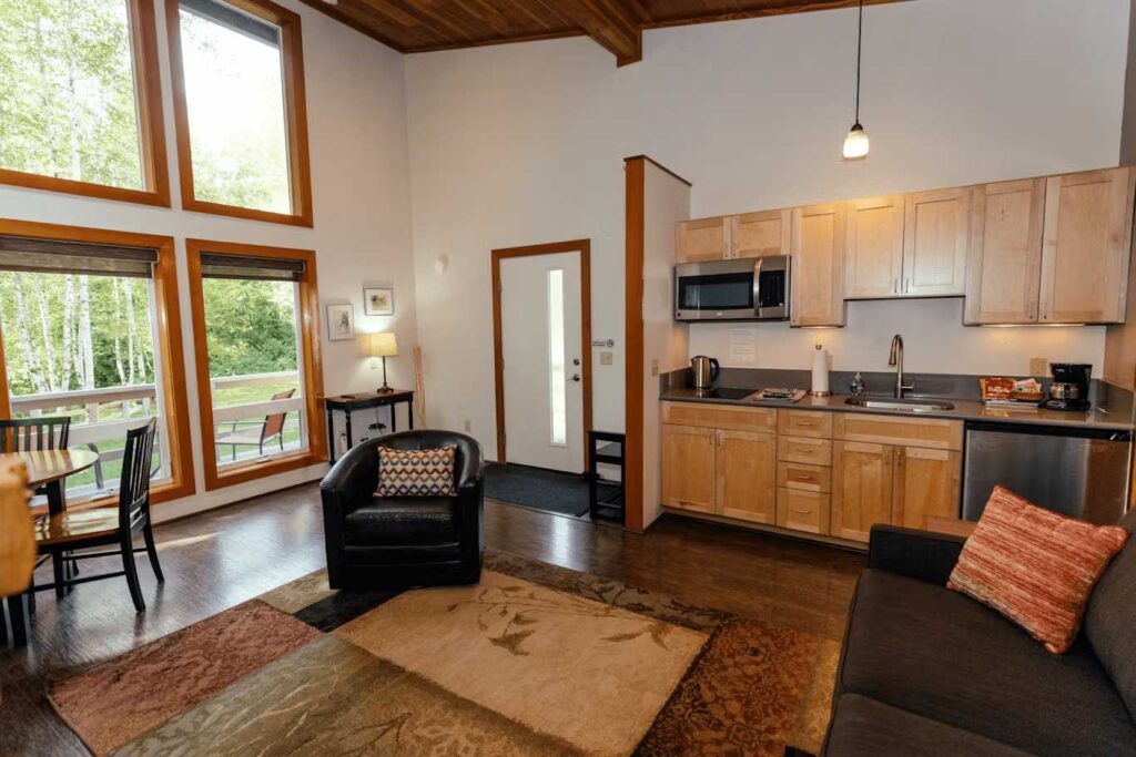
This streamlined approach ensures a straightforward and efficient experience for potential guests engaged in research and decision-making, allowing them to easily access the information they need and consider their options with ease.
THE FOLLOWING AFTER THIS AD
Kimpton
Powered by Adobe Experience Manager
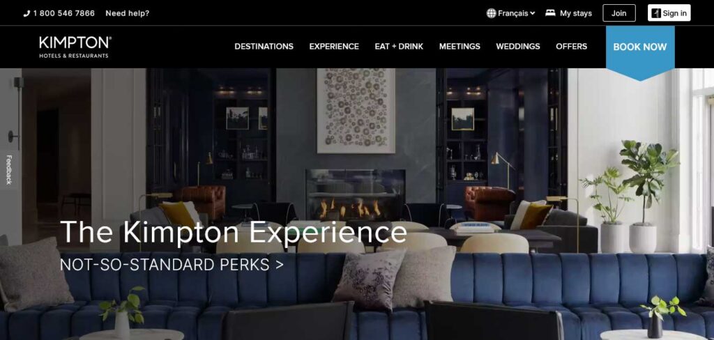
Kimpton, renowned for its boutique hotels, masterfully captures the distinct personality of each property on its main website while maintaining brand cohesion.
Through carefully curated images, the website creates an inviting atmosphere, appealing to a design-focused audience and increasing the likelihood of guests choosing a hotel that aligns with their preferences.
The editorial-style main page of this hotel website features high-quality imagery, a prominent search box, and a standout blue ‘check availability’ button for a compelling above-the-fold call to action (CTA).
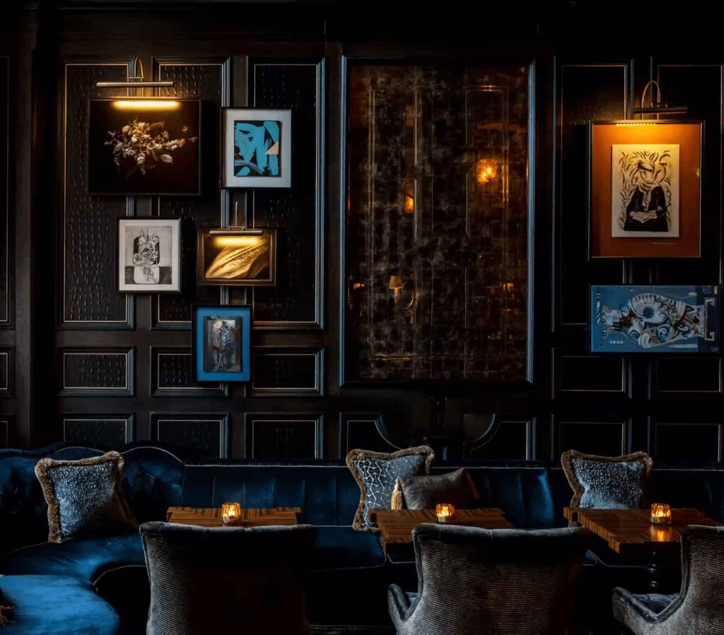
The clean and simple navigation ensures easy access to all sections, contributing to a seamless user experience.
La Mamounia
Powered by Synxis Guest Connect
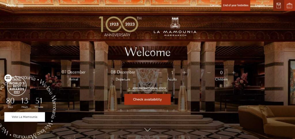
La Mamounia, a luxurious palace hotel nestled in Marrakesh, Morocco, boasts a website that serves as a powerful tool for projecting its brand and enticing tourists.
The design of this hotel website is meticulously crafted to convey one unmistakable message: luxury. Every element, from the carefully chosen colors to the fonts and captivating imagery, contributes to creating a sense of opulence.
Despite being photo-heavy, the website maintains an excellent balance with well-utilized text and typography. Functional features abound, allowing visitors to explore the hotel’s suites and restaurants in advance, providing a visual feast of what to expect.
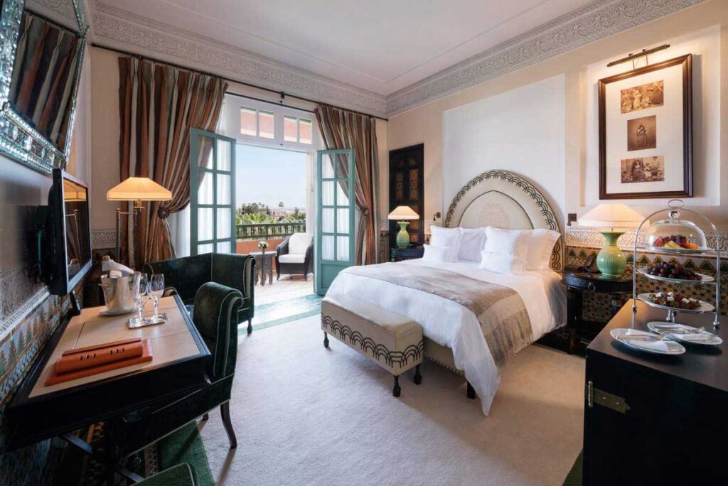
The website also facilitates easy checking of suite availability and enables seamless online bookings, offering a comprehensive and immersive experience for potential guests.
Petit Mirador
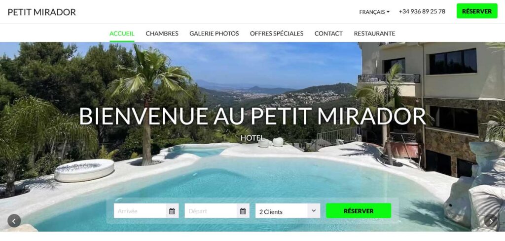
At Petit Mirador hotel website design, the scrolling slideshow banner takes center stage on the webpage, serving as a visual showcase of the property and its picturesque surroundings.
This dynamic feature, displayed prominently at the top of the page, immediately captures the attention of site visitors. The slideshow incorporates a series of stunning images showcasing unique views and amenities, providing a vivid preview of the potential guest experience at the hotel.
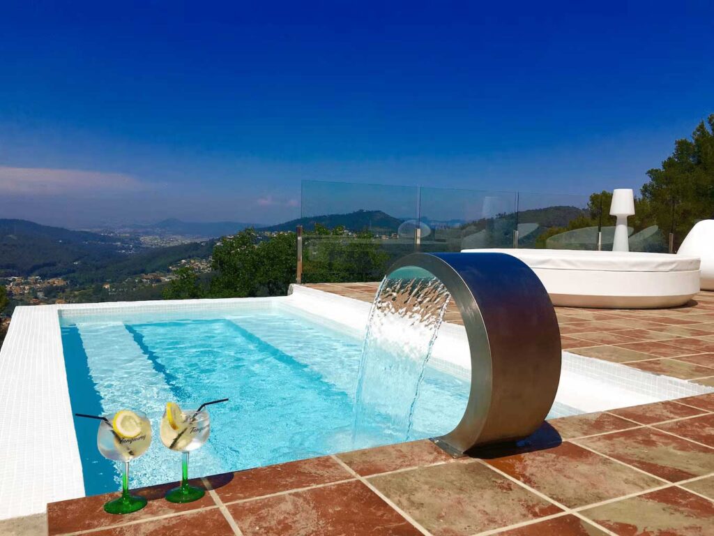
A notable advantage is the efficient design that requires just one scroll to present a comprehensive list of available room types, offering convenience and a seamless exploration of accommodation options.
Smyth Tribeca
Powered by Synxis Guest Connect
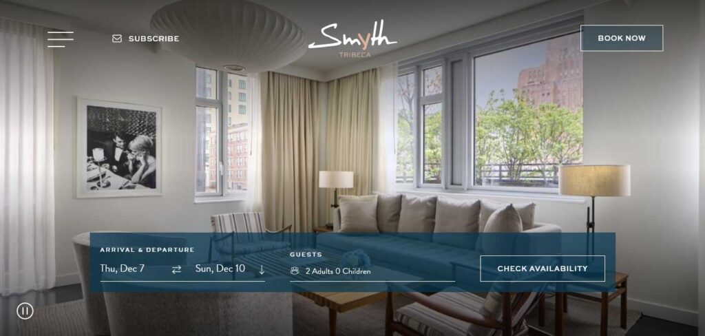
The website of Smyth Tribeca reflects a deliberate emphasis on elegance throughout its layout and design.
From the refined top bar to the sophisticated hover effects and each widget, the design exudes a sense of neatness and refinement. The homepage strategically presents a widget showcasing slides of exclusive offers, providing a glimpse into the hotel’s offerings.
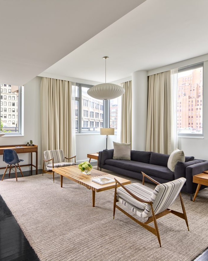
A brief overview of the hotel’s suites and rooms is followed by a section highlighting the available amenities. By the end of the website journey, visitors have gained a substantial amount of valuable information about the hotel.
Notably, Smyth Tribeca’s hotel website design distinguishes itself by not solely urging visitors to book rooms immediately but also encouraging them to subscribe to the hotel’s newsletter for updates, adding a thoughtful touch to the user experience.
The Bal’e Villas
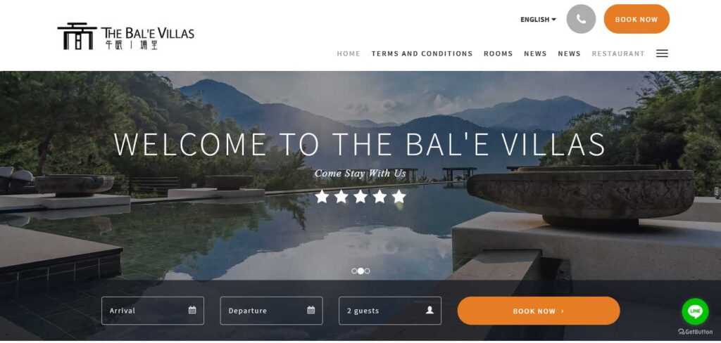
Upon landing on the homepage of The Bal’e Villas website, travelers are greeted with a seamless and user-friendly experience.
The stunning feature image immediately captures attention, creating an inviting atmosphere. The website’s simple layout is designed for optimal ease of use, allowing visitors to access vital information or make instant bookings without the need to scroll down or search extensively.
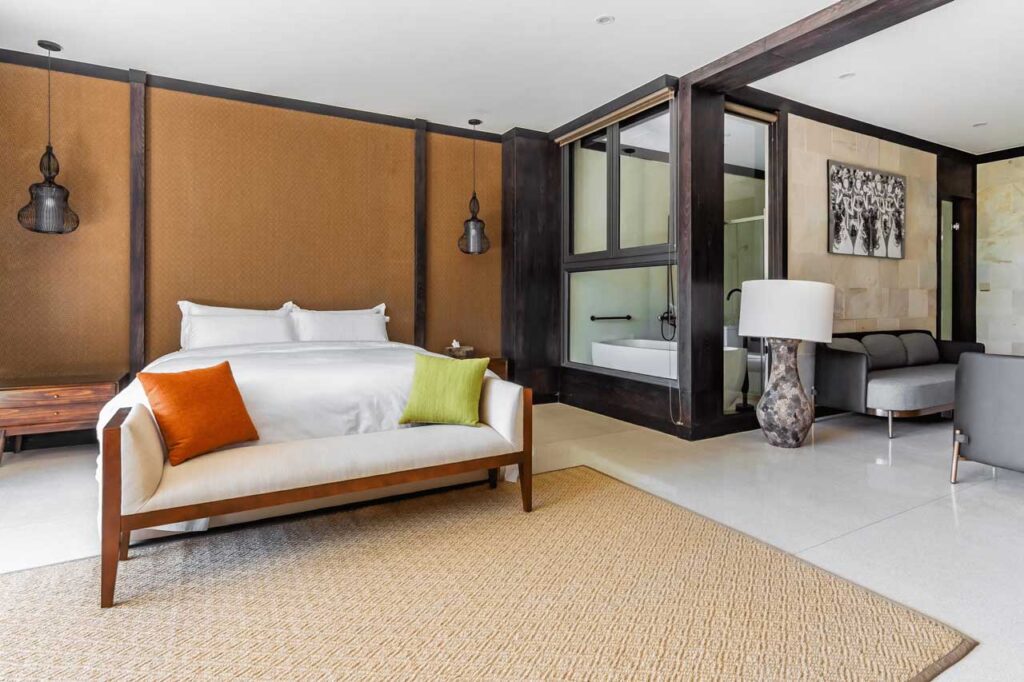
This streamlined approach enhances user engagement, ensuring that essential features are readily available and making the overall navigation efficient for potential guests.
The Corner Hotel
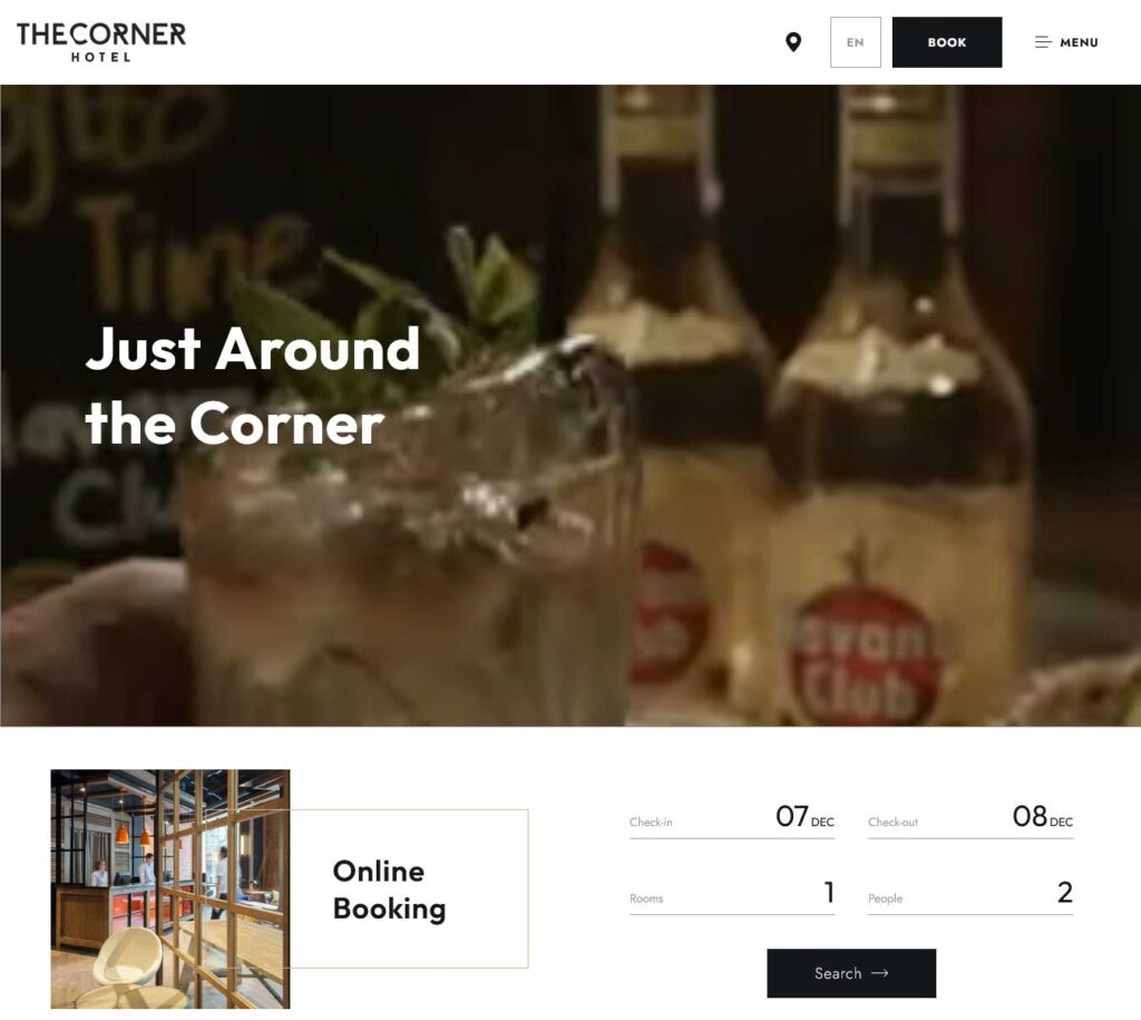
The Corner, a distinguished boutique hotel in Barcelona, sets itself apart through a dynamic website design aimed at captivating and converting visitors.
The homepage features short videos of the hotel as a backdrop to a prominent “Book Now” widget, strategically placed to encourage immediate bookings. The website cleverly highlights special offers, such as Free Cancellation, enticing potential guests with added value.
Integrating a Trip Advisor tab, users can seamlessly access reviews for added credibility. What truly distinguishes this hotel website design is the provision of a virtual tour, offering an immersive experience beyond traditional photos and videos.
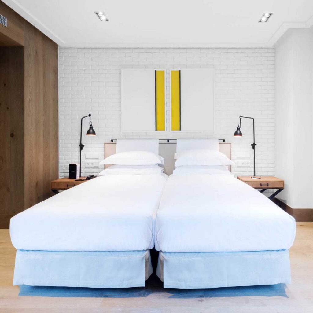
This thoughtful feature adds a unique touch, providing intending customers with a memorable and engaging preview of The Corner.
The Hollywood Hotel
Powered by Synxis Guest Connect
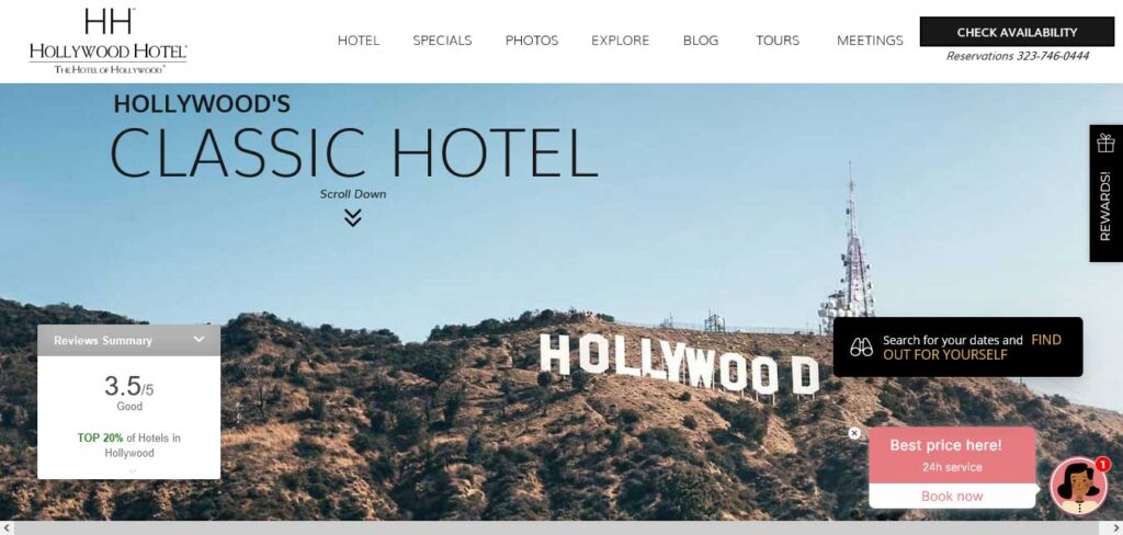
The Hollywood Hotel, aptly situated in Hollywood, California, welcomes visitors with the iconic Hollywood Hills as a captivating introduction on its website.
Notably, the hotel stands out by offering a 24-hour live chat option, enhancing customer support and creating a comforting environment for prospective guests. The real-time assistance provided through this feature is designed to alleviate concerns and uncertainties, potentially increasing the likelihood of visitors making a booking.

By prioritizing accessibility and responsiveness, The Hollywood Hotel sets a customer-centric tone from the very first interaction on its website.
The Hotel Beacon NYC
Powered by Synxis Guest Connect
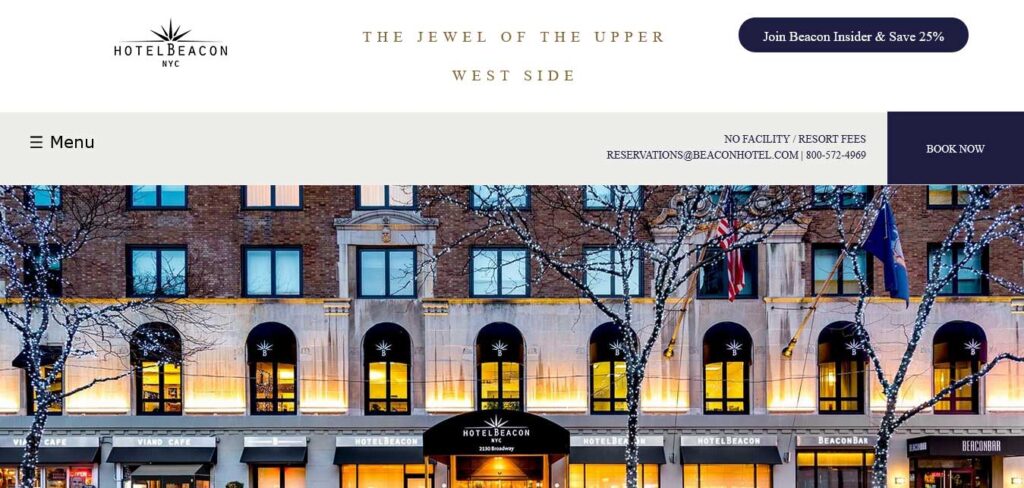
The Hotel Beacon, situated in the heart of Manhattan, New York, not only boasts a rich history but also presents a website strategy designed to engage and entice visitors.
The homepage immediately captures attention by offering an exclusive membership with a 25% discount, a clever tactic to attract frequent travelers to New York.
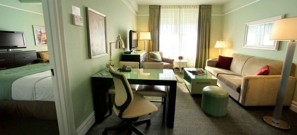
The website strategically features reviews from Trip Advisor, leveraging the credibility of user testimonials to convince potential customers that it is the ideal choice for their stay. These elements collectively contribute to creating a compelling online presence for The Hotel Beacon.
The Rees Hotel
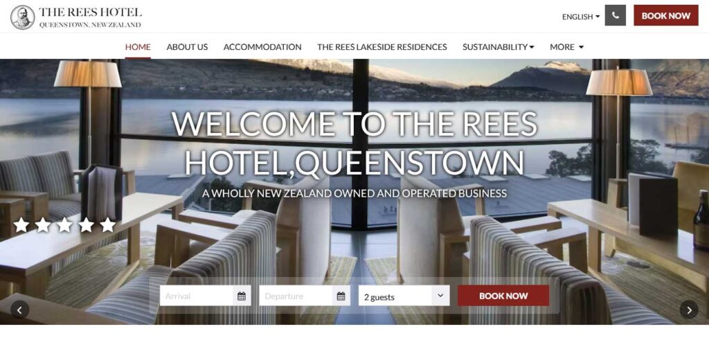
The Rees Hotel website design strategic use of the menu and navigation options ensures an optimal user experience.
Despite providing a wealth of information and details for visitors to explore, all sections are easily accessible from the main navigation. The ‘Book Now’ button is prominently featured, allowing guests to initiate bookings at any time.
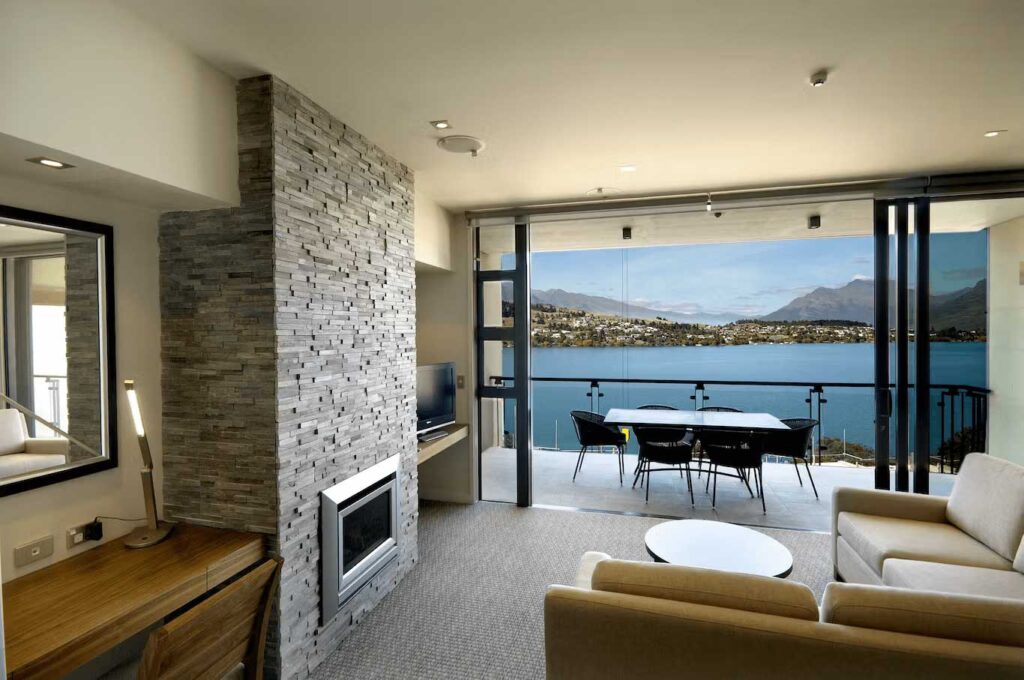
The ‘MORE’ dropdown adds a valuable and straightforward way for guests to discover additional resources, ensuring transparency and easy access to all this hotel website has to offer without burying information deep within the site structure.
The Provincial Hotel Ballarat
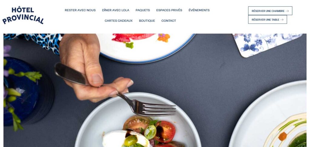
The provincial hotel ballarat website takes a distinctive approach by prioritizing a sense of homeliness and hospitality over the traditional focus on luxury.
Through the use of warm and inviting images resembling a home rather than flashy skyscrapers, the design achieves a cozy ambiance. The choice of colors, typography, and copy further contributes to this welcoming atmosphere.
Notably, the homepage features a table comparing the hotel with offerings on other sites such as Bookings.com and Expedia, providing transparency and helping potential guests make informed decisions.
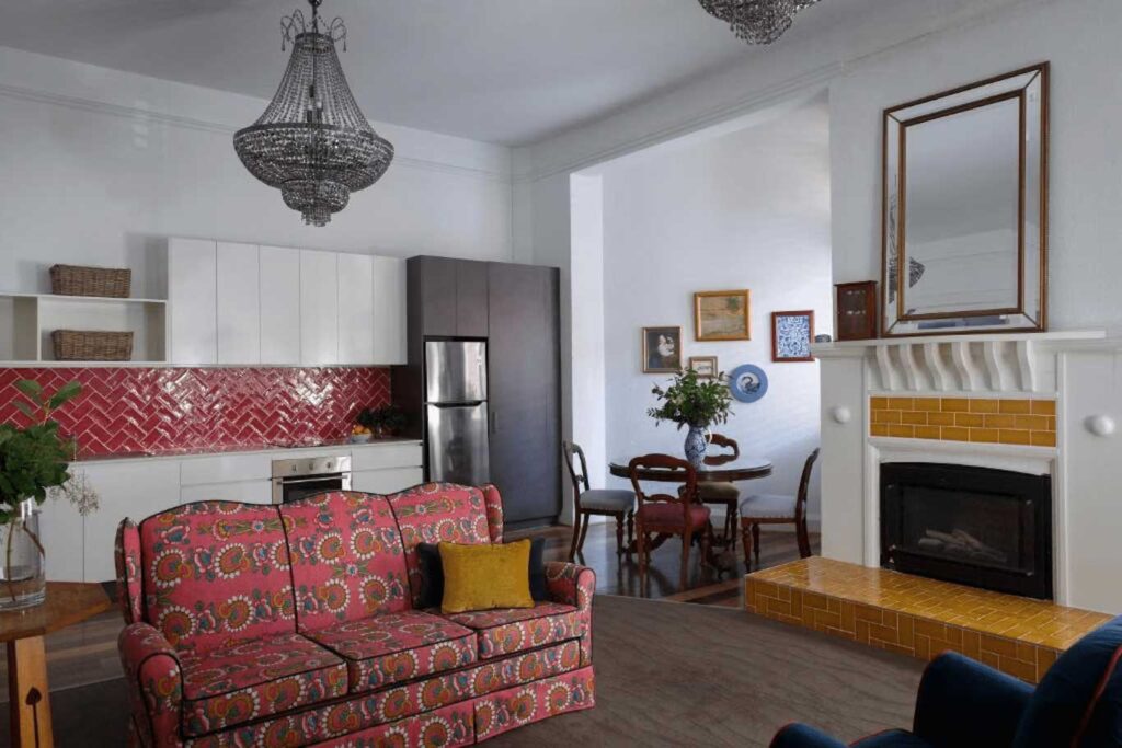
This unique blend of warmth and practicality sets this hotel website apart in creating a comfortable and trustworthy online presence.
THE FOLLOWING AFTER THIS AD
Best Hotel Website Templates
Explore a curated selection of 8 stunning WordPress themes with online booking specifically designed for hotels, promising to elevate your hotel website with contemporary features.
Hotel Themes | Active Installs | Theme Developer | Price | Rating |
|---|---|---|---|---|
| Bellevue | 13000+ | Themovation | $60 | 97.8% |
| Soho | 8700+ | Quitenicestuff | $59 | 90.6% |
| Hotel Master | 7000+ | GoodLayers | $62 | 88.8% |
| Hoteller | 5800+ | ThemeGoods | $64 | 97.2% |
| Hotel Booking Theme | 5200+ | Nicdark | $54 | 92.4% |
| Sailing | 3700+ | ThimPress | $54 | 92.2% |
| LeadEngine | 5200+ | Key-Design | $59 | 96.2% |
| Kalium | 45700+ | Laborator | $69 | 99% |
If you’re seeking a broader array of choices, delve into an extensive article showcasing the top 25 hotel WordPress themes.
THE FOLLOWING AFTER THIS AD
Conclusion
These showcased hotel websites exemplify excellence in design, functionality, and user experience. By drawing inspiration from these standout examples, hoteliers can enhance their own online presence, leaving a lasting impression on potential guests.
Remember, a well-crafted hotel website is not just a virtual showcase but a powerful tool that can elevate your establishment in the competitive hospitality landscape.
