Table of Content
Divi, the most popular WordPress theme, with almost 1,000,000 downloads.
It includes the following features :
Explore the world of architectural excellence with our curated selection of the best architect website examples, tailored to ignite inspiration for your own online presence.
Architectural websites play a pivotal role in establishing a digital footprint, enabling architects to showcase their work to a broader audience, allure potential clients, and articulate their unique design philosophy. Beyond mere presentation, these platforms serve as dynamic hubs for networking and fostering connections within the industry.
You can simplify the creation of your architecture website design by exploring one of these outstanding WordPress themes tailored specifically for architects and architecture firms.
Within this compilation, discover extraordinary and innovative architecture websites that serve as both a canvas for creative expression and a powerful tool for brand promotion. Don’t overlook this invaluable resource; instead, seize the opportunity to glean insights and select features that are essential for the success of your architecture website design project.
8 Tips to Know before Creating a Stunning Architecture Website
THE FOLLOWING AFTER THIS AD
Creating a stunning architecture website requires careful planning and attention to detail. Your website is often the first impression that potential clients and collaborators will have of your work, so it’s essential to make it visually appealing and user-friendly.
Here are some tips to consider before diving into the process of building your architecture website:
- Define Your Purpose and Audience: Clearly articulate the purpose of your website. Are you showcasing a portfolio, offering architectural services, or both? Identify your target audience – potential clients, fellow architects, students, or a broader public audience.
- Focus on Visual Appeal: Use high-quality images to showcase your portfolio. Invest in professional photography to capture your projects in the best light. Opt for a clean and modern design that reflects your architectural style. Minimalism often works well in the design industry.
- Responsive Design: Ensure your architecture website design is responsive and works seamlessly on various devices (desktops, tablets, and smartphones). This is crucial for user experience and search engine optimization.
- Tell Your Story: Include an “About Me” or “About Us” section to provide background information. Share your architectural philosophy, experience, and any unique aspects of your practice. Consider adding a blog to share insights, project updates, and industry trends.
- Highlight Your Best Work: Curate your portfolio to showcase a variety of projects, emphasizing your best work. Include detailed case studies with before-and-after images if applicable. Use captions to provide context and explain the design process.
- Contact Information: Clearly display your contact information. Include a contact form for inquiries and a map if you have a physical office location. Make it easy for potential clients to get in touch with you.
- Optimize for Search Engines: Use relevant keywords in your content to improve search engine rankings. Consider what potential clients might be searching for when looking for architectural services. Add alt text to images, use descriptive titles, and create a sitemap for search engine crawlers.
- Regular Updates: Keep your website content up-to-date. Remove outdated projects, update your portfolio, and refresh your “About Me” section as your practice evolves. Regular updates also signal to visitors and search engines that your website is active and relevant.
With these tips, you can create a stunning architecture website that effectively showcases your work, engages your audience, and establishes a strong online presence for your architectural practice.
To simplify the process further, contemplate utilizing one of these amazing WordPress themes specifically designed for architects and architecture firms. They often come with customizable layouts, sleek designs, and built-in features tailored to highlight architectural portfolios and services.
Top Architecture Websites Examples
THE FOLLOWING AFTER THIS AD
Amanda Martocchio
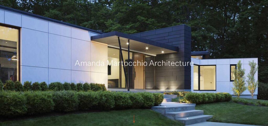
Amanda Martocchio is a skilled architect known for large-scale cultural and commercial buildings, her website seamlessly transitions from full-width images to a captivating scrolling experience.
This architect website homepage prioritizes visual impact with large images showcasing a diverse array of projects, allowing the audience to absorb the essence of her work at a glance.
Each project is thoughtfully presented with a slider highlighting crucial details, providing a comprehensive view of Amanda’s expertise. The off-canvas menu ensures a clean and uncluttered navigation experience, reflecting the precision and clarity evident in her architectural designs.
Archi-Graphi
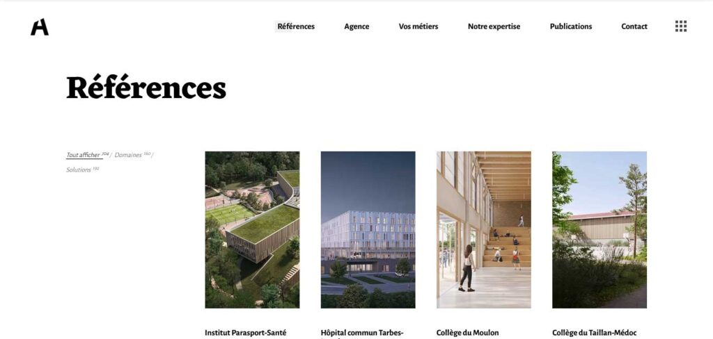
Archi-Graphi is a dynamic firm that excels in seamlessly integrating design innovation and effective communication across all stages of project lifecycles.
With 15 years of diverse design expertise and an impressive portfolio boasting 1200 references, our architecture firm stands as your dedicated partner from the inception to the completion of your projects.
Immerse yourself in their visually stunning online experience through their architecture website design. Explore interactive scrolling animations and high-quality project images set against a striking monochromatic backdrop.
Archi Site Mobius
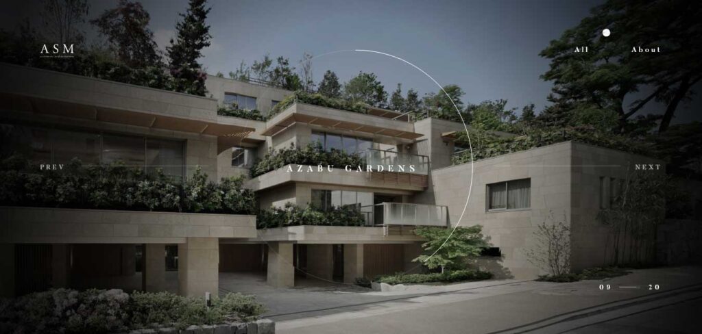
Committed to creating serene spaces, Archi Site Mobius is eager to share its expertise, and its website stands as a testament to innovation.
Utilizing the popular GSAP animation, ASM’s project exhibition is a visual marvel. The transition effect between projects is not only impressive but clever, adding a dynamic element to the user experience. This architect website homepage, complete with the brand’s name, an about page, and a comprehensive project showcase, features intuitive next and previous buttons for seamless navigation.
Inner pages continue the visual journey, introducing specific projects with an array of captivating images. Archi Site Mobius invites you to a digital exploration where design meets serenity, and each transition is a work of art.
Ark Shelter
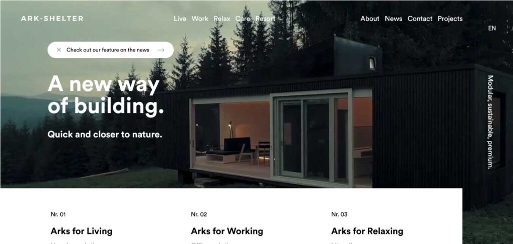
Ark Shelter is a European-based firm, inspired by nature, their designs seamlessly blend flexibility, practicality, durability, and smart technology, reconnecting clients to nature and fostering human connections.
Mirroring their commitment, their website is a testament to modern, sharply-designed simplicity, they have one of best architecture websites. On their website, a hero video envelopes you in the Ark Shelter experience, while clean, straightforward browsing ensures effortless navigation.
Experience a website that, like its designs, transcends the frills and immerses you in the essence of modern living.
EYRC Architects
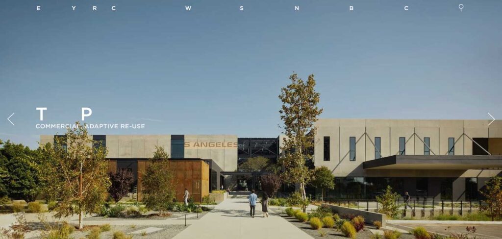
EYRC Architects’s website thrives on obscurity while showcasing remarkable expertise. Through captivating imagery and a whimsical use of words, the firm unfolds its narrative, allowing each project to speak volumes.
Explore their diverse portfolio spanning residential, commercial, and public spaces, and delve into the visual stories that accompany each masterpiece.
This architecture website invites you to experience architecture beyond the conventional, where creativity and innovation converge in a playful dance of design excellence.
GNB Architects
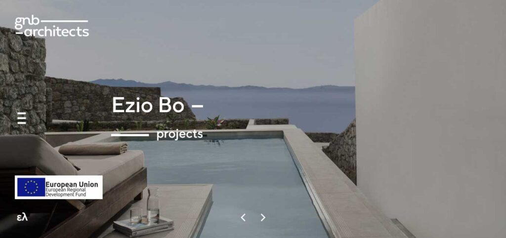
Utilizing high-contrast overlays and large images, they have crafted an immersive experience that simplifies navigation and maximizes focus on their architectural masterpieces.
Navigate effortlessly through this architecture website as high-contrast overlays guide you to key sections, ensuring a user-friendly exploration. Large, meticulously curated images take center stage, offering an unobstructed view of their projects.
Humbert & Poyet
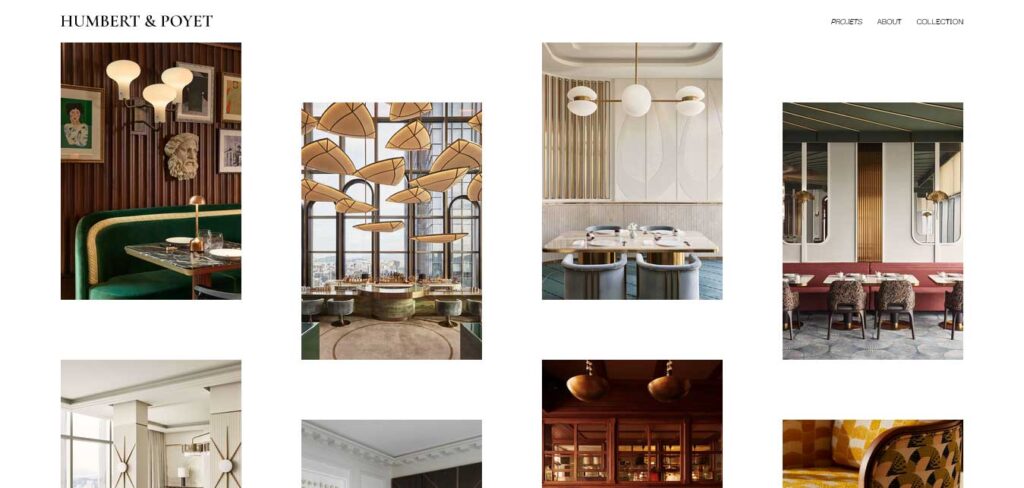
Humbert & Poyet, experienced architects are dedicated to creating safe, functional, and exquisite spaces. Their inspiring architecture website design sets a benchmark for the industry.
The homepage, uniquely designed, focuses on showcasing a multitude of successful projects, ranging from restaurants and offices to villas and hotels. Every corner of their expertise is highlighted, emphasizing their commitment to excellence.
Inner pages continue the seamless experience with a simple menu and a cool slider featuring a diverse array of captivating images.
Kilograph
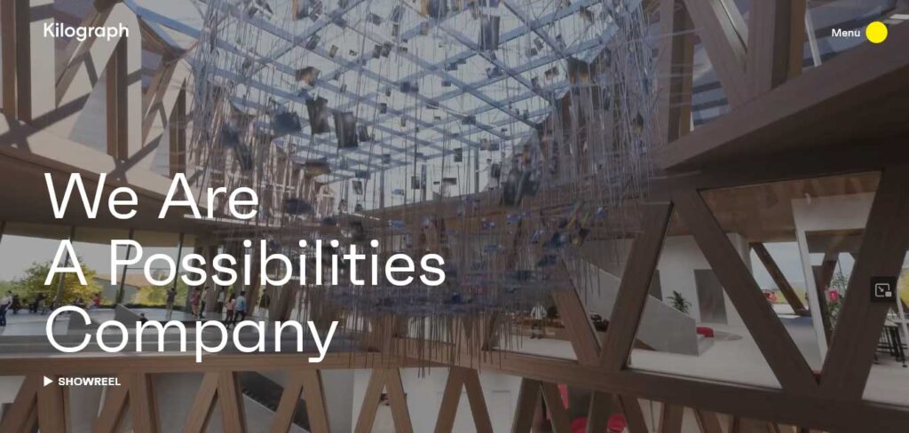
Kilograph is a full-service creative agency that has etched its mark in the architectural world. They offer a comprehensive range of services across the digital landscape, redefining the way architecture is portrayed and experienced.
Through immersive AR/VR rendering, they create an unparalleled experience that goes beyond the traditional, allowing their clients to present their projects with a narrative that captivates and resonates.
Their commitment is to empower architecture and design companies to not only realize their creative visions but also effectively communicate their message to a global audience.
You can experience the visual allure of full-width hero videos, arresting in their eye-catching appeal, setting the tone for an exploration of our diverse capabilities. The clean layout and typography enhance readability, ensuring that the message is communicated with clarity and precision.
Largo Studio
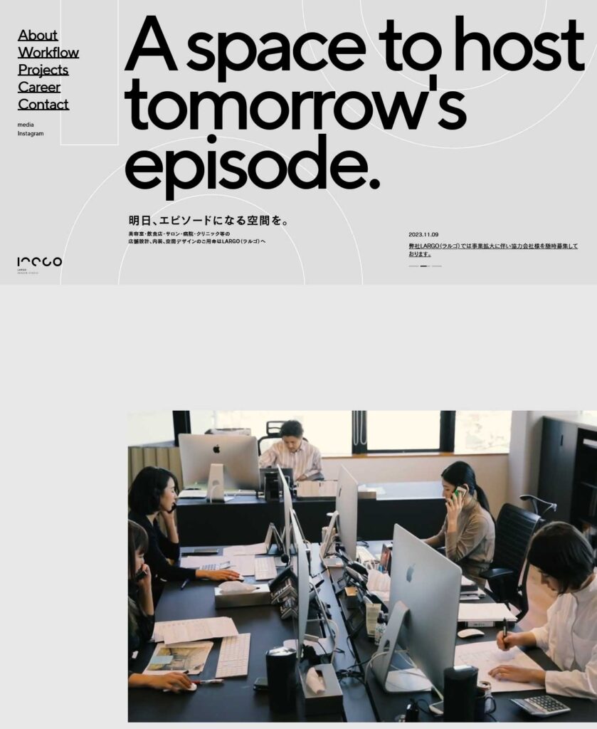
Largo Studio is a Japanese-based architecture firm specializing in the artful design of beauty salons, restaurants, and offices across Japan.
Witness the beauty of their portfolio, showcasing a seamless blend of fluid and responsible design.
As you enter Largo Studio’s homepage, be greeted by captivating geometric graphics and animated scrolling—a visual journey that sets the stage for their creative prowess. Progressive videos unfold stories, providing a dynamic perspective on their projects.
Largo Studio not only crafts stunning physical spaces but also embodies professional design through a thoughtful and imaginative website.
MAFCOHouse
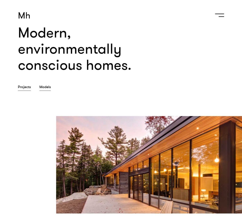
Led by Dan and Diane Molenaar, the forefront of their design operation, MAFCOhouse crafts modern, environmentally-conscious homes that seamlessly blend with nature.
On their architecture website design, experience simplicity at its finest. A straightforward and easy-to-navigate interface welcomes you, adorned with bright, high-quality images—a digital breath of fresh air.
MAFCOhouse effortlessly combines minimalist design with a focus on reconnecting clients with nature.
Measured
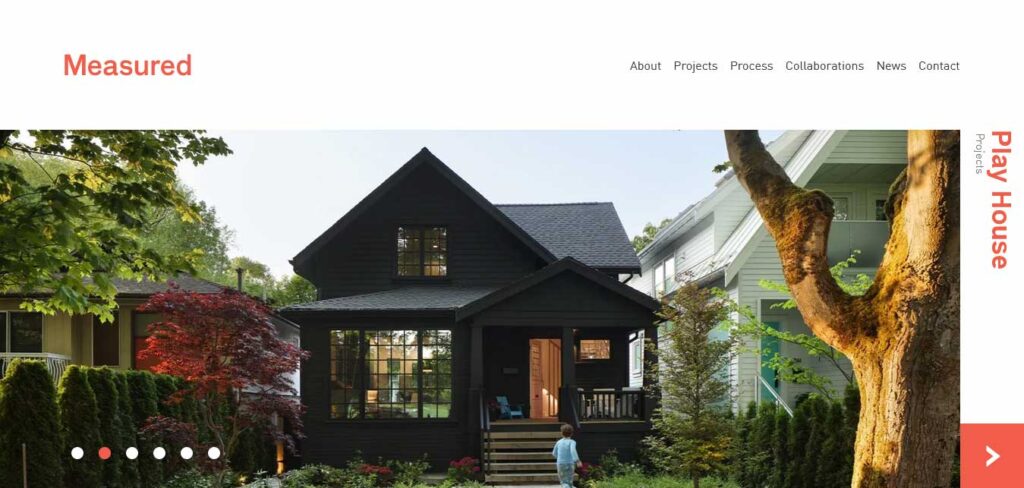
Measured is a Vancouver-based architecture agency specializing in modern design, interiors, and landscapes. Merging functionality with creativity, their fully functional website is a testament to brand awareness.
Measured architecture website’s homepage captivates with a beautiful asymmetrical layout, adorned with high-quality images for aesthetic allure. A sleek slider showcases Measured’s previous projects, featuring an attractive call-to-action, project names on the sidebar, and a sticky menu in the header for seamless navigation.
The news section is equally stunning, accompanied by a visually appealing newsletter subscription.
Olson Kundig
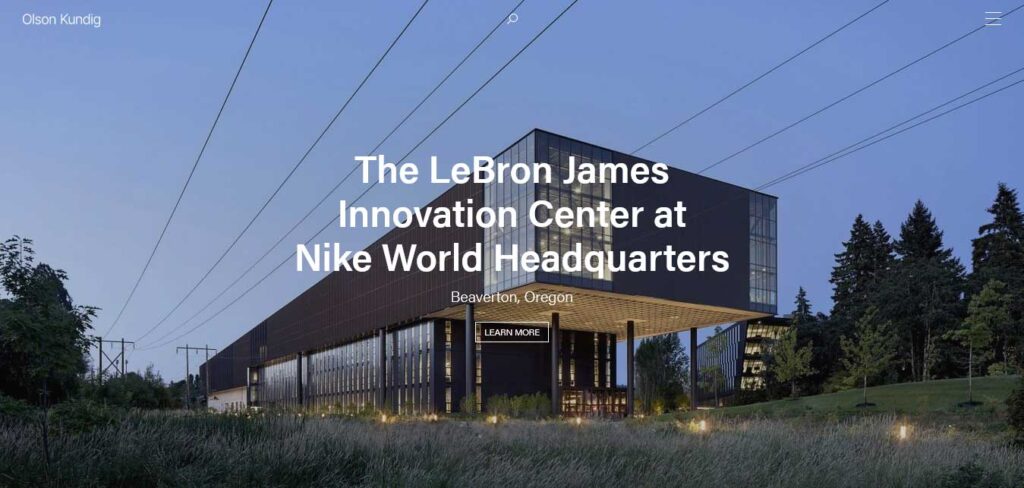
Olson Kundig is a design studio that masters the art of harmonizing architecture with the environment. Mirroring their aesthetic, the studio’s website captivates with large, full-width images showcasing the natural beauty of surrounding landscapes.
Experience sophistication through parallax elements and subtle, seamless animated transitions that mirror the studio’s commitment to open concepts, kinetic elements, and celebrating the human scale.
Patchwork Architecture
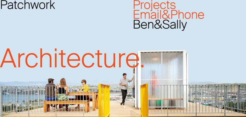
Patchwork Architecture is a firm with a rich portfolio spanning projects large and small, residential and commercial.
Dedicated to crafting beautiful, efficient, and economic spaces tailored to purpose and location, this architecture website mirrors its out-of-the-box design ethos.
You can discover extraordinary works presented in an asymmetrical layout, accentuated by strategic white space and an impressive hover effect. This architecture website’s inner pages follow suit with stunning designs, featuring cool and subtle animations upon scrolling.
SOM
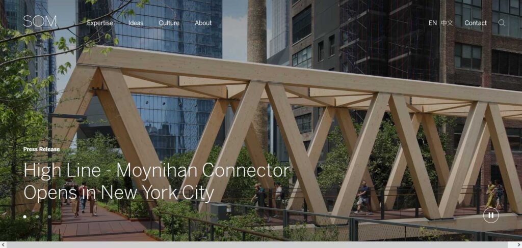
SOM is an international architectural powerhouse known for technically advanced and environmentally conscious designs. Renowned for iconic projects like the Freedom Tower in New York, SOM’s architecture website is a testament to its excellence.
The simple grid layout showcases a wealth of experience, with small thumbnail images, project names, and locations, offering a quick glimpse into their cutting-edge and globally diverse portfolio.
SOM is where innovation meets sustainability, as it continues to lead in green building designs and consistently achieves high levels of LEED certification.
Vertically Built
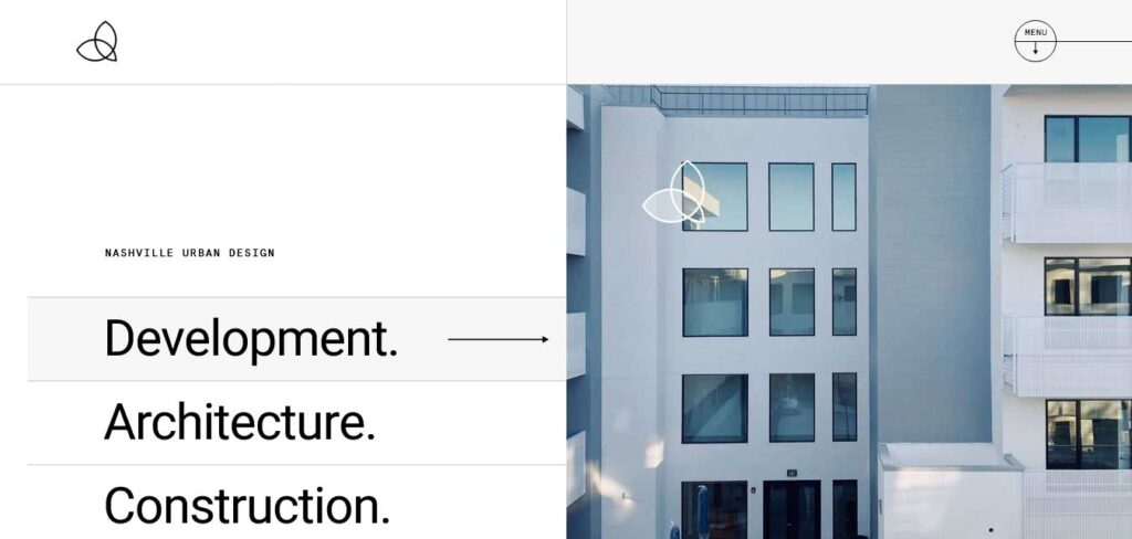
Vertically Built’s new website epitomizes sleek design with clean lines and features large, crisp images that effectively highlight the company’s architectural expertise.
The commitment to precision is evident through the seamless integration of ample white space, contributing to a visually appealing and user-friendly experience.
This architecture website design not only showcases the company’s commitment to excellence in architectural design but also serves as a gateway to their multifaceted range of services available in the vibrant metro-Nashville region.
The interface mirrors their dedication to providing top-notch services, creating a seamless online environment that aligns with their reputation for quality and innovation.
THE FOLLOWING AFTER THIS AD
Conclusion
Establishing a strong online presence is crucial for architects to reach a wider audience and showcase their work to potential clients. The carefully curated selection of architecture website examples serves as a reminder that the fusion of technology and design can elevate a firm’s identity.
Embracing the capabilities of modern architecture WordPress themes not only streamlines the process but also opens doors to dynamic features, allowing architects to present their portfolios in engaging and interactive ways.
As the virtual landscape continues to evolve, these architecture websites stand as beacons of inspiration, encouraging architects to embrace the endless possibilities that the online platform offers for shaping the future of their profession.
