Table of Content
Divi, the most popular WordPress theme, with almost 1,000,000 downloads.
It includes the following features :
We’ve meticulously curated a selection of the most exceptional musicians websites, carefully designed to ignite your creativity and kickstart your digital journey.
Within this handpicked collection, you’ll uncover a realm of possibilities, from seamlessly embedding videos and playlists to effortlessly promoting tour dates, showcasing your latest tracks and albums, and even establishing an online merchandise store – all elegantly achievable through the canvas of a stunning website.
The best part? You don’t need to be a coding or design expert to make it happen. We’ve got a secret weapon for you: WordPress themes tailor-made for musicians. These themes will empower you to craft your own captivating online presence effortlessly.
By drawing inspiration from the elegant and sophisticated designs featured in this list, you’ll find that transforming your website into a magnet for your target audience has never been easier. So, let’s dive right in and explore some of the finest musicians websites available, brimming with innovative ideas and potential.
Amazing Musicians Websites Examples
THE FOLLOWING AFTER THIS AD
Andrew Huang
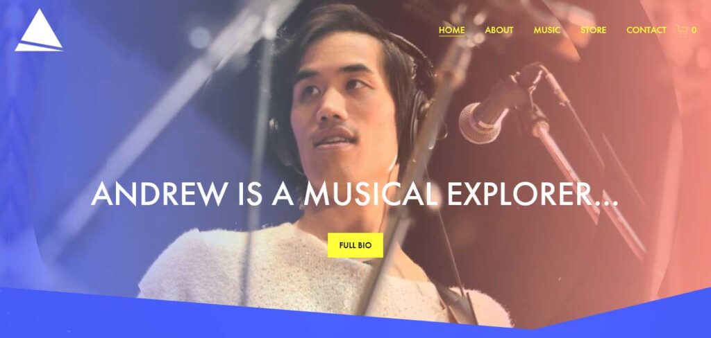
Andrew Huang’s musician website is characterized by vibrant and eye-catching colors that immediately capture visitors’ attention.
The hero section cleverly features links to Andrew’s social media profiles, facilitating immediate connection with the artist. The floating header at the top of the screen ensures that menu links are readily available at all times, enhancing user navigation.
Further down the page, a simple video grid showcases Andrew’s video content, allowing fans to explore his creative work. Just before the footer, there’s a newsletter subscription form, encouraging visitors to stay updated on Andrew’s latest news and releases.
Behemoth
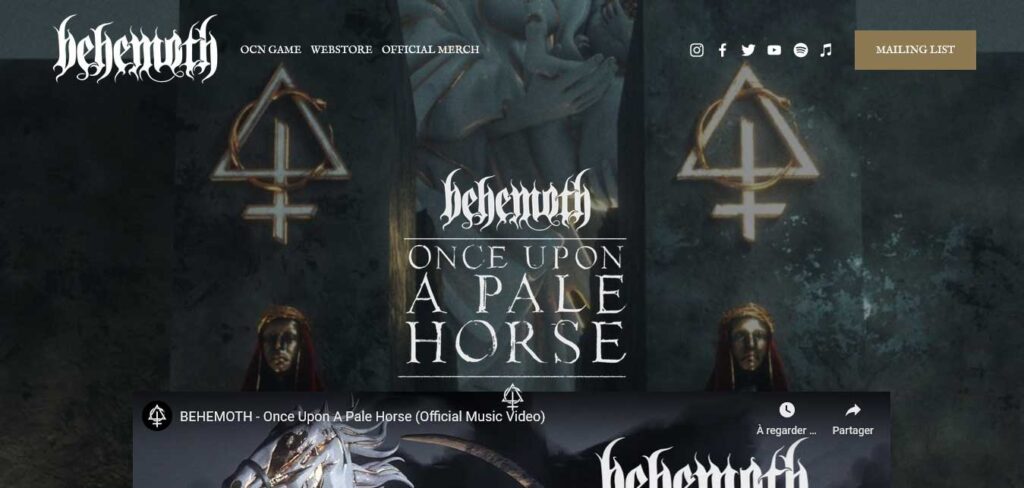
Behemoth’s band website offers a visually striking design, with an embedded video positioned above the fold, overlaying a background image.
The transparent header contributes to a distraction-free experience, ensuring that the video and background image remain the central focus. The navigation bar includes not only menu links but also social media icons, making it easy for fans to connect with the band across various platforms.
Additionally, the website features a call-to-action (CTA) button, inviting visitors to join the mailing list.
Blink 182
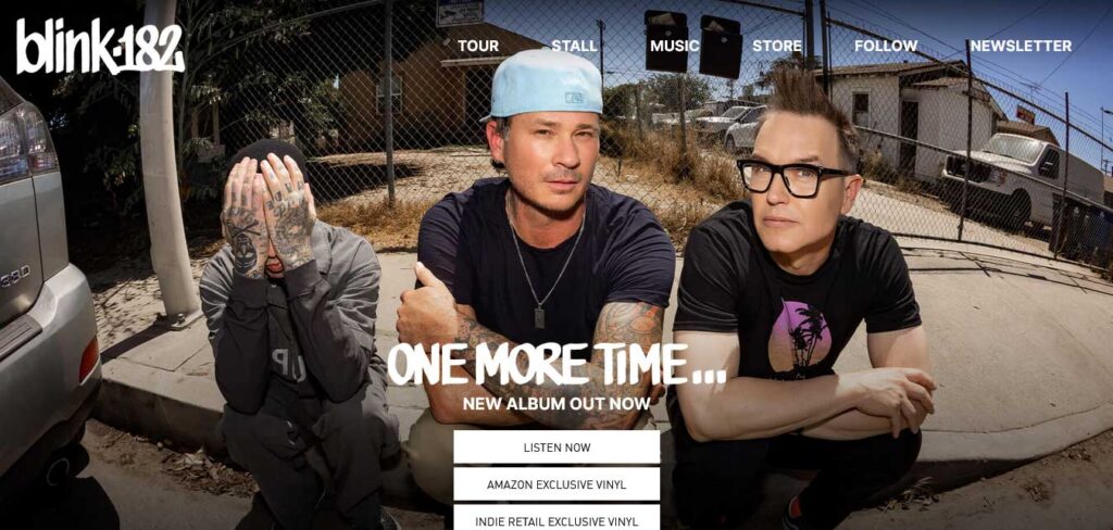
Blink 182’s musician website offers a clean and straightforward design that efficiently highlights the band’s latest content and tour information.
The full-screen hero section at the top of the page features clear call-to-action (CTA) buttons that encourage visitors to engage with the band’s content. A simple navbar makes navigation easy and intuitive.
Further down the page, visitors can find the band’s latest official music video, providing an immediate opportunity to enjoy their music. Following this is a list of tour dates, ensuring fans are informed about upcoming shows.
The website’s footer, while compact, provides essential user and business links, ensuring that visitors have access to necessary information.
Cameron Carpenter
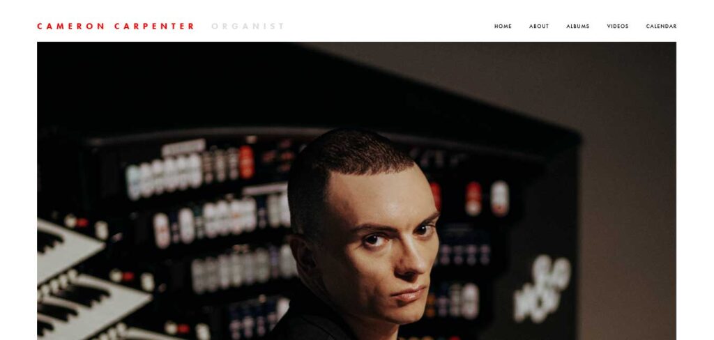
Cameron Carpenter’s musician website design embraces minimalism and simplicity. The above-the-fold section features a hero image without any text or call-to-action (CTA), allowing the visual content to take center stage.
Below the fold, the website strategically utilizes social proof by showcasing PR mentions from various authorities.
This minimalistic approach ensures that the website remains visually uncluttered and focused on establishing trust and credibility through social proof.
Carl Cox
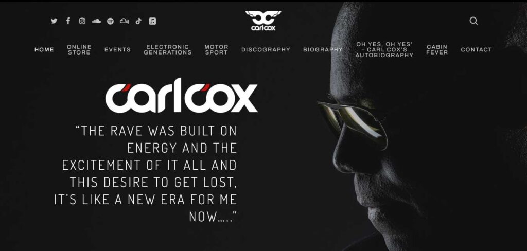
The Carl Cox website boasts a straightforward and bold design, with a dominant and dark color scheme.
It prominently features a full-screen hero background image, showcasing a captivating visual that sets the tone for the website. The site’s header is minimalist and transparent, offering essential elements such as menu links, a search bar, and social media icons, ensuring that visitors can navigate and connect with ease.
The text in the hero section consists of a quote from Carl, adding a personal touch to the website and enhancing its character.
Charley Crockett
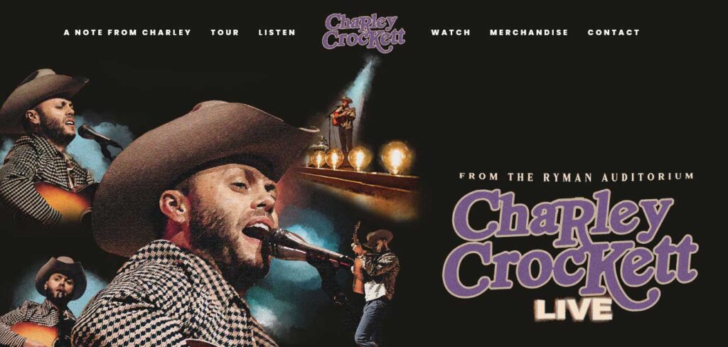
Charley Crockett’s website employs a straightforward and minimalist design that is both modern and responsive. The homepage focuses primarily on promoting the artist’s music and tour dates, ensuring a user-friendly and efficient experience.
The hero section boasts a full-screen image background, offering a visually appealing introduction to the site. The transparent header, which floats as visitors scroll, keeps navigation simple and unobtrusive.
This musician website’s simplicity is a strength, as it excels in its core functions: promoting Charley Crockett’s tunes and tour dates.
Charlotte De Witte
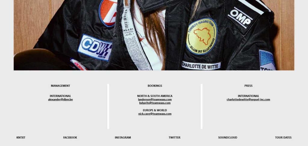
Charlotte De Witte’s website adopts a clean and concise one-page design. It kicks off with a full-screen home layout that immediately captures attention with a catchy text-revealing effect.
The homepage prominently displays a large hero image of the artist, creating a visually striking introduction. Beneath this, visitors can find all the essential contact details to connect with Charlotte De Witte directly.
The website is further enriched with a footer that contains additional links to various social media profiles and tour dates, offering visitors easy access to stay updated on the artist’s latest news and events.
Claire Soulier
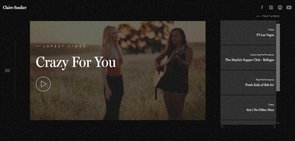
Claire Soulier’s website stands out with a unique and engaging design. Several distinctive features make this musicians website particularly interesting:
- Auto-Played Video: The homepage hero section immediately captures attention with an auto-played video.
- Infinite Scrolling: To enhance the user experience, the website loads content as users scroll down the page.
- Sticky Sidebar Hamburger Menu: Claire Soulier’s website includes a sticky sidebar hamburger menu icon. When activated, it opens an overlayed navigation menu, providing easy access to various sections of the website. Additionally, the header with social media buttons remains visible as users navigate the site, ensuring they can connect with the artist on social platforms.
- Contrasting Design: While the core design of the website leans towards a dark color scheme, the footer takes on a more dynamic appearance with a light background.
Elles Bailey
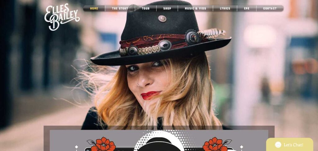
Elles Bailey’s website stands out due to its visually stunning parallax background image.
This musician website example features a boxed layout, which neatly organizes its content. Within this layout, you’ll find an embedded playlist and video, allowing visitors to engage with the artist’s music directly on the site. Additionally, tour dates are prominently displayed, keeping fans informed about upcoming events.
An interesting and uncommon feature on this musician’s website is the live chat widget in the bottom right corner.
Garry Tallent
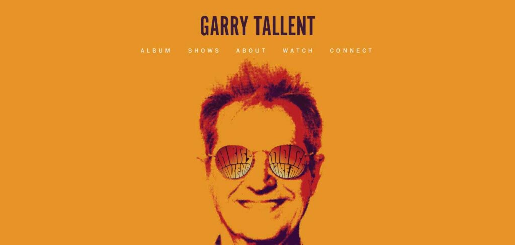
Garry Tallent’s musician website embraces an artistic design in its above-the-fold area, featuring a visually engaging background image.
The website employs a single-page structure, ensuring that all essential details are just a few scrolls apart. However, it’s worth noting that a sticky header would enhance navigation and make jumping from section to section more convenient.
In a unique touch, Garry uses a Twitter grid feed powered by the Juicer tool, deviating from the more common Instagram feed approach.
Harpdog Brown
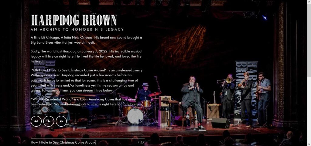
Harpdog Brown’s musician website design offers a unique and engaging front page. The use of a full-screen background slider immediately captures attention, and the presence of an audio player allows visitors to enjoy the artist’s music directly on the site. Additionally, links to social media and other pages enhance user interactivity and engagement.
While the homepage maintains a simple design without a header or footer, the rest of the website incorporates these elements. The navigation bar, in particular, stands out with its drop-down menu, which simplifies the process of finding specific information. This navigation feature enhances user convenience, ensuring that visitors can easily explore the website and access the content they desire.
Janie Bay
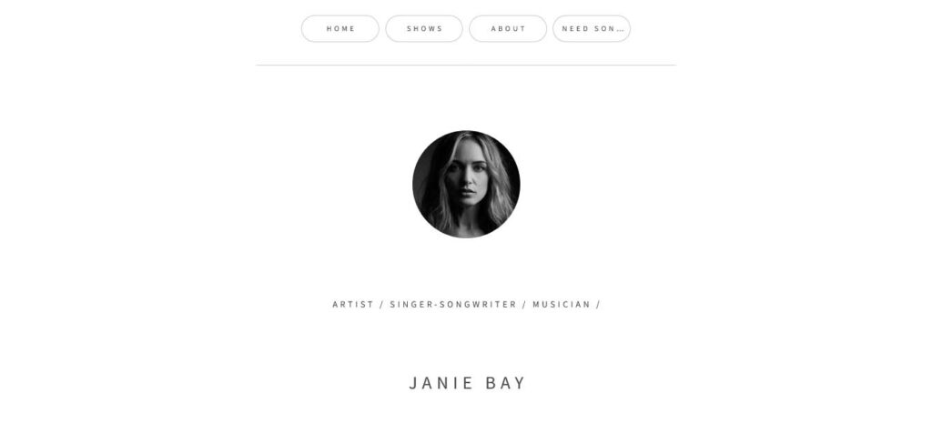
Janie Bay’s website is an excellent example of the power of minimalism in web design. This simplicity works to create a clean and uncluttered user experience, where the focus is on presenting essential information effectively.
This musician website example includes basic details about the artist, a straightforward header with navigation links, and social media and email icons in the footer.
Jay Hardway
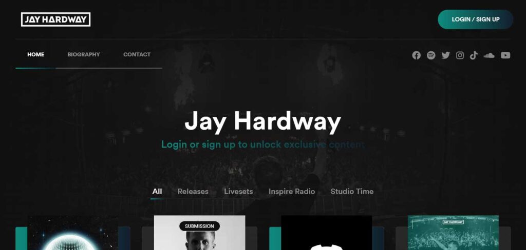
What sets Jay Hardway’s website apart is its approach to accessibility and user engagement. The website combines public and member-exclusive content, offering a dynamic user experience.
The homepage features a distinctive four-column grid layout with tags that enable visitors to filter and view content based on their specific interests.
Additionally, this musician website incorporates a floating header that provides quick access to essential functions. This includes a login/sign-up call-to-action (CTA) button, streamlining the process for visitors to become members and access exclusive content.
Jonathan Jackson
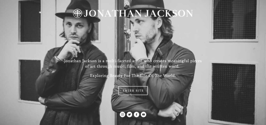
Jonathan Jackson’s musician website has a captivating front page with a full-screen image background and overlaid text. It encourages visitors to enter the website and features social media icons at the bottom, facilitating immediate connection with the artist’s online presence.
Upon entering the website, users discover a wealth of information, including videos and other content. The website opens in a new tab, ensuring a seamless transition and providing a user-friendly experience.
Justin Ward
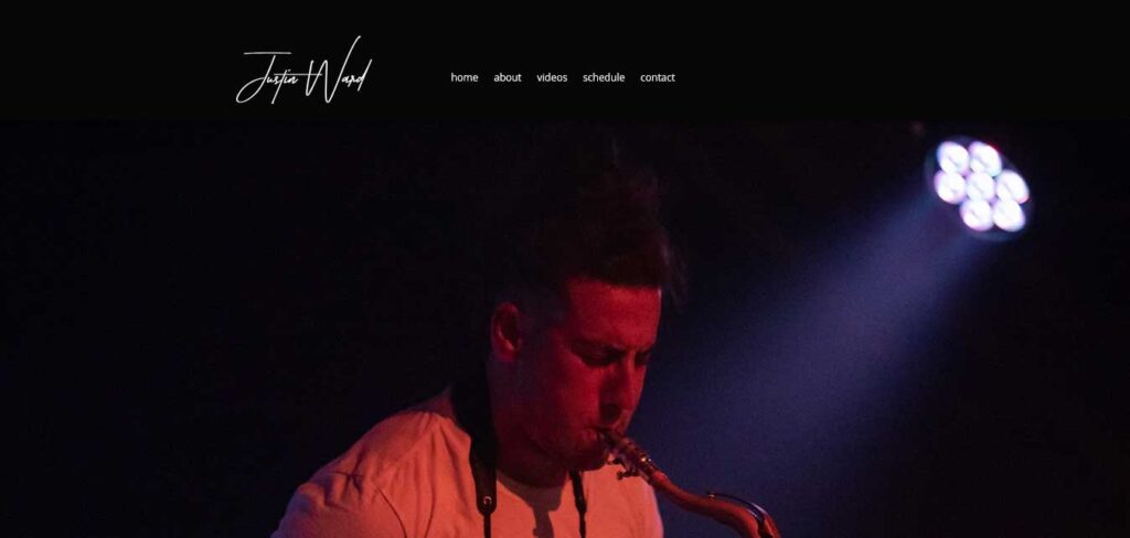
Justin Ward’s musician website adopts a clean and straightforward design. The hero image on the front page is uncluttered, without overlay text or a call-to-action (CTA). This minimalist approach puts the visual content at the forefront.
The website’s header features a menu that allows for easy navigation, while the footer includes links to Justin Ward’s social media profiles. This simple structure ensures that visitors can quickly access all the essential information with just a few clicks, providing a user-friendly and efficient experience.
Lauren Conklin
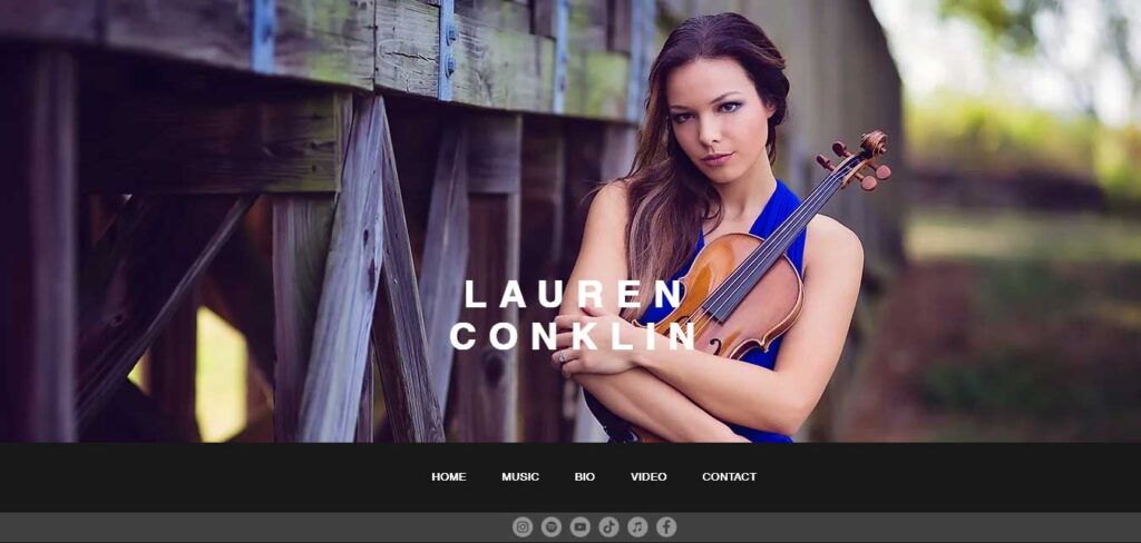
Lauren Conklin’s website offers a compelling and immersive user experience. The homepage begins with a full-width image featuring the artist’s name overlaid, creating an aesthetically pleasing introduction to the site.
The website cleverly embeds three Shopify playlists, allowing visitors to listen to Lauren’s music directly through the website.
A standout feature is the beautiful video gallery/library, complete with optional share buttons. This gallery enables visitors to explore Lauren’s video content and easily share it with others, enhancing her online presence.
The floating header/menu positioned at the bottom of the screen ensures that menu links are readily accessible and do not interfere with the visual appeal of this musician website.
THE FOLLOWING AFTER THIS AD
Paul Lay
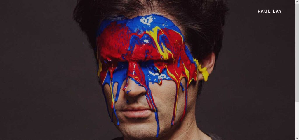
Paul Lay’s website offers a bilingual homepage, allowing visitors to choose between the French and English versions.
The homepage features two call-to-action (CTA) buttons with a hover effect, enabling visitors to easily enter their preferred language version of the website. Additionally, social media icons in the bottom right corner provide a direct connection with Paul, fostering engagement with the artist.
The website incorporates a header with a drop-down menu, ensuring straightforward navigation. A footer, complete with a newsletter subscription form, keeps fans informed about Paul’s latest updates. The inclusion of additional sidebar navigation enhances the user experience, allowing for easy exploration of the artist’s content and offerings.
Peggy Gou
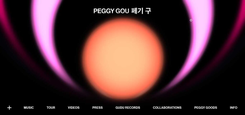
Peggy Gou’s website stands out as a unique and creative platform. Unlike traditional musician websites, this site takes a distinctive approach to navigation and user engagement.
The menu, typically found at the top of a webpage, is located at the bottom of the screen in Peggy Gou’s site. This sticky menu remains accessible as users scroll, making it easy to access various sections of the website.
A notable feature is the ability to play music by pressing the “+” sign in the bottom left corner.
The website’s home page animations are captivating and add an extra layer of visual appeal, making the site even more eye-catching and engaging.
Sierra Hull
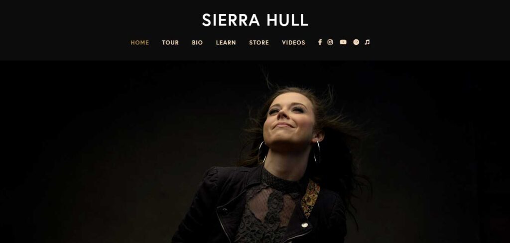
Sierra Hull’s website offers a semi-one-page design that combines fluid navigation with relevant content sections, ensuring an engaging and user-friendly experience.
The website features a floating navigation bar that makes it easy to move between sections and other pages without requiring extensive scrolling.
Below the hero area, visitors encounter a section dedicated to promoting Sierra Hull’s latest album, followed by a list of tour dates. Each tour date is accompanied by clear calls-to-action (CTAs) for tickets and RSVPs, streamlining the process for fans to engage with her live performances.
The website also includes a newsletter subscription form, offering visitors a chance to stay updated on Sierra Hull’s latest news. The newsletter form is positioned between an Instagram feed slider and a Spotify playlist, enriching the site with dynamic content and music engagement options.
Sharam
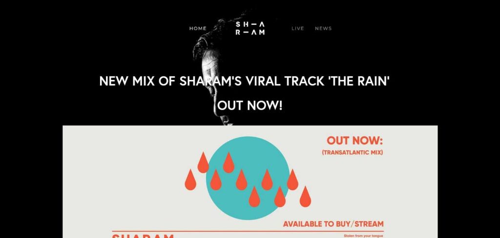
The Sharam musician website embraces a darker, atmospheric design. Its header and footer maintain a basic and unobtrusive style, allowing the website’s content to take center stage.
Its hero area takes the spotlight, promoting the latest tunes and featuring call-to-action (CTA) buttons that link to social media platforms. The content is elegantly overlayed onto the background image, creating a visually appealing and immersive atmosphere that complements the musician’s style and work.
Steve Benjamins
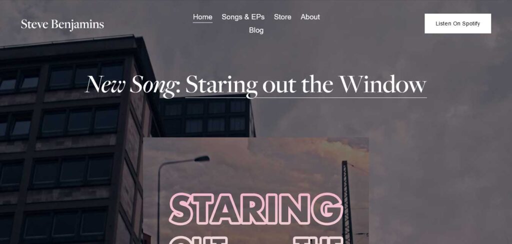
Steve Benjamins’ musician website follows a simple and effective design approach, with a single-sectioned front page that emphasizes the promotion of his new song.
The header, transparent and minimalistic, features a call-to-action (CTA) button that directs visitors to his Spotify profile, facilitating quick access to his music.
In the footer, you’ll find three columns, each serving a distinct purpose. The first column is dedicated to the vinyl, likely offering physical music releases or merchandise. The second column contains a newsletter subscription form, which includes reCAPTCHA for security. The third column features social media icons, making it easy for visitors to connect with Steve Benjamins on various platforms.
Batzorig Vaanchig
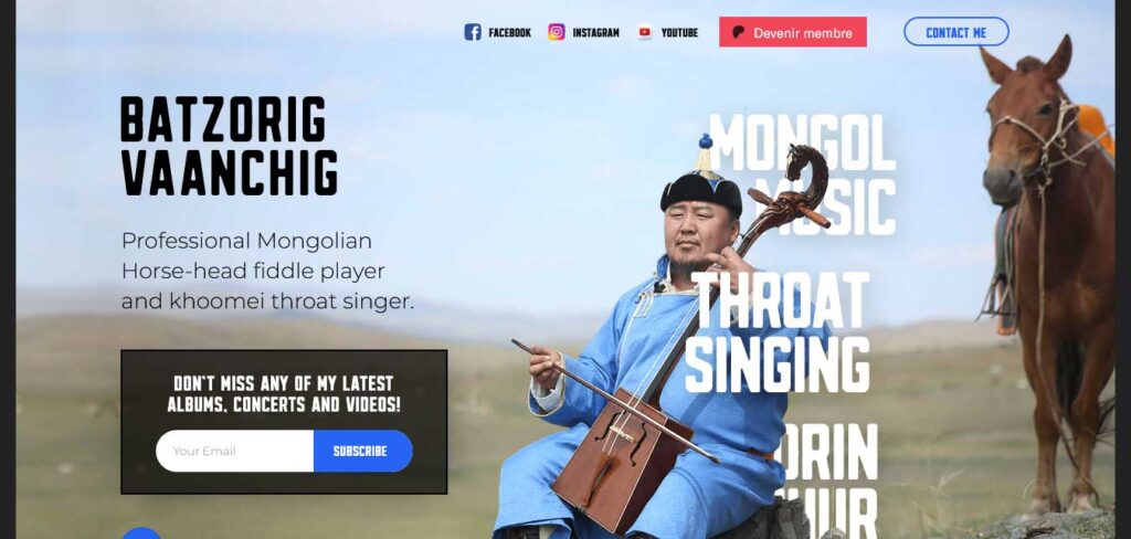
Batzorig Vaanchig musician’s website serves as a compelling example of the significance of exposure and an artist’s journey, particularly when the artist practices niche arts rooted in a specific culture and operates in a less mainstream context.
The website is neatly laid out, offering visitors easy access to key elements. At the top of the page, social media buttons provide a direct link to the artist’s online presence, ensuring that fans and visitors can connect easily. A Patreon link invites fans to support the artist, and a “Contact Me” call-to-action (CTA) offers a convenient way for visitors to get in touch.
The website features striking photos of the artist in gorgeous attire, showcasing the rich and vibrant aesthetics of the culture and arts they represent.
One of the noteworthy elements of the site is the historical timeline that chronicles the artist’s journey in an engaging and interesting way.
Benjamin Righetti
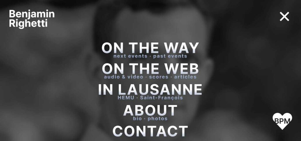
Benjamin Righetti’s musician website takes inspiration from the Swiss style of design, characterized by the use of Helvetica typography and a disciplined approach to graphic development.
The website’s design employs a smooth and dynamic narrative that enhances the user experience. The layout is organized to facilitate easy reading, and the text elements seem to dance in response to the scrolling, adding a creative and engaging dimension to the site.
From the very beginning of the user’s journey, the website incorporates surprise features that interrupt the narrative and keep users engaged. These surprises maintain a sense of novelty and anticipation, encouraging visitors to explore the site further.
Gentil Musician Website
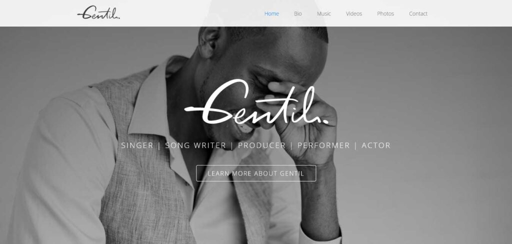
Gentil’s musician website takes a candid and personal approach, effectively conveying his happiness, passion, and enthusiasm for his work through a series of photographs that depict these emotions.
This musician website design maintains consistency while showcasing various elements, including audio and video files.
The font choice, although initially appearing light, remains completely legible, contributing to a clean and professional look. The background of the website is thoughtfully utilized, featuring watermark-style photos of the musician.
Im Really A T-Rex
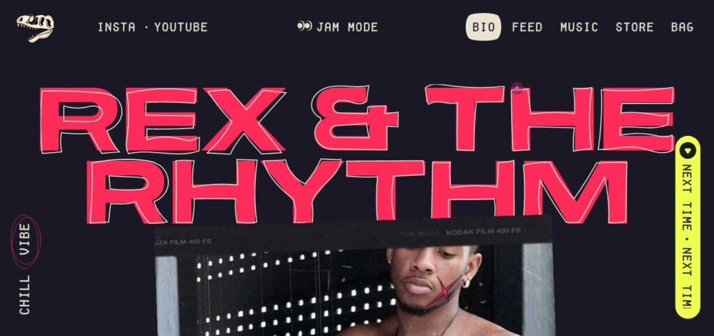
This musician’s website employs a distinct and on-brand design approach that captures the artist’s style and personality.
The website opens with a striking image of the artist, and the choice to go shirtless aligns with the overall tone of the site. The typography and dark color scheme contribute to the site’s edgy and distinctive aesthetic.
Below the succinct introduction, a clickable banner featuring a dino skull provides an interactive element for visitors. The “New Drop! Listen Here!” call-to-action (CTA) is animated, crawling from right to left on the screen, adding an engaging touch to the user experience.
Furthermore, the website incorporates custom elements, including a unique cursor, adding to the overall personalization and branding of the site.
Kenji Edo
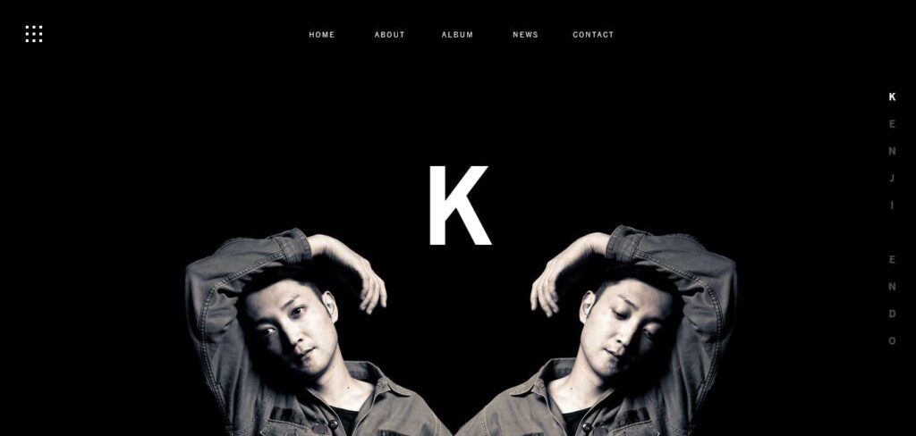
Kenji Endo’s musician website employs a striking contrast between black and white colors to emphasize various elements, creating a visually compelling and impactful design.
The design effectively uses this contrast to draw attention to the message, album covers, and text, ensuring that these elements stand out prominently.
Furthermore, the website provides convenient links to SoundCloud, other music sites, and social media, making it easy for visitors to access Kenji Endo’s music and connect with him on various platforms.
The menu is also a unique and distinctive feature of the website, opting for a cube design demarcated into nine parts instead of the traditional three-line menu.
Mo
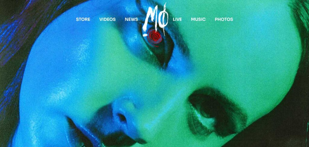
MØ’s musician website stands out for its sleek and buttery-smooth transitions that enhance the user experience as visitors navigate through the site.
This musician website design features seamless transitions as users move from the homepage’s main picture of the musician to other sections like her appearances and schedule. These transitions are executed so seamlessly that they create a fluid and immersive browsing experience. The transitions effectively hide the fact that you are moving from the top of the page to the bottom, maintaining the user’s engagement and flow.
Olly Murs
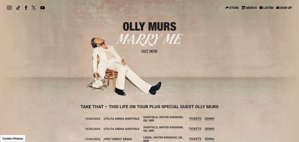
Olly Murs’ website follows a simple yet functional design, providing easy access to essential features and information for fans.
At the top of the website, visitors can find quick links to the newsletter, official store, social media platforms, and music streaming links.
The website’s color scheme appears to be deliberately chosen to create a striking contrast with elements like Olly Murs’ clothing, font colors, and differently colored sections of the site.
For fans interested in tour dates, the website provides a dedicated section that displays upcoming tour dates, ensuring that visitors are informed about live events. Additionally, there’s an option to sign up for a newsletter, allowing fans to stay updated with the latest news and announcements directly from the artist.
Sivert Hoyem
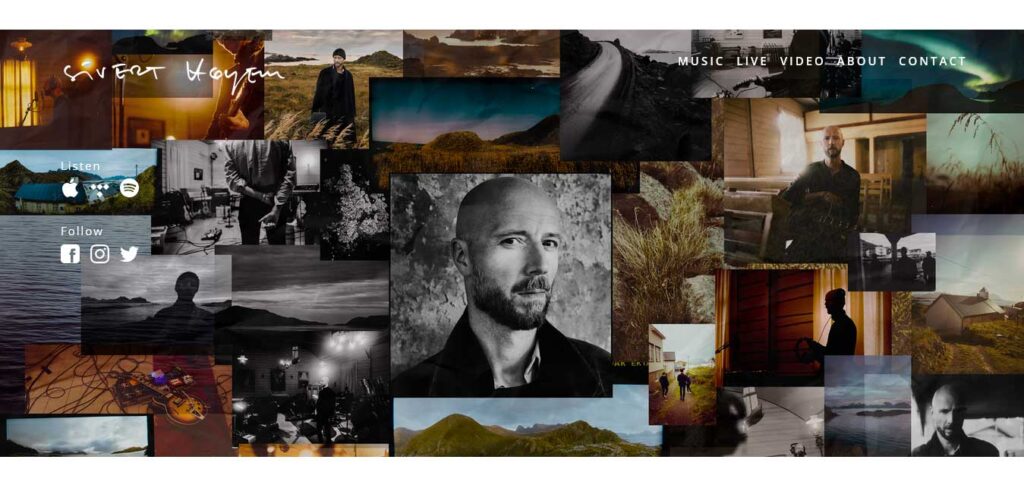
Sivert Høyem’s website captures the distinct style and persona of the artist, providing visitors with a unique and engaging experience.
The website opens with an impromptu-looking photo of Sivert Høyem, which aligns with his distinct style and adds an element of spontaneity. The image, cut off abruptly halfway down his torso, serves as an attention-grabber, drawing visitors into the site.
Below the photo, links to all the platforms where visitors can find his music are conveniently placed, making it easy for fans to access his work.
The organization of the albums section is straightforward and user-friendly. Each album is clearly labeled with its name and the year of release, and it is accompanied by a thumbnail, providing visitors with a visual reference.
What are the Key Components of a Musician Website?
Recognizing the fundamental components that underpin an impactful musician’s website is essential for cultivating a robust and enduring connection with fans and followers. Here are the key elements that a musician’s website should encompass:
- About Page: This section provides visitors with their initial introduction to the musician, offering a glimpse into their identity and journey.
- Music: Ensuring easy access to the artist’s music via popular streaming services like Spotify, SoundCloud, or iTunes directly through the website is paramount.
- Photographs: High-quality images sourced from live performances or professional photoshoots are pivotal, as they play a crucial role in leaving a positive and lasting impression.
- Social Media: Leveraging the power of social media is crucial for engaging with your community of fans and promoters. It’s equally vital to integrate social media links and widgets into your website for seamless access.
- Contact Page: Inclusion of a contact page enables visitors to reach out via email, fostering direct communication.
- Upcoming Events: Transparently showcasing details about upcoming performances, including dates and venues, keeps fans informed and excited.
- Merchandise: Establishing a merchandise store on the musician website provides fans with the opportunity to purchase items that not only serve as memorabilia but also function as effective promotional tools for the musician’s brand.
THE FOLLOWING AFTER THIS AD
Conclusion
An effective musician website acts as a vital link between artists and their audience, nurturing a powerful and enduring bond with fans and followers.
Through its seamless integration of music, visuals, and direct communication, a well-crafted website enhances an artist’s visibility and fosters meaningful connections with their audience.
For those looking to establish their online presence effortlessly, leveraging WordPress Themes specifically tailored for musicians can be a game-changer, streamlining the process of creating a captivating and functional musician website.
