Table of Content
Divi, the most popular WordPress theme, with almost 1,000,000 downloads.
It includes the following features :
Embarking on the quest for inspiration for your business or service website!
Before immersing ourselves in a showcase of 30 exceptional services websites, let’s first unravel the nuanced elements that underpin the credibility of a service site.
From the delicate balance of minimalism, creativity, and originality to exploring diverse sectors like business consulting, plumbing, travel agencies, digital services, dentistry, psychology, authorship, and construction, this curated compilation promises not just variety but also insights into what makes a service website truly stand out.
Key Ingredients for Amazing Service Website
THE FOLLOWING AFTER THIS AD
For service-oriented websites, trust serves as the cornerstone upon which meaningful customer relationships are established.
The initial encounter between a business and its prospective customers often transpires through a meticulously designed service website. To leave a lasting impression and guarantee a smooth user experience, specific fundamental components become imperative for crafting an exceptional service website.
Here are key elements that collectively contribute to the credibility of a service website:
- Professional Design and User-Friendly Interface: A credible service website reflects professionalism through its design and layout. A clean, visually appealing interface instills confidence in visitors. Simultaneously, a user-friendly design ensures easy navigation, helping users find the information they need effortlessly.
- Clear and Transparent Information: Credible services websites provide clear and comprehensive information about their services, pricing, and policies. Transparency builds trust, and users are more likely to engage with a service provider who openly communicates what they offer and how they operate.
- Contact Information and Support Channels: A credible service website prominently displays contact information, including a physical address, phone number, and email. Offering multiple support channels, such as live chat or a customer service hotline, reinforces the commitment to assisting customers and resolving queries promptly.
- Client Testimonials and Case Studies: Genuine client testimonials and case studies act as social proof of the service provider’s competence. Publishing real-world success stories establishes trust and credibility by showcasing the positive experiences of previous clients.
- Authoritative Content and Blog: Establishing expertise in the industry is crucial for credibility. Services websites can achieve this by regularly publishing authoritative content, industry insights, and helpful blog posts. This not only showcases knowledge but also positions the website as a valuable resource.
- Responsive and Mobile-Friendly Design: Given the growing prevalence of mobile devices, it is essential to prioritize the responsiveness of your website. Guarantee a smooth and consistent user experience across diverse screen sizes and devices. Adopting a mobile-friendly design not only enhances user satisfaction but also has a positive effect on your website’s search engine rankings.
All these elements enhance a service website credibility, fostering trust among visitors and potential clients. In the digital landscape, credibility is a valuable currency that can set a service provider apart in a competitive market. If you don’t have a website and are looking to create one for your service or business, consider using a theme from this small business WordPress themes collection or this business WordPress themes collection.
Let’s now dive into the diverse and exemplary landscape of service website examples.
Top Services Websites Examples
THE FOLLOWING AFTER THIS AD
Alice Lee – Designer Website
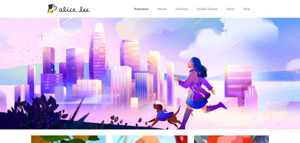
Alice Lee’s design portfolio website is a vibrant and engaging online presence that showcases her skills and creativity.
The website is flooded with colors, and the landing page features a collection of illustrations and mural art. The use of vibrant colors and captivating visuals creates an immersive and visually appealing experience for visitors, allowing them to explore Alice Lee’s design work in an interactive and dynamic way.
Ames Counselling and Psychological Services
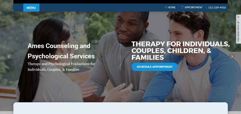
The website for Ames Counseling and Psychological Services adopts a single-page format, efficiently organizing a wealth of information.
A left sidebar serves as a central hub for navigation, ensuring easy access to various sections. Each service page maintains a consistent design, featuring a common card layout at the bottom.
Andreas Dittes – Business Consultant´s Website
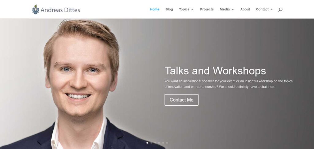
Andreas Dittes, the business consultant, exudes a cool and inspiring vibe on his website, incorporating unique font styles and a comprehensive image slider featuring a transparent call-to-action (CTA).
The landing page is enriched with a testimonial area, emphasizing client feedback and building credibility for the business consulting services offered.
Bazter – Digital Agency Website
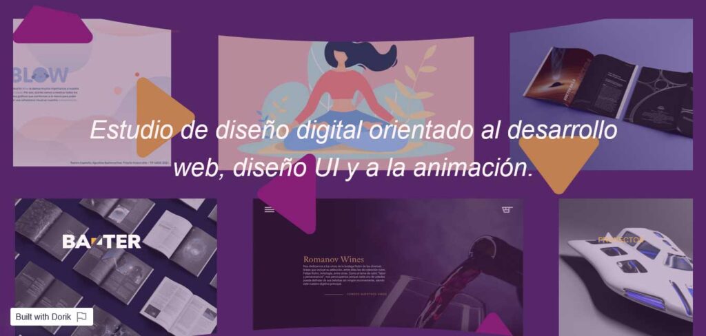
Bazter presents a catchy and attractive website that seamlessly blends color and design to create a vibrant online presence.
This service website’s outlook exudes creativity and captivates visitors with a visually engaging display of a couple of its standout projects right on the front page.
Beyond its appealing aesthetics, Bazter’s layout gains richness from its seamless functionality. Noteworthy features, such as the text-reveals design on the ‘about us’ section and the smooth animation transitions between sections, elevate the overall user experience.
brand.new – Digital Marketing Agency Website
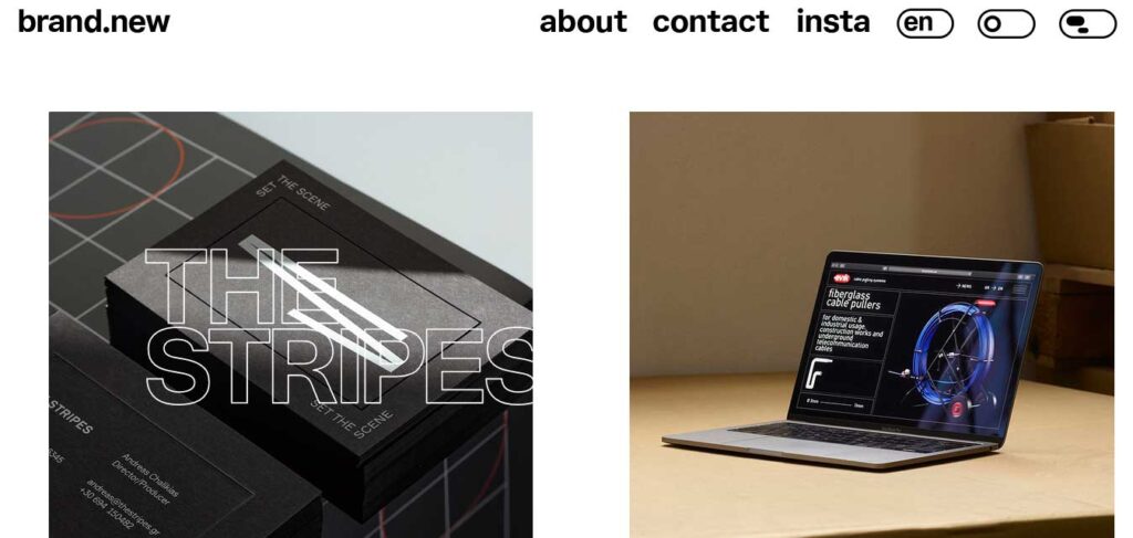
The brand.new website design showcases a modern approach, featuring a translucent navigation bar complemented by a white and black color scheme.
The use of diverse font styles adds depth to the overall aesthetics. Notably, dynamic animations elevate the user experience, with sections floating upon interaction.
Invisible titles and subtitles become visible and responsive to the user’s mouse pointer, enhancing engagement throughout the website.
Chegg – Teacher Website
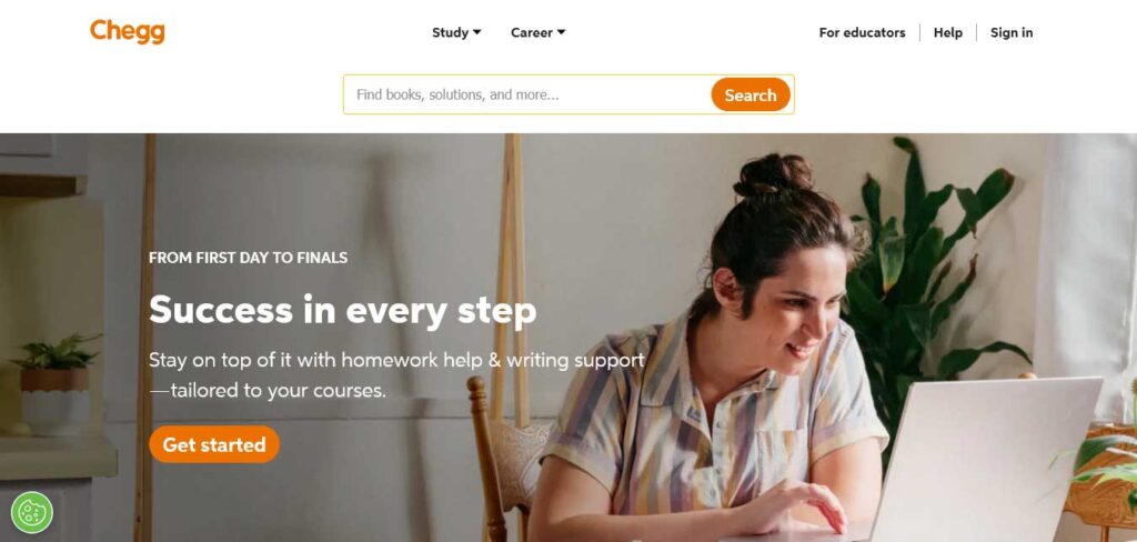
Chegg is an educational platform that focuses on providing affordable and accessible learning solutions using technology.
The company utilizes advanced technology to help students enhance their learning experience while keeping costs and time investment to a minimum.
Chegg’s services include textbook rentals, study guides, homework help, and tutoring, offering a comprehensive set of tools to support students in their academic journey.
Chris Boyer – Digital Strategy Consultant Website
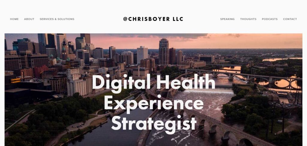
Chris Boyer’s consultant service website demonstrates an effective balance between content and visual appeal.
Despite featuring a substantial amount of text between two large parallax images, the website provides a positive user experience.
The navigation bar facilitates easy access to Chris Boyer’s services, along with links to other essential information and a dedicated contact page.
Costello Construction – Construction Service Website
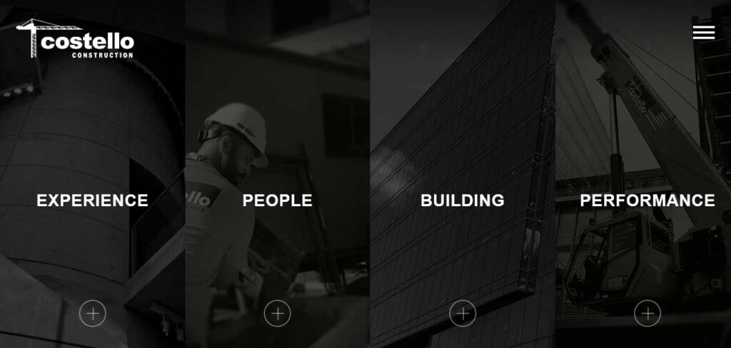
The Costello Construction service website example serves as a practical and informative hub, presenting all the essential information needed to win over potential clients.
In a single, well-organized page, they showcase details about their team, completed projects, satisfied customers, and performance metrics, offering a comprehensive overview of their expertise and capabilities.
Dntl BAR – Dentist Service Website
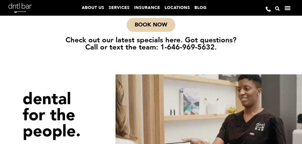
Dntl Bar’s website boasts a bold and clean design that immediately catches the eye.
The landing page features a high-quality video, creating a welcoming atmosphere that reflects their friendliness towards patients.
The intelligent design structure is evident in the thoughtful orientation of each section’s items, creating a seamless flow and an engaging user experience.
E.liza photography – Photography Website
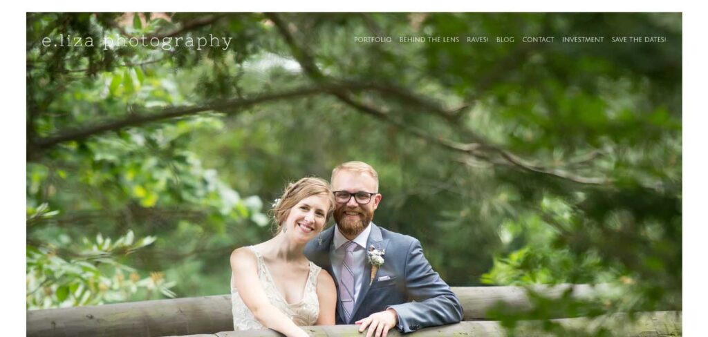
E.liza Photography’s website begins with a captivating display of their skills, featuring a high-resolution and precise image that immediately captures the viewer’s attention.
The strategic use of a stunning visual ensures that visitors seeking a skilled photographer are left with a positive and lasting impression right from the start.
FONDA LEE – Author Website
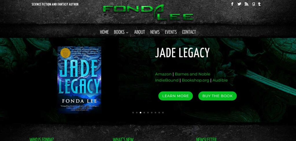
Fonda Lee’s author website is designed with a compelling theme, featuring an image slider showcasing the cover images of her books.
The strategic use of visuals in the first section creates an engaging and immersive experience for visitors.
Additionally, the clear and uncluttered footer section provides easy access to Fonda Lee’s social media profiles, allowing followers to stay connected with her and her work.
Gretel – Digital Marketing Agency Website
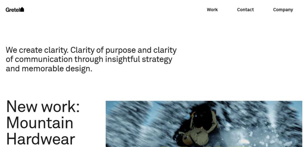
Gretel’s website takes a unique approach by starting with a brief explanation of their services before showcasing projects. This service website design then presents some of their projects in an animated form, adding an engaging and dynamic element to the user experience.
Harper Construction – Construction’s Service Website
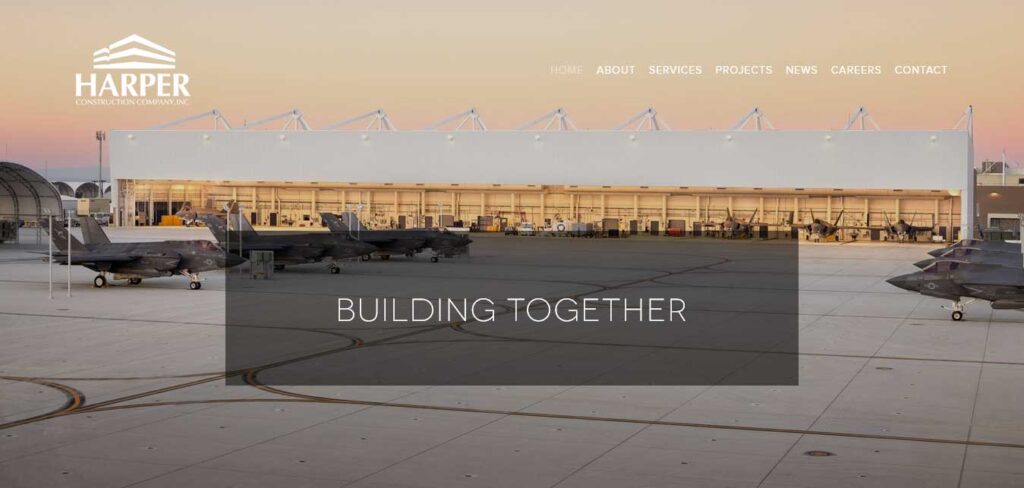
Harper Construction’s service website stands out as an excellent example of how a construction business can establish a strong online presence with a simple yet effective design.
The parallax image background, coupled with a transparent header, creates an inviting and welcoming atmosphere.
The inclusion of two snippets provides insights into the company’s history and services, complemented by a portfolio showcasing some of their completed works.
HomeLight – Real Estate Website
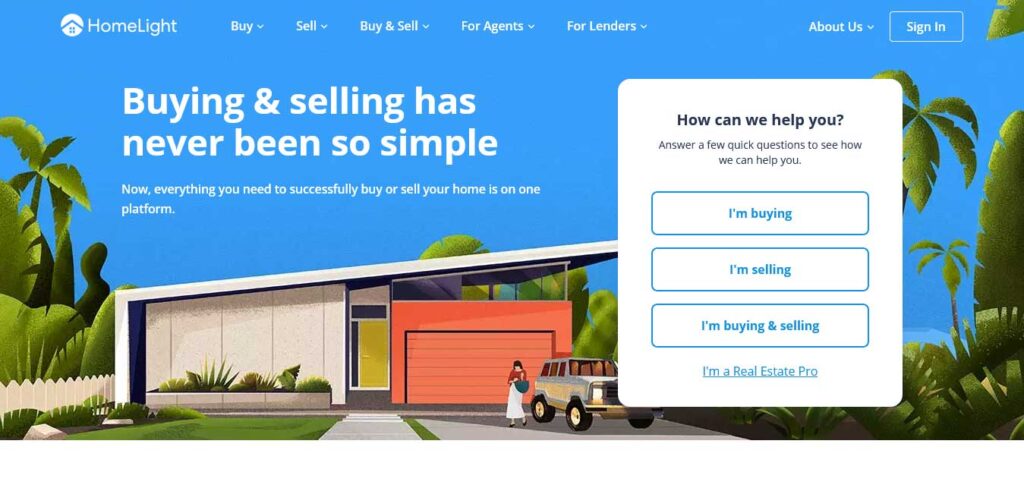
HomeLight’s real estate business website is designed to assist visitors in finding their services in the simplest and most accessible form.
The website maintains a calm and relaxing theme with an incredible background image. In the very first section, a single form increases user engagement, and the inclusion of maps helps customers find the perfect real estate agent in their area.
Jeff Miller, Ph.D. – Psychologist and Healthcare Provider´s Website
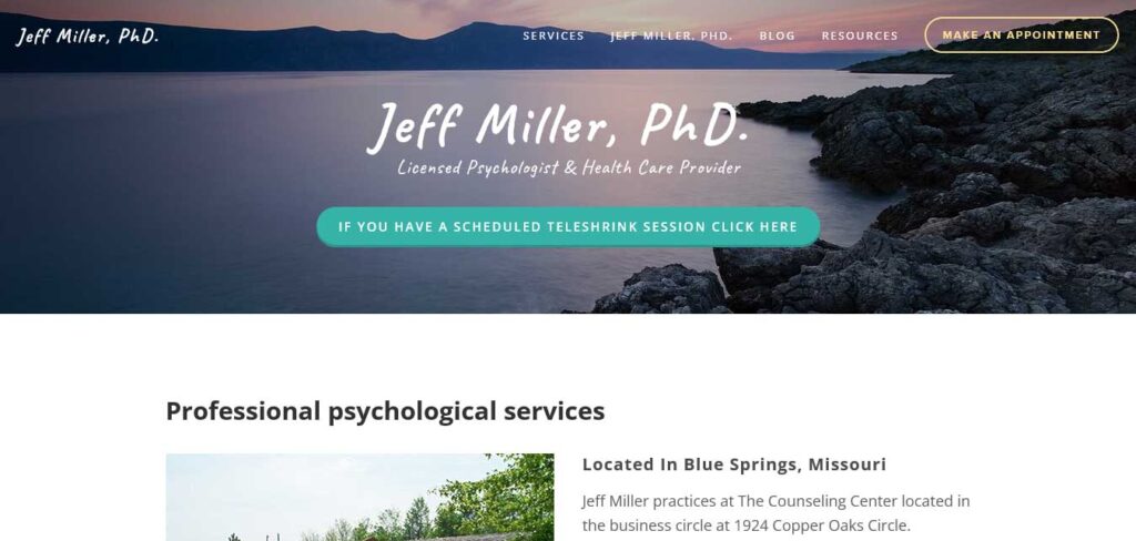
Jeff Miller, Ph.D.’s website is a testament to the harmonious blend of expertise and simplicity.
The buttons, adorned with a solid turquoise color, add a touch of vibrancy to the website. The stylish italic font used for the title enhances the overall visual appeal, creating a sophisticated and welcoming atmosphere.
Navigating to the service page, visitors are greeted with a well-organized presentation of services.
JWL – Accounting & Business Services Website
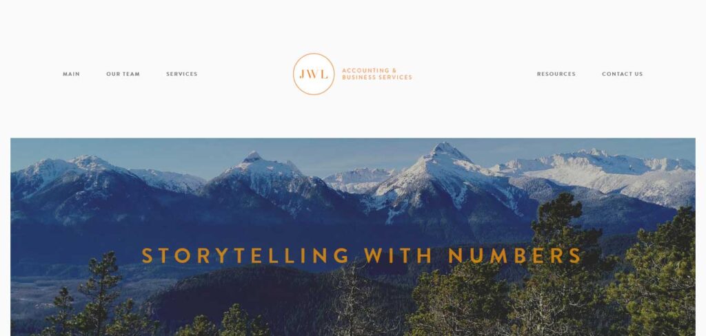
JWL Accounting’s website adopts a simple and powerful design with a clean header section. It features a large parallax image with a concise three-word title, creatively explaining their services.
The site includes dedicated sections for About and Services, providing essential information. Additionally, the integration of Google Maps helps showcase the location of their business.
Madrid & Beyond – Travel Agency Website
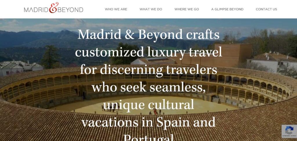
Madrid & Beyond invites you to embark on a journey through their captivating service website, starting with a warm and inviting message that transcends traditional brevity.
The carefully crafted words set the tone for an immersive experience, enticing visitors to explore the wonders that Madrid & Beyond has to offer.
The landing page is adorned with three transparent call-to-action buttons, strategically placed to guide visitors seamlessly towards their next adventure. The navigation bar, anchored with precision, enhances the organization of the website, allowing for easy access to sub-services and landing page sections.
Maine Dentistry – Dentist Service Website
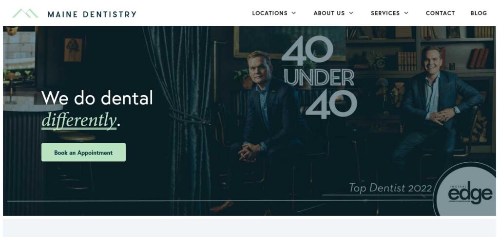
The Maine Dentistry website opens with a captivating hero image, claiming its space and attention at the top half of the screen.
Anchored by a functional navigation bar, the website seamlessly guides visitors through its enchanting world.
As you scroll down, the background unfolds in a magical symphony of fern colors, creating a unique and soothing atmosphere.
Marylebone Square – Real Estate Website
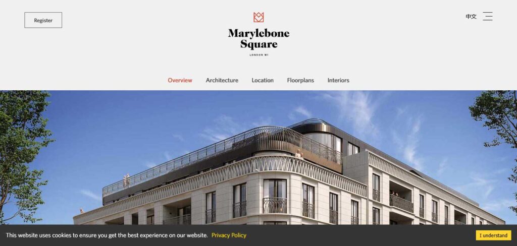
Marylebone Square’s real estate service website example showcases a thoughtful design that caters to a diverse audience.
By incorporating text, video, and illustrations, the website offers visitors a varied and engaging experience.
The content on the website emphasizes the significant advantages of Marylebone Square’s business plot, including its location, architecture, and interiors.
MISSIO – Musician’s Website
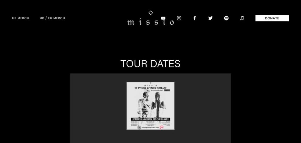
MISSIO’s musician website stands out with its fully-functional design, featuring a rocking vibe in the background imagery and font style.
The website is linked to their business site, providing a seamless experience for visitors. The anchored links on the logo and navigation bar icons enhance functionality, and strategically placed CTAs encourage users to take action for various purposes.
MyClean – Cleaning Service Website
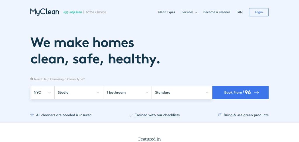
MyClean revolutionizes the user experience with a distinctive and unique approach to pricing.
At the forefront of the header section, a customized pricing card steals the spotlight, allowing users to seamlessly choose services tailored to their specific needs.
The user-friendly design breaks down the service stages, providing a clear and structured overview of how MyClean delivers its exceptional services.
MY MATH TUITION – Webinar Teaching Website

The MY MATH TUITION website adopts an appealing design with a range of graphics and animations, contributing to a polished and visually pleasing appearance.
The use of a light color scheme enhances readability and maintains a harmonious balance between the text and background elements.
Narania Holidays Travels India Pvt Ltd
Made With Google My Business
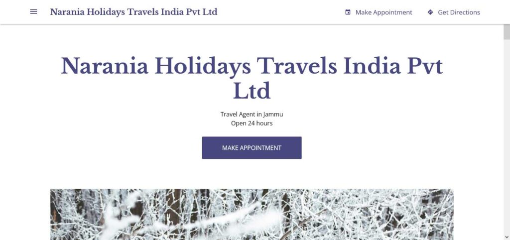
Narania Holidays Travels India Pvt Ltd invites you to explore its website with a captivating magazine-style layout, where every element is thoughtfully arranged for an engaging experience.
The navigation bar and sidebar serve as key components, strategically prioritizing and categorizing various items.
This service website design exudes a sense of sophistication, mirroring the curated pages of a magazine. Each section is carefully placed to provide visitors with easy access to the information they seek.
Nautilus Plumbing – Plumbing Service Website
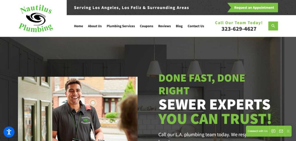
Nautilus Plumbing showcases a vibrant and refreshing design palette, combining leaf green with crisp white for a stylish and clean aesthetic.
The use of a curvy font style adds a touch of modernity, while transparent buttons, headers, and footers with an opacity effect contribute to the overall sophistication.
The incorporation of social media icons seamlessly integrates the brand’s online presence. A unique touch is added with the placement of a distinctive sticky bar before the navigation bar on the first section, not only providing a singular design theme but also capturing visitors’ attention and encouraging them to book an appointment.
Peels of Skin – Skincare Service Website
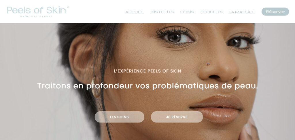
The Peels of Skin dynamic self-care website embraces a simple yet robust design, offering a wide array of functionalities.
The clean and effective navigation bar and header buttons guide visitors seamlessly to the service area, ensuring a user-friendly experience.
RyuCreative – Digital Marketing Agency Website
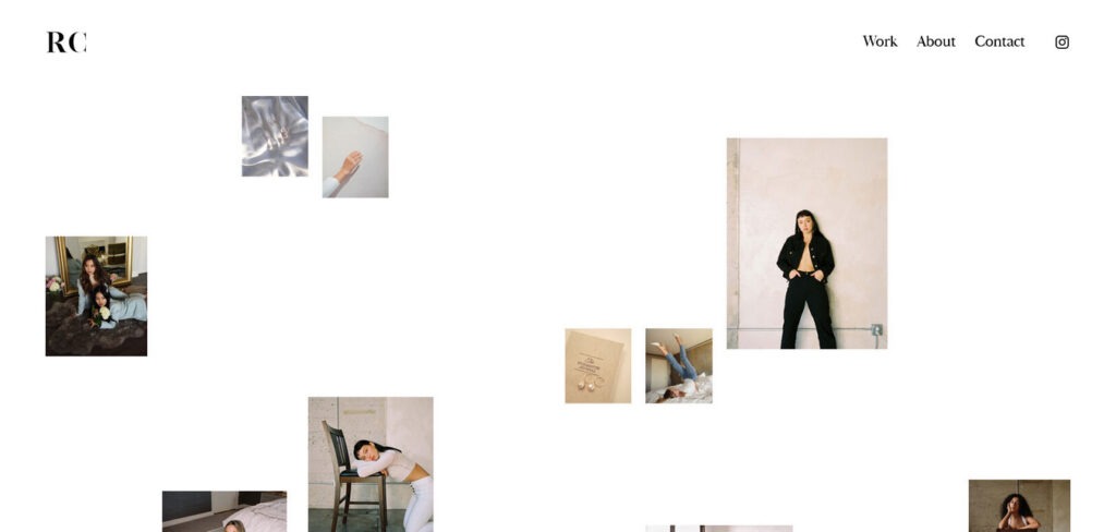
RyuCreative’s website is modern and minimalist, featuring a cool hero section with a collage of images.
The website has a simple header, with the logo on the left and a three-part menu with an Instagram icon on the right.
In addition to a services section, RyuCreative opts for a clean Instagram feed instead of a traditional footer, providing a sleek and streamlined design for visitors.
Sanitary – Plumbing Service Website
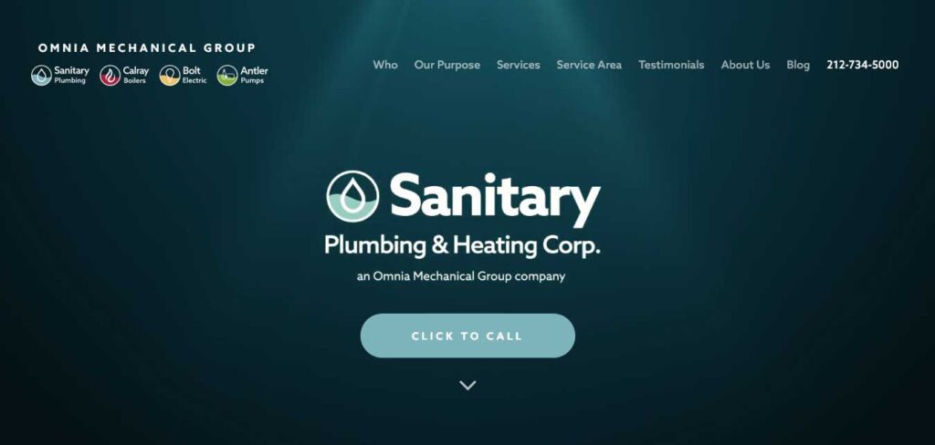
Sanitary stands out with a creative logo that encapsulates the essence of its offerings.
This plumbing service website’s custom-designated call-to-action button serves as a focal point, guiding visitors seamlessly to take desired actions. The carefully curated color scheme, featuring a dark slate blue, perfectly mirrors the services provided.
Every element of the website design reflects the commitment to excellence in plumbing services. The incorporation of water wave motifs adds a touch of fluidity and dynamism, underlining the expertise of Sanitary Plumbing Service.
SNYDER Construction Group – Construction Service Providing Website
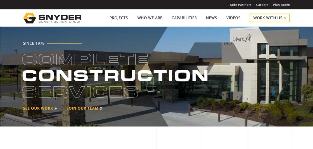
The SNYDER Construction Group’s website stands out with two prominent sections anchored in its hero section.
One is dedicated to showcasing their work for prospective clients, while the other serves as a hiring page, inviting potential employees to join their team.
The website’s vast white space and the harmonious color combination of black and yellow ochre create a visually appealing contrast between text and background.
Summerlin Vision – Optometrist Website
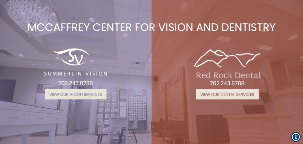
At Summerlin Vision, the first glance reveals more than just a website; it’s an immersive journey into their world. The video header offers a sneak peek inside their office, setting the tone for an influential and transparent online experience.
Key elements include the strategic placement of opening hours and office location, providing visitors with essential information.
The design goes beyond aesthetics, focusing on functionality with a sticky navigation bar that ensures seamless access to a wealth of services.
THE FOLLOWING AFTER THIS AD
Conclusion
Leveraging service website is a pivotal strategy for businesses aiming to attract and retain customers, ultimately leading to increased revenue and sustainable growth.
The article provides valuable examples that serve as inspiration for those contemplating the creation or enhancement of their service business website. To facilitate a seamless design process, consider exploring templates from either the small business WordPress themes collection or the business WordPress themes collection.
As you embark on this journey, let these illustrative examples motivate you to craft a platform that not only highlights your products but also leaves a lasting and positive impression on your customers.
