Table of Content
Divi, the most popular WordPress theme, with almost 1,000,000 downloads.
It includes the following features :
Take inspiration from these amazing copywriter website examples, and create your own website that grab the attention of your visitors.
A powerful online presence is the key to showcasing your exceptional portfolio, promoting your top-notch services, and crafting a compelling “About Me” page that truly resonates with your audience.
But it doesn’t stop there. You can establish trust and bolster your credibility by featuring glowing client testimonials that highlight your prowess in the field.
To make this process seamless and visually captivating, we recommend harnessing the power of WordPress. To save you time and effort, we’ve put together a handpicked selection of the best WordPress themes for copywriters and freelance writers.
Best Examples of Inspiring Copywriter Websites
THE FOLLOWING AFTER THIS AD
Content Bistro

Content Bistro’s website is designed to create an intimate and personalized experience, effectively engaging visitors through captivating images and stylish icons.
While the website maintains a clean and organized layout, it’s the thoughtful attention to detail that elevates the overall user experience, adding a touch of richness to the design.
The clever use of imagery and icons on the website enhances its visual appeal, making it feel warm and inviting. One standout feature of Content Bistro’s website is the use of a live chat/contact form widget in the bottom right corner.
This addition greatly improves customer service, providing a convenient and immediate way for visitors to connect with the copywriter, ensuring their needs and inquiries are met promptly.
Jennifer Locke

Jennifer Locke is one of the best copywriter websites examples we encountered during our search. It excels at crafting an engaging copywriter website that hooks visitors right from the start.
Her hero section stands out with a thought-provoking question, immediately drawing in the audience’s interest, and a well-placed call-to-action (CTA) button prompts immediate action.
A transparent sticky header enhances the user experience by keeping essential navigation options accessible as visitors scroll through the content. At the same time, the website’s footer offers a contact form and two additional CTA buttons, ensuring that important links and interaction options are within easy reach.
Jennifer’s website adopts a streamlined single-page layout, making every piece of information readily accessible, a testament to its user-friendly design and the effective communication of her copywriting services.
Alejandro Castro
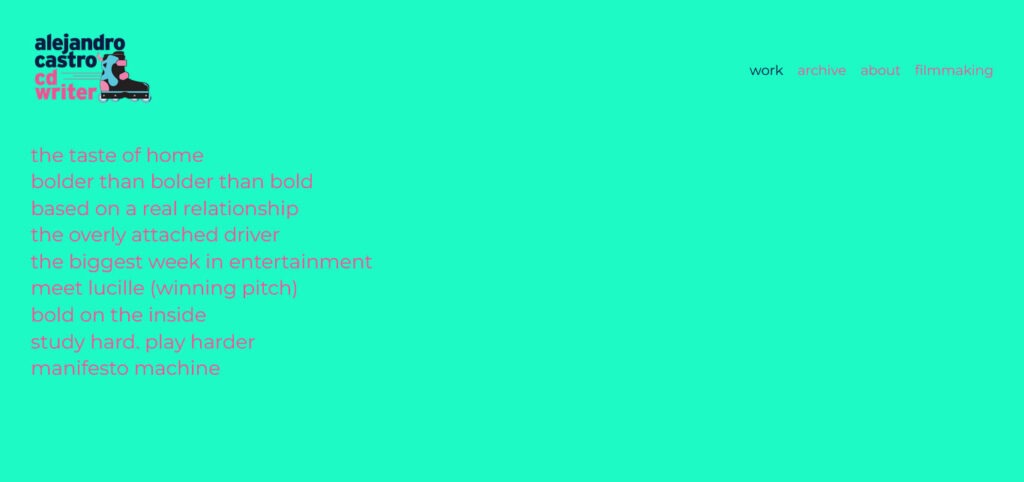
Alejandro Castro grabs your attention with its bold and vibrant background color, demanding your focus in a captivating and assertive manner.
This design choice adds a compelling and memorable dimension to the website’s visual identity. This copywriter website is a masterclass in creating an unconventional but highly engaging user experience. Its distinctive use of text and color combines to create a lasting impression that is both visually striking and memorable.
Brandon Van Buskirk
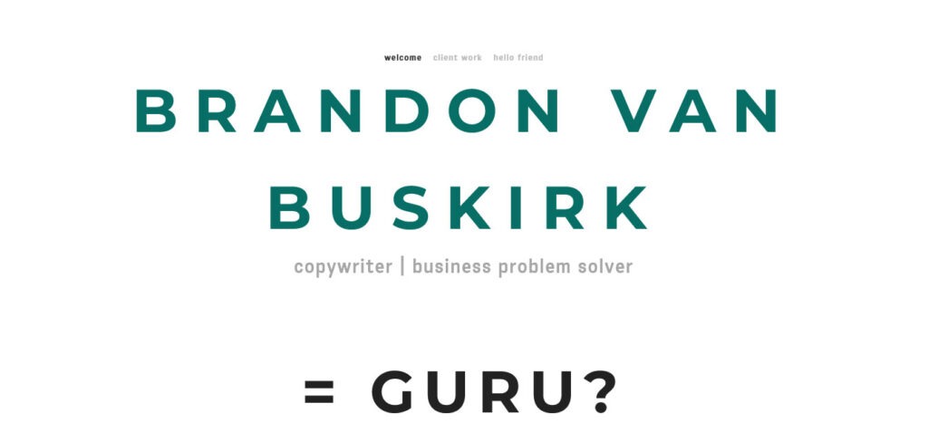
Brandon Van Buskirk’s homepage is a harmonious blend of simplicity and eye-catching elements.
What’s particularly noteworthy is the uniformity in design: both the header and the footer have the same background color as the base of the page.
This consistency creates a polished and well-organized look, contributing to the website’s overall sense of cohesiveness and professionalism.
Brooks Lockett

Brooks Lockett’s website boasts a dynamic and action-oriented hero section that immediately captures your attention with compelling text and a prominent call-to-action (CTA) button, inviting visitors to take the next step.
One of the standout features of Brooks Lockett’s website is the extensive collection of client testimonials. In addition to the testimonials, Brooks’ website skillfully presents his working process.
Copy Blogger
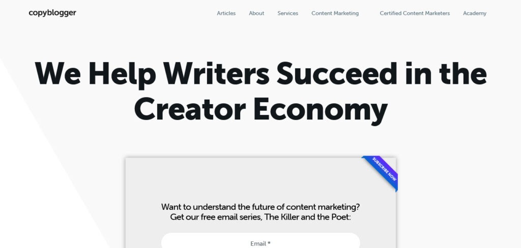
Copy Blogger’s website boasts a striking minimalist design, where content is the true star. The hero section, though text-heavy, is meticulously designed to convey its message effectively, with a sole opt-in form as the gateway to valuable free training.
Both the header and footer embrace a clean, uncluttered appearance that harmonizes seamlessly with the website’s core elements. The primary content is structured in a post grid layout with pagination, ensuring an organized and user-friendly browsing experience.
Just before reaching the footer, another opportunity for action presents itself with a strategically placed opt-in form. This second chance to engage and opt-in ensures that visitors have every opportunity to access the valuable resources on offer.
Emma Gannon
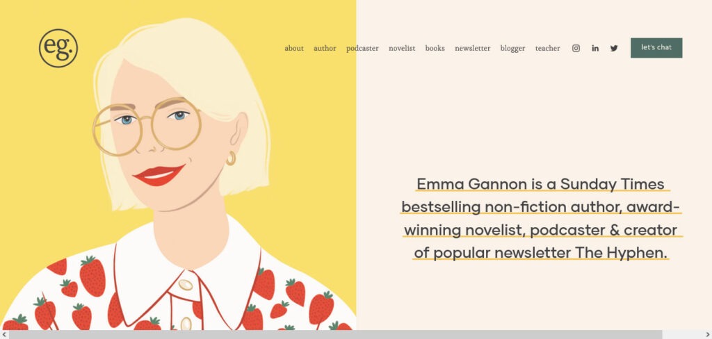
This copywriter website strikes a balance between being cool and professional, a rare feat that piques your curiosity and leaves you eager to explore every corner.
The website’s captivating design draws you in, while the professional content assures you that you’re in the hands of an expert.
Emma Gannon’s website is a captivating blend of creativity and professionalism, making it a refreshing and inviting platform that seamlessly combines aesthetics with informative and engaging content.
EST Creative
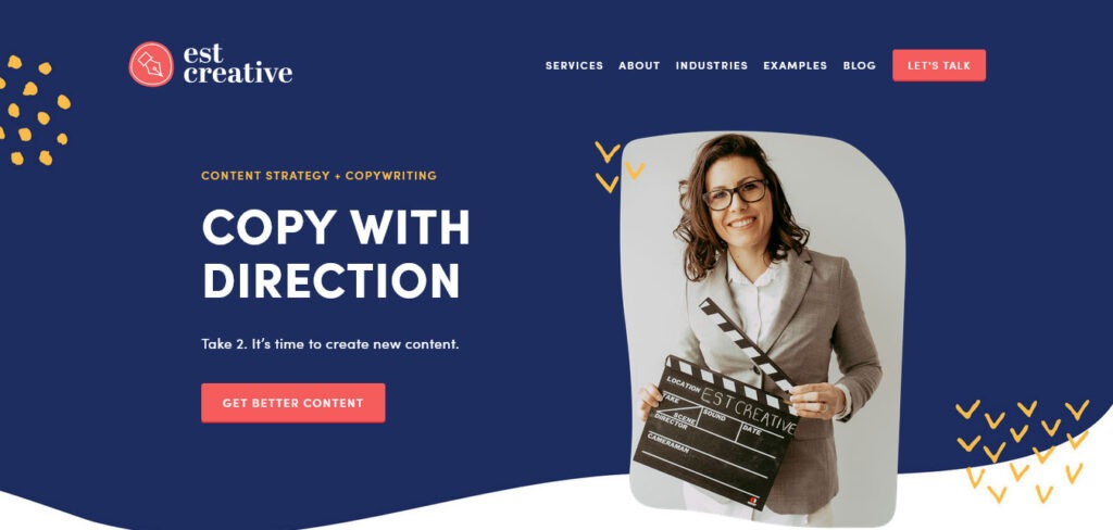
EST Creative’s website stands as a shining example of a contemporary and highly professional business platform. It opens with a clean and captivating hero section that immediately captures your attention.
As you navigate through the website, you’ll discover a thoughtfully designed grid layout dedicated to client testimonials. These testimonials add a layer of trust and credibility to EST Creative’s services, offering insight into the positive experiences of previous clients.
This copywriter website’s footer is a treasure trove of valuable content, where visitors can subscribe to a newsletter, staying connected and updated on the latest offerings and insights from EST Creative.
Gari Cruze
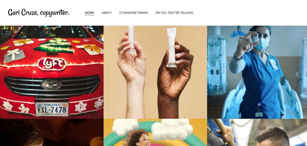
Gari Cruze’s portfolio website is a wellspring of inspiration, elegantly presented with a grid layout that beckons exploration.
To ensure smooth navigation, a straightforward header remains fixed at the top of the page, granting easy access to different sections, including the top bar notification, which provides essential updates or information.
This cohesive design not only enhances the user experience but also adds to the overall appeal of the site.
Gio Marcus
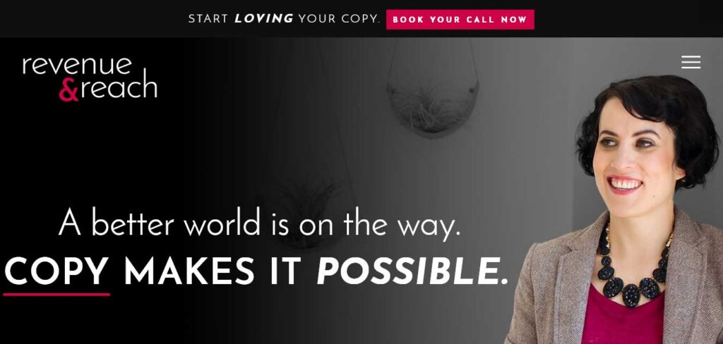
Gio Marcus’s website immediately seizes your attention with a visually compelling above-the-fold section. This high-impact area is replete with multiple elements that combine seamlessly to create a dynamic and engaging user experience.
At the very top, a notification bar serves as a noteworthy attention-grabber, ensuring important messages are noticed. The presence of a hamburger menu icon, which, when clicked, reveals an overlayed navigation, offers smooth and intuitive browsing options.
In the center of it all, a striking main banner captures the essence of its services, leaving a powerful first impression.
One of the standout features of this copywriter website is her savvy use of email capture. Visitors are offered a free product in exchange for their email address, a strategy further optimized through the use of a popup, which efficiently builds her list of potential clients while delivering value to her audience.
THE FOLLOWING AFTER THIS AD
Grace Ventura
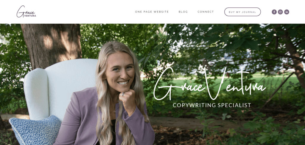
Grace Ventura’s website is a captivating fusion of compelling copywriting, storytelling prowess, and visually engaging content, all strategically combined to pique the interest of visitors.
Upon arrival, visitors are greeted with a top bar notification that delivers essential information, which can be easily closed for uninterrupted browsing.
The navigation bar is a model of effectiveness, featuring a call-to-action (CTA) button that prompts visitors to take action, as well as prominent social media icons for seamless connectivity.
Katie Lemon
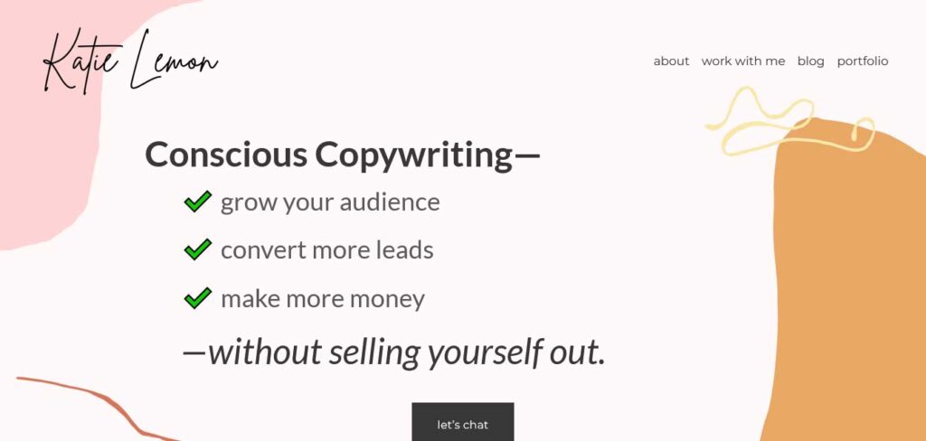
Katie Lemon’s copywriter website, while content-rich, combines a thoughtful selection of colors and distinctive backgrounds that add a charming and likable touch.
The hero section immediately captures your attention with a compelling title, informative text, and a strategically placed call-to-action (CTA) button for booking, ensuring that visitors are encouraged to take action from the get-go.
One distinctive feature of Katie’s website is her strategic approach to building an email list. In addition to her services, she promotes a free guide and workbook, enticing visitors to provide their email in exchange for these valuable resources.
Kelsey O’Halloran
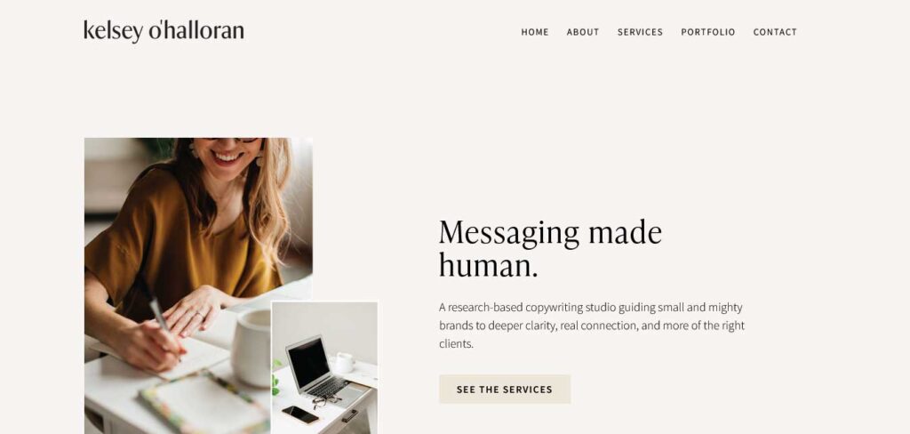
Kelsey O’Halloran’s personal website offers a truly immersive and personalized experience. The website’s design is centered around Kelsey herself, with striking images and captivating copy that instantly draw you in.
While the header may appear simple, it serves as the perfect gateway to the richness of content within. The footer, on the other hand, is a hub of activity.
It features prominent an extensive menu with relevant links, call-to-action buttons, an array of social media icons for easy connection, and even an engaging Instagram feed that keeps you updated on Kelsey’s visual journey.
Kristin Macintyre
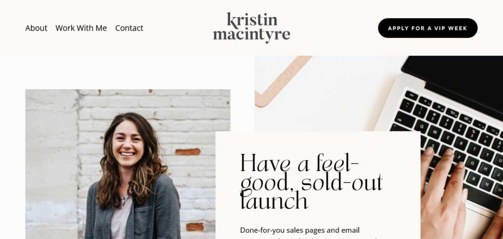
What truly sets Kristin Macintyre’s website apart is its innovative approach to user engagement. As you scroll through the website, content dynamically loads, creating a seamless and interactive experience that keeps visitors engaged and intrigued.
The website’s design is minimalist and elegant, with a clean and unobtrusive header that features a menu and a strategically placed call-to-action (CTA) button.
As you scroll down, the header gracefully disappears to provide an unobstructed view of the content. However, as you begin to scroll back to the top, the header reappears, offering easy navigation and access to the CTA button.
BigMouth Copy
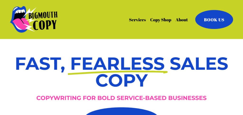
BigMouthCopy’s website is a visual delight, thanks to its vibrant and captivating color scheme that elevates the browsing experience to a whole new level. The color choices are not just visually appealing but also strategically chosen to enhance the overall aesthetic.
The hero section of the website makes an immediate and bold statement. Against a striking yellow background, it features a compelling call-to-action (CTA) button that practically leaps off the page, urging visitors to take action.
One standout feature of this copywriter website is the sliding text animation. This subtle yet thoughtful detail infuses a sense of liveliness into the page.
Meg Peery
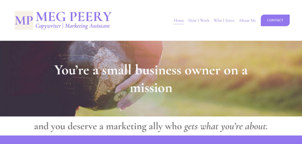
Meg Peery’s website boasts a full-width layout, featuring large images and well-composed text that creates a visually stunning and immersive experience for visitors.
This website employs a clever header that dynamically disappears as you scroll down, allowing the content to take center stage. Yet, as you start scrolling back towards the top, the header elegantly reappears, ensuring that navigation remains intuitive and accessible.
The website’s footer, while maintaining a simple and clean aesthetic, offers additional quick links, completing the user-friendly design and providing easy access to further content.
Shanley Cox
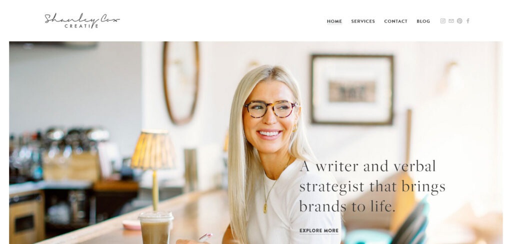
Shanley Cox’s website, dedicated to showcasing her skills as a copywriter, is a shining example of minimalist elegance infused with a touch of femininity and creative flair.
Navigating through this copywriter website is a delightful experience, thanks to a responsive navigation bar that boasts a subtle hover effect, gracefully highlighting the link under your cursor.
The homepage features a pristine client testimonial slider that exudes credibility and trustworthiness. Her impressive portfolio takes center stage, presenting a selection of her finest work, with each piece serving as a testament to her copywriting prowess.
From Scratch
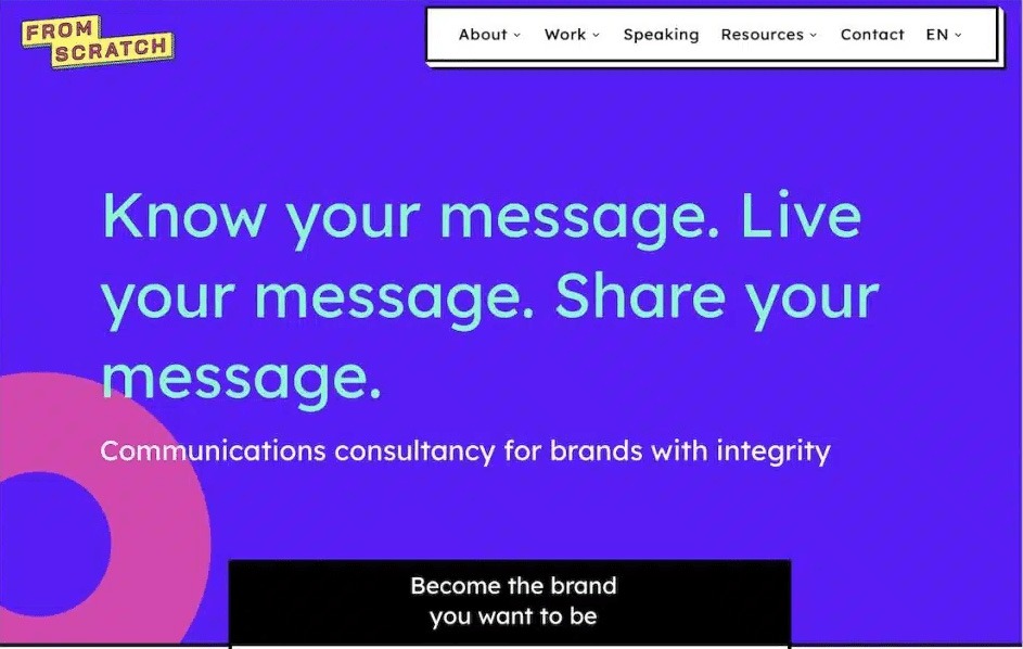
From Scratch stands as an exemplary copywriter website, a testament to the art of combining uniqueness with minimalist design. This approach ensures that all your attention is directed towards the rich content it offers.
The homepage, in particular, is a treasure trove of testimonials spanning various categories. These endorsements from diverse sources offer a comprehensive and compelling dose of social proof, underscoring the copywriter’s expertise and reliability.
Luciano Viterale
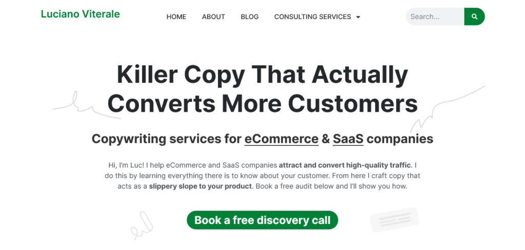
Luciano Viterale’s copywriter website is nothing short of epic, meticulously tailored to serve a specific niche—e-commerce and SaaS—and effectively communicates this specialization to every visitor. The clarity in its messaging ensures that visitors instantly recognize the expertise they are seeking.
At the heart of the page is a compelling and descriptive call-to-action (CTA) that leaves no room for ambiguity, guiding visitors on the precise action to take next.
One of the standout features of this landing page is a section that expertly draws visitors in by making a persuasive comparison between Luciano Viterale and other copywriters in the field. This contrast is not only insightful but also serves as a powerful tool for boosting conversions, as it underlines Luciano’s unique value proposition.
Furthermore, the landing page is adorned with social proof, including logos and testimonials that bolster Luciano’s credibility and showcase his successful collaborations with well-known brands and satisfied clients.
Apostrophe Copywriter
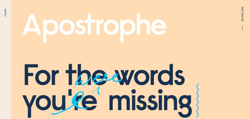
Apostrophe Copywriter’s website offers a visually pleasing experience, with background colors that are easy on the eye and create an inviting atmosphere.
Effective copywriting shines through the content, ensuring that the message is not only clear but also engaging. The combination of thoughtful design and skillful copywriting makes this website an excellent example of how form and function can work together harmoniously to provide an exceptional user experience.
Let’s see if this name is taken
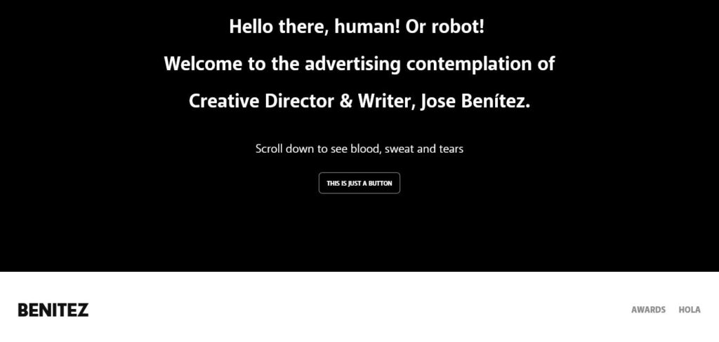
This copywriter website boasts a delightful color scheme, striking a perfect balance between simplicity and power. The carefully selected colors add vibrancy to the site without overwhelming it, and the overall design exudes a sense of approachable professionalism.
One of the highlights of the website is the use of fun and engaging copywriting that not only informs but also entertains visitors.
The content is a testament to the creative prowess of the copywriter, leaving a memorable and positive impression on anyone who visits.
Michelle Christina Larsen
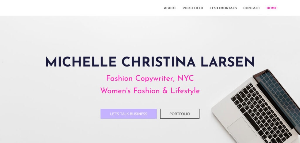
Michelle Christina Larsen’s website is a shining example of both organization and charm, making it one of the most delightful copywriter websites you’ll come across. With a meticulously structured menu and a simple yet endearing design, it offers visitors a seamless and enjoyable experience.
The website’s exceptional organization ensures that visitors can effortlessly explore the content. It’s designed with simplicity in mind, allowing for a clear and uncluttered browsing experience that highlights the value of Michelle’s work. The menu structure is intuitive and user-friendly, making it easy to access the information you seek.
Kylie De Boer
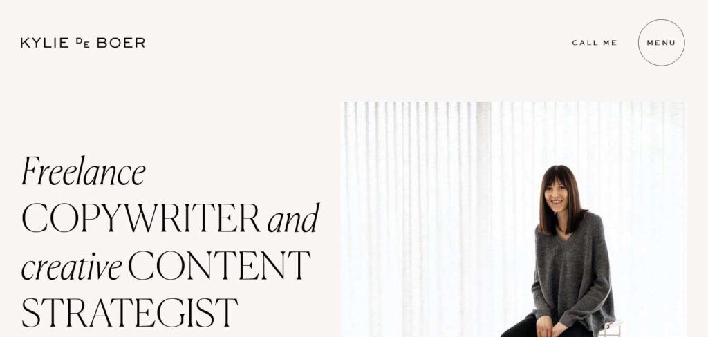
Kylie De Boer’s website is immediately captivating, thanks to her compelling opening message that grabs visitors’ interest from the start.
The website not only looks good but is also highly informative, providing comprehensive details about the services she offers. The clean and calming web design creates a sense of professionalism and invites visitors to explore further, confident in the credibility of the services on offer.
THE FOLLOWING AFTER THIS AD
Conclusion
The world of copywriting is as diverse and dynamic as the clients it serves. These exemplary copywriter websites demonstrate the art of crafting a compelling online presence, capturing your audience’s attention, and building trust through effective design and messaging.
It’s evident that these copywriters understand the importance of presenting their work in a visually captivating and user-friendly manner.
If you’re a copywriter looking to elevate your game and create a lasting impression, take inspiration from these outstanding examples websites and start building your own online masterpiece. These websites set a standard for showcasing your skills and engaging potential clients in a compelling and professional way.
