Table of Content
Are you currently exploring the web in search of a curated selection of top-notch informational websites, not just for their content but also for their captivating web design that can serve as a wellspring of inspiration?
In our compilation, we’ve gathered exemplary instances from diverse industries. These websites are presented in great detail, offering you a comprehensive view and sparking fresh creative ideas. The selection includes both one-page and multi-page websites, showcasing the expansive possibilities in web design.
It’s essential to note that you can effortlessly and swiftly create your own informational website using any of these amazing multipurpose WordPress themes.
As you peruse these information websites, they are not just for admiration but serve as practical references, offering you a clear idea of what your own website could potentially emulate.
9 Key Elements for Amazing Informational Website
STAY WITH US – REST OF THE POST AFTER THIS PRESENTATION
Divi, the most popular WordPress theme, with almost 1,000,000 downloads.
It includes the following features :
Creating an amazing information website requires careful consideration of various elements to ensure a seamless user experience and the effective delivery of content. Whether you’re building a blog, news portal, or educational platform, incorporating key elements is essential to engage your audience and establish credibility.
Here are some crucial components to consider for an outstanding information website:
- User-Friendly Navigation: Implement an intuitive and straightforward navigation menu to help users easily find the information they are looking for. Use clear and descriptive labels for menu items to guide visitors through different sections of your website. Consider incorporating a search bar for quick access to specific content.
- Responsive Design: Ensure your information website is optimized for various devices, including desktops, tablets, and smartphones. Responsive design enhances the user experience and improves accessibility, contributing to higher user satisfaction and retention.
- Compelling Visuals: Use high-quality images, graphics, and videos to enhance the visual appeal of your informational website. Incorporate visuals that complement your content and help convey information more effectively.
- Engaging Content: Create informative and engaging content that adds value to your audience. Use clear and concise language, breaking up text with headings, subheadings, and bullet points for better readability. Regularly update your content to keep it fresh and relevant.
- Credible Sources and Citations: Provide accurate and reliable information by citing credible sources. Include references, links, or footnotes to support your content and build trust with your audience.
- Social Media Integration: Integrate social media buttons to allow users to easily share your content on various platforms. Display social media feeds or follow buttons to encourage visitors to connect with your brand across different channels.
- Loading Speed Optimization: Optimize your information website’s loading speed to prevent users from bouncing due to slow performance. Compress images, leverage browser caching, and choose a reliable hosting provider to ensure swift page loading.
- Clear Calls to Action (CTAs): Include clear and strategically placed CTAs to guide users to take desired actions, such as subscribing to a newsletter, downloading resources, or exploring related content.
- Analytics and Monitoring: Implement analytics tools to track user behavior, understand your audience, and optimize your informational website based on data-driven insights. Regularly monitor website performance, fix broken links, and address any issues that may arise.
Taking into account these essential elements, you have the potential to develop an information website that not only draws in visitors but also offers them a rewarding and pleasant online journey.
To further simplify the process and enhance the visual appeal of your informational website, consider utilizing one of these multipurpose WordPress themes. These themes provide a user-friendly framework, responsive design, and customizable features, ensuring your website stands out with both functionality and aesthetics.
Top Informational Websites
THE FOLLOWING AFTER THIS AD
He Spoke Style
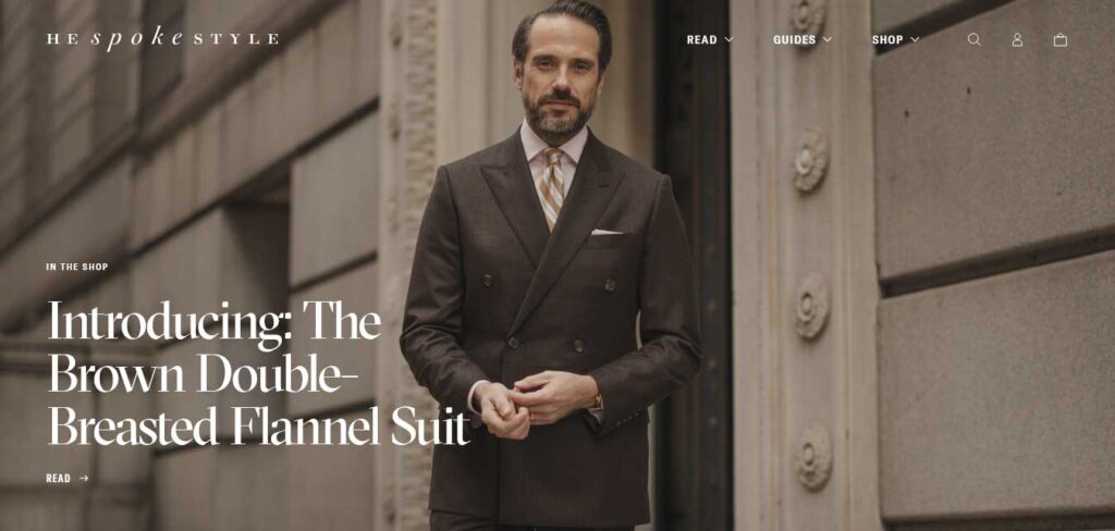
He Spoke Style opens with a top bar notification, user-dismissable with the ‘x’ button. Following is a logo and a navigation bar that contains all essential links, with only the navbar adhering to the top of the screen as users scroll.
The home page adopts a visual-centric approach, prioritizing images complemented by titles and occasional one-sentence excerpts. A minimalist footer wraps up the design, featuring additional business links.
This clean and focused layout ensures a streamlined user experience on He Spoke Style’s website.
HubSpot Blog
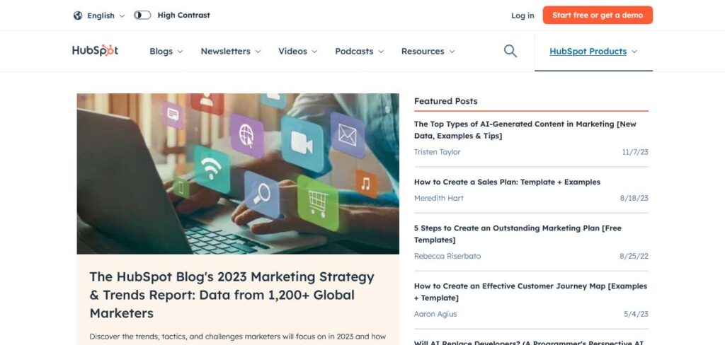
The HubSpot Blog seamlessly combines the richness of an online magazine with an organized, sectioned structure for swift information retrieval.
This informational website’s abundant content is neatly categorized, enabling users to find the right information quickly. The sticky header, featuring a mega menu and a search bar, ensures easy accessibility to all essential elements.
Notably, the email subscription form stands out for its user-friendly customization, allowing subscribers to choose the specific blog emails they want to receive—an incredibly handy feature for personalized content delivery.
Build In Public
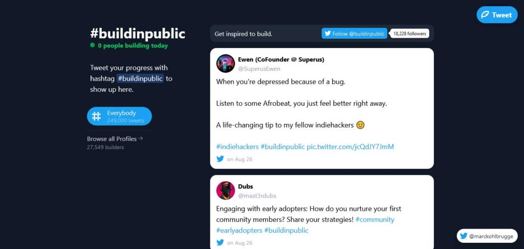
Build In Public presents an intriguing information website, essentially functioning as a Twitter feed centered around a specific hashtag, featuring an infinite scroll for seamless exploration.
The left sidebar adds a dynamic element with information on popular users, total tweets, and more. A strategically placed button in the top right corner simplifies the process of joining the hashtag with your tweet.
Additionally, a prominent call-to-action (CTA) at the top of the page ensures that users don’t miss out on any key information.
Cookie And Kate
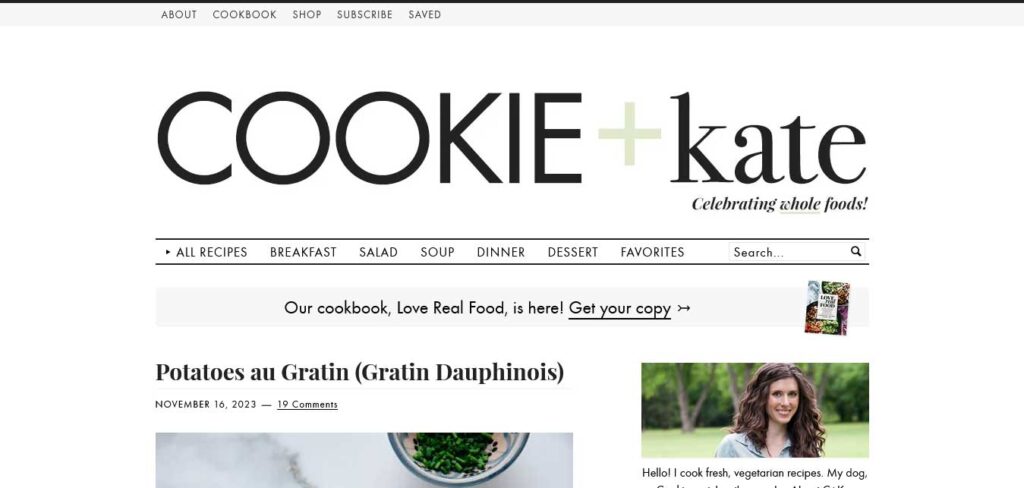
Cookie And Kate, a food and recipe blog, embraces a minimalist aesthetic in its design. The layout is thoughtfully structured, beginning with a top bar, followed by a logo, and then a multi-level drop-down menu equipped with a search bar.
What sets Cookie And Kate apart is the utilization of relatively long blog post excerpts, often featuring multiple images for a comprehensive visual experience.
This informational website design incorporates a sizeable sticky sidebar banner ad and another floating banner bar at the bottom of the screen, ensuring strategic placement for enhanced visibility and engagement.
Experience Map
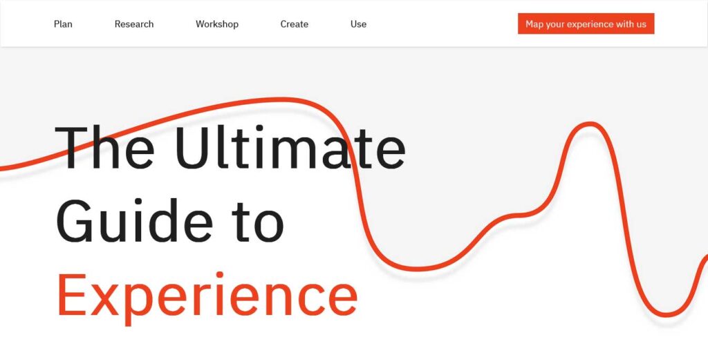
Experience Map unfolds as a comprehensive informational website with a light and clean design, opting for a title text at the beginning instead of a hero image, slider, or video.
The extensive content and single-page structure are navigated seamlessly with the help of a sticky navigation bar, facilitating quick jumps from one section to another.
Strategic design choices include a call-to-action (CTA) in the menu section, enhancing user engagement. Another CTA strategically placed just before the minimalist footer ensures a well-rounded invitation for interaction, making Experience Map a user-friendly and informative digital experience.
Help Scout
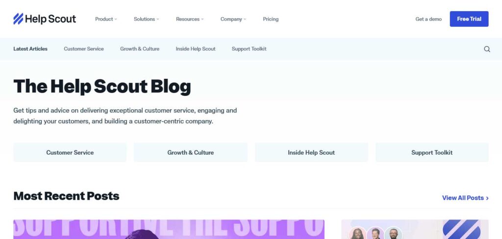
Help Scout’s information blog shines with its light and clean design, offering instant access to the most recent posts, editor’s picks, customer service insights, and more.
The content is seamlessly presented with titles and accompanying text featuring quick links. A floating header enhances user navigation, incorporating a mega menu that provides access to a wealth of other useful information, products, resources, and more.
Info Tech
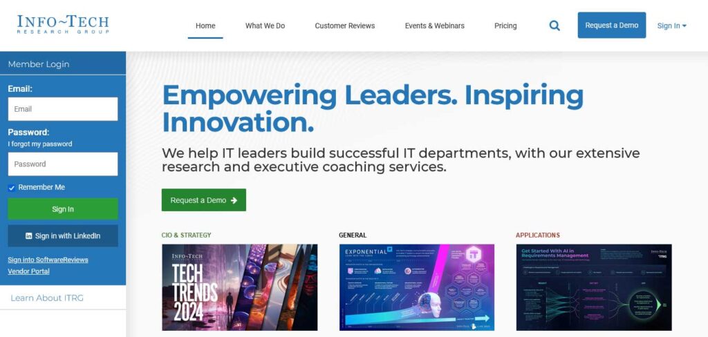
Info Tech’s website boasts a modern, professional, and clean design that incorporates image loading on scroll for a dynamic user experience.
Despite the abundance of content, the strategic use of white space ensures readability on both desktop and mobile devices. The hero section features a prominent call-to-action (CTA) button, enticing users to explore a trial that seamlessly opens a new page with a user-friendly form.
Notably, a more advanced subscription form is strategically placed at the bottom of the home page, equipped with a dropdown feature, allowing users to choose a topic relevant to their interests for a tailored subscription experience.
Open Subscription Platforms
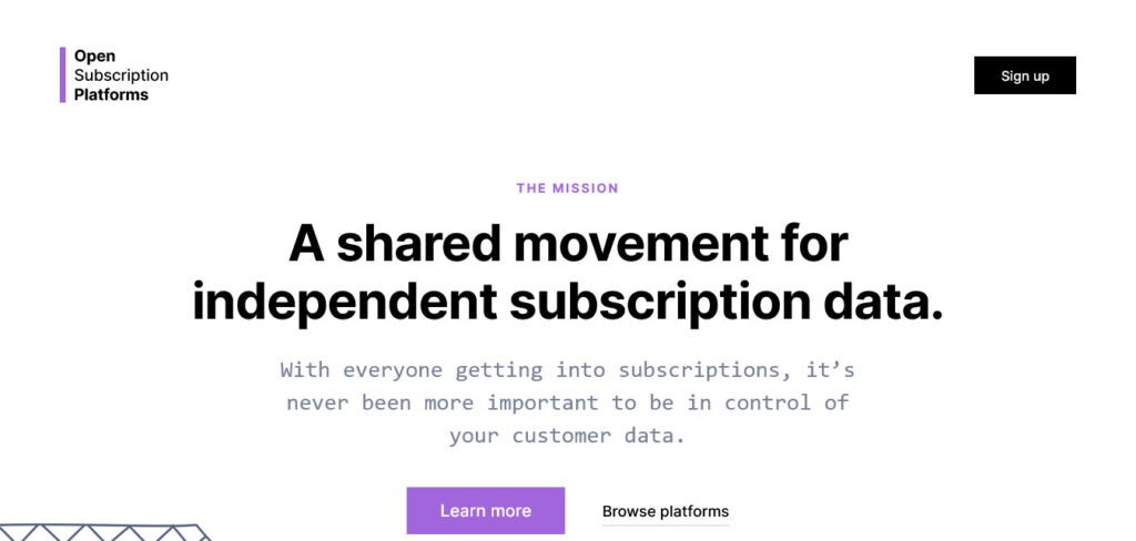
Open Subscription Platforms employs a striking text section above the fold on a solid background, ensuring their mission is prominently visible to all visitors.
The simplistic design approach extends to both the header, featuring a call-to-action (CTA) button, and the footer, both blending seamlessly with the same background color to maintain a cohesive look.
Notably, the subscription form takes center stage with a substantial size, a strategic choice aimed at boosting opt-in rates.
Photofocus
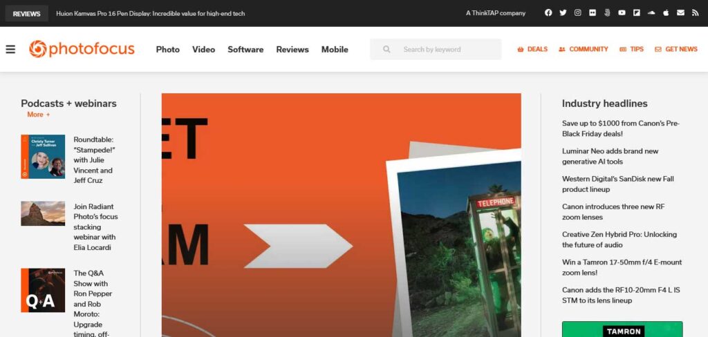
Photofocus maintains a clean layout, featuring a simple header with a hamburger menu icon, logo, and a search bar.
The navigation unfolds as a full-screen overlay, incorporating additional search functionality and social media icons. This informational website adopts an online magazine layout, complete with a sidebar, a sticky newsletter subscription widget for constant visibility, and a convenient back-to-top button for seamless navigation.
Polygon
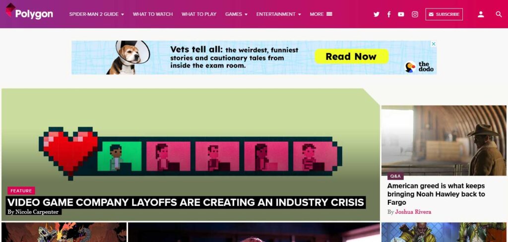
Polygon, a magazine-style website, welcomes visitors with a wealth of content on the homepage. Navigating through the abundance of material is made easy with the drop-down navigation and a search bar for specific inquiries.
As you begin to scroll, a large and attention-grabbing newsletter subscription form dynamically appears at the bottom of the screen, sticking with you throughout your journey.
Notably, sidebar banner ads cleverly float along with the content, ensuring they capture more eyeballs and enhance visibility. This strategic design choice optimizes user engagement and provides an effective platform for content discovery and advertisement exposure.
Regeneration
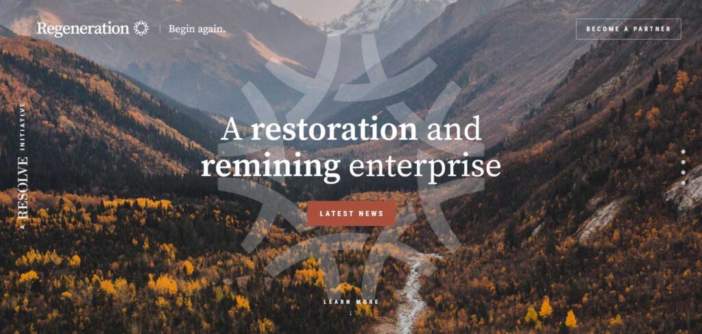
Regeneration crafts a fantastic browsing experience through its informational content with an epic one-page website layout that features animated content as you scroll.
This informational website design incorporates larger texts and plenty of white space, enhancing the overall readability and making the reading experience more pleasant. Notably, Regeneration includes a back-to-top button for user convenience, eliminating the need to scroll all the way back manually.
The website’s thoughtful design also integrates a call-to-action (CTA) in the sticky header, ensuring it remains easily accessible throughout the user’s journey.
SocialSizes
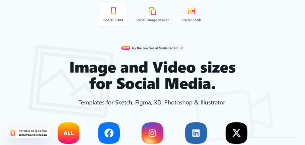
SocialSizes introduces clickable social media icons for direct access to essential content. As you scroll, the sticky bottom ‘navigation’ ensures continual access to other content, enhancing user convenience.
For quick navigation to the top, a back-to-top button is strategically placed. The header, featuring three links and a newsletter subscription form, serves as a hub for essential interactions. The minimalist footer includes menu links, social media icons, and an email contact, completing the seamless and user-friendly design of SocialSizes.
Steve Jobs Archive
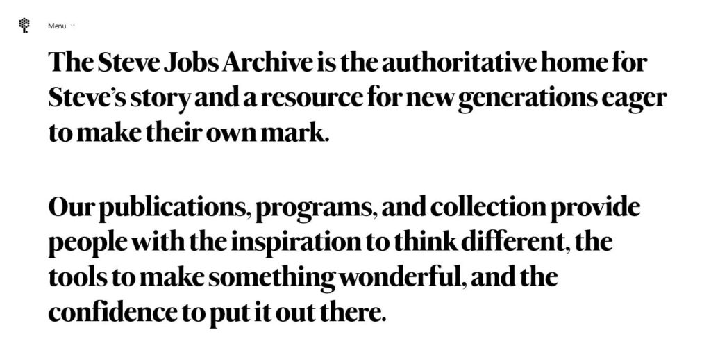
The Steve Jobs Archive adopts a minimalist timeline-style design, foregoing a traditional header and featuring a basic footer. The timeline elements cleverly employ a hover effect that highlights the viewed item and initiates playback of a thumbnail video. Notably, this information website offers the option to resize Steve’s email for improved readability, ensuring a neater appearance while maintaining the site’s initial size.
The Information
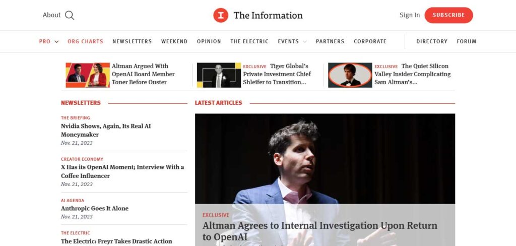
The Information’s website offers a dynamic blend of members-only and public content. Strategically designed for user engagement, an email opt-in is prominently placed above the fold, guiding visitors to exclusive content.
Another opt-in opportunity is thoughtfully positioned in the footer, ensuring multiple access points for users. A well-timed popup serves as a reminder to become a subscriber, enriching the user experience.
The website’s structure includes a top bar, header, hamburger menu for seamless navigation, and a sticky bottom notification bar with a compelling call-to-action (CTA) button, providing a cohesive and user-friendly interface.
The Rocks
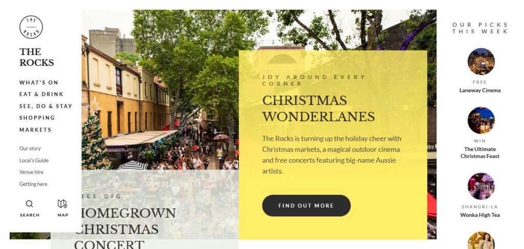
The Rocks, an information website, stands out with its creative and responsive web design.
The semi-sidebar header/menu adds a touch of innovation, collapsing once you begin scrolling and sticking to the top left corner for easy navigation. A floating subscription form in the bottom right corner dynamically disappears as you scroll to the bottom, strategically replaced by a subscription widget in the footer.
A noteworthy feature is the ‘best picks of the week’ section in the right sidebar above the fold, offering visitors quick access to curated content. This design showcases a thoughtful approach to user experience and engagement.
The Verge
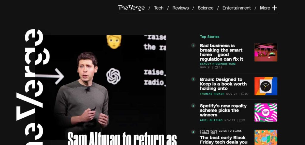
The Verge distinguishes itself with its specialty in dark design, instantly setting it apart from the rest. The website employs sticky elements that enhance the visibility of specific content and ads.
The navigation is dual-faceted, featuring a basic menu and a hamburger menu on the right side of the screen. The drop-down includes convenient links for log-in, sign-up, and social media icons, providing a seamless and user-friendly browsing experience.
The dark design and strategic use of sticky elements contribute to The Verge’s unique aesthetic and effective content presentation.
3rd Wave Coffee Collection
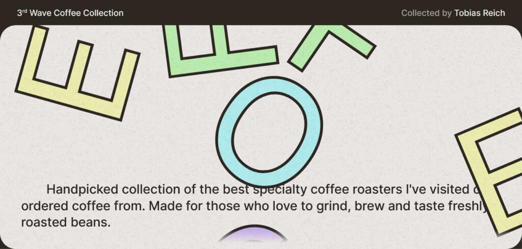
The 3rd Wave Coffee Collection stands out as a creative and clean information website, featuring a custom cursor that commands attention with its size.
The large hero section greets visitors with a cool ‘coffee’ graphic and concise descriptions outlining the essence of the page.
The rest of the page is thoughtfully structured, with a small grid showcasing favorites and a comprehensive list displaying all the featured roasters.
Wix Encyclopedia
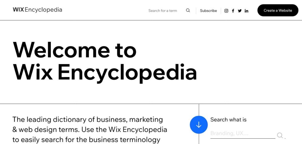
Wix Encyclopedia is an information website boasting a clean and straightforward design. It kicks off with a prominent title text, setting the stage for easy navigation.
The practical search bar is readily accessible, featuring a selection of the most searched terms just a click away for user convenience. A notable feature is the full alphabet available, allowing users to search terms alphabetically.
Adding to its user-centric design, Wix Encyclopedia utilizes a popup bar at the bottom of the screen, enabling visitors to take immediate action in building a website—a seamless integration of information and functionality.
THE FOLLOWING AFTER THIS AD
Conclusion
In the vast ocean of information that the internet represents, these inspiring information websites emerge as beacons of knowledge and motivation.
The overwhelming expanse of the web often leads us astray into a realm of distraction, but these carefully curated platforms serve as a reminder that the internet is not merely a source of diversion—it is a powerful tool for inspiration and personal growth.
Whether your goal is to expand your mind, foster creativity, or stay abreast of the latest breakthroughs, the websites highlighted in this blog post present themselves as a roadmap to enlightenment. They offer a diverse array of insights and resources, catering to a spectrum of interests and curiosities.
Moreover, it’s worth emphasizing that the journey toward creating your own informational website has never been more accessible. With the aid of these exceptional multipurpose WordPress themes, you can effortlessly and swiftly embark on the creation of your digital space.
