
Table of Content
Divi, the most popular WordPress theme, with almost 1,000,000 downloads.
It includes the following features :
What is a Bootstrap popup? What is it used for? And above all how to implement it in a web project?
The Bootstrap popup is a small window designed with the Bootstrap library that is superimposed on a web page after putting a gray mask on it.
Its uses are multiple, it can be used to present information, display advertising messages or encourage the user to enter data.
You will discover in the following lines how to design popup with Bootstrap in three simple steps.
Below is the capture of the popup that we will learn to make.
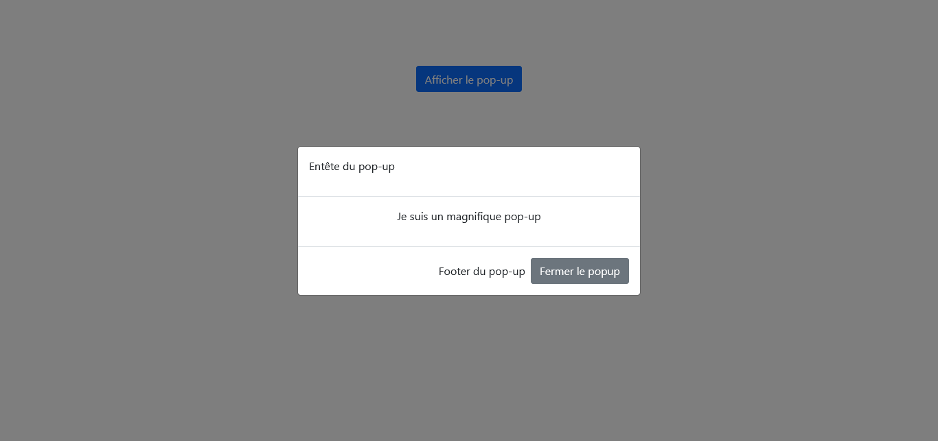
You can view and interact with the popup we will get at the end of the tutorial by clicking on the button below. Feel free to view it on computer, tablet and mobile, you will notice that it adapts perfectly to different types of screens.
Now that you have seen the final result we will achieve, we can start designing our Bootstrap popup.
THE FOLLOWING AFTER THIS AD
Create Bootstrap popup with BS 4
Requirements for a Bootstrap Popup
The Bootstrap popup requires the integration of the popper.js script on the page before it can work normally.
But also you need to respect the following order: call the jquery library first, then call the popper.js script and finally the Bootstrap JavaScript extensions.
Bootstrap has taken on the mission of making life easier for its users, so it has grouped the popper.js script and Bootstrap’s own JavaScript extensions in the bootstrap.bundle file.
As a result, the code can be lightened by only calling jquery and bootstrap.bundle.
For this tutorial, we will call Bootstrap and JQuery from their distribution networks.
JQuery and the Bootstrap script file will be called after closing body.
<script src="https://cdn.jsdelivr.net/npm/jquery@3.5.1/dist/jquery.slim.min.js" integrity="sha384-DfXdz2htPH0lsSSs5nCTpuj/zy4C+OGpamoFVy38MVBnE+IbbVYUew+OrCXaRkfj" crossorigin="anonymous"></script>
<script src="https://cdn.jsdelivr.net/npm/bootstrap@4.6.1/dist/js/bootstrap.bundle.min.js" integrity="sha384-fQybjgWLrvvRgtW6bFlB7jaZrFsaBXjsOMm/tB9LTS58ONXgqbR9W8oWht/amnpF" crossorigin="anonymous"></script>
The Bootstrap CSS file will be integrated in the header tags
<link rel="stylesheet" href="https://cdn.jsdelivr.net/npm/bootstrap@4.6.1/dist/css/bootstrap.min.css" integrity="sha384-zCbKRCUGaJDkqS1kPbPd7TveP5iyJE0EjAuZQTgFLD2ylzuqKfdKlfG/eSrtxUkn" crossorigin="anonymous">
Now we can move on to the design of our popup
First Step : Base structure of a Bootstrap popup
The implementation of a Bootstrap popup is done in 3 stages. In the first stage we have to define the base of the popup using the .modal class.
In the second stage, we create our modal window using the .modal-dialog class
And in the third stage, we include the container in which the contents of the window will be organized. This container is defined using the .modal-content class.
Let’s translate these 3 paragraphs into code
<div class="modal">
       <div class="modal-dialog">
                <div class="modal-content">

                </div>
       </div>
</div>
Second Step : Organizing the contents of a Bootstrap popup
In order for the content of a component to be properly presented to users, it must be well structured. This makes navigation easy for the user.
Bootstrap is aware of this and offers a structuring system for these pop-ups which are flexible components.
Thus, we have the possibility to organize the contents of a Bootstrap popup like this: present the header of the popup, the main part i.e. the body of the popup and finally the bottom of the popup.
The header is defined using the .modal-header class, the body using the .modal-body class and the bottom using .modal-footer.
Example :
<div class="modal">
       <div class="modal-dialog">
                <div class="modal-content">
                 <div class="modal-header">
                        <p> Popup Header </p>
                       </div>
                 <div class="modal-body">
                        <p> I am a beautiful pop-up </p>
                       </div>
                 <div class="modal-footer">
                        <p> Popup Footer </p>
                       </div>
                </div>
       </div>
</div>
The pop-up is created, now we have to make it visible on the page.
Third Step : Display the popup
- Static display
Bootstrap by default defines a fixed position (position: fixed) and a non-display (display: none) for the pop-up component.
So to be able to display the result of the pop-up we designed, we will have to change the values of these two CSS properties in an external stylesheet linked to the project.
.modal{
  display: block;
  position: relative;
}
- Appearance of the pop-up when clicking on a button
This display option allows you to keep the pop-up invisible and make it visible when a link or a button is clicked.
Two essential attributes allow to specify to a button to display a Bootstrap pop-up.
The first attribute is the data-toggle attribute which must have the value modal.
The second attribute is the data-target attribute which has a hash value followed by the value of the pop-up identifier.
Let’s take the example of our pop-up again but this time adding a button that allows to display it
<!-- Button -->
<button type="button" class="btn btn-primary" data-toggle="modal" data-target="#popup">
    Display the popup
</button>

<!-- Pop-up -->
<div id="popup" class="modal">
       <div class="modal-dialog">
                <div class="modal-content">
                 <div class="modal-header">
                     <p> Popup Header </p>
                       </div>
                 <div class="modal-body">
                     <p> I am a beautiful pop-up </p>
                       </div>
                 <div class="modal-footer">
                     <p> Popup Footer </p>
                       </div>
                </div>
       </div>
</div>
The user can click on the greyed-out part to return to the page, but it is advisable to offer the user a close button on the pop-up.
To design a close button on a pop-up, you just have to include the data-dismiss attribute in the button and set it to modal.
Let’s go back to our previous example and include a close button at the bottom of the pop-up.
<!-- Button -->
<button type="button" class="btn btn-primary" data-toggle="modal" data-target="#popup">
    Display the popup
</button>

<!-- Pop-up -->
<div id="popup" class="modal">
       <div class="modal-dialog">
                <div class="modal-content">
                 <div class="modal-header">
                      <p> Popup Header </p>
                       </div>
                 <div class="modal-body">
                      <p> I am a beautiful pop-up </p>
                       </div>
                 <div class="modal-footer">
		    <p> Popup Footer</p>
                    <button type="button" class="btn btn-secondary" data-dismiss="modal">Close the popup
                               </button>
                       </div>
                </div>
       </div>
</div>
Here is how to center your modal window vertically on the page.
You just need to include the .modal-dialog-centered class in the second stage of your pop-up.
THE FOLLOWING AFTER THIS AD
Example :
<!-- Button -->
<button type="button" class="btn btn-primary" data-toggle="modal" data-target="#popup">
    Display the popup
</button>

<!-- Pop-up -->
<div id="popup" class="modal">
       <div class="modal-dialog modal-dialog-centered">
                <div class="modal-content">
                 <div class="modal-header">
                      <p> Popup Header </p>
                       </div>
                 <div class="modal-body">
                      <p> I am a beautiful pop-up </p>
                       </div>
                 <div class="modal-footer">
		    <p> Popup Footer</p>
                    <button type="button" class="btn btn-secondary" data-dismiss="modal">Close the popup
                               </button>
                       </div>
                </div>
       </div>
</div>
Creating a Bootstrap popup with BS 5
The process of creating a popup with Bootstrap 5 is similar to that of version 4 of the library, but there are two nuances.
The first nuance is that unlike a popup designed with Bootstrap 4, the one designed with Bootstrap 5 does not require the jQuery library to work.
The second nuance is the replacement of data-xxx attributes in Bootstrap 4 by data-bs-xxx attributes in Bootstrap 5.
Example : data-target in Bootstrap 4 is replaced by data-bs-target in Bootstrap 5.
Bootstrap 5 call
We will use the stylesheet and the script of Bootstrap 5. The stylesheet will be integrated in the header and the script will be just above the closing of the body tag.
Calling the Bootstrap 5 stylesheet :
<link href="https://cdn.jsdelivr.net/npm/bootstrap@5.1.3/dist/css/bootstrap.min.css" rel="stylesheet" integrity="sha384-1BmE4kWBq78iYhFldvKuhfTAU6auU8tT94WrHftjDbrCEXSU1oBoqyl2QvZ6jIW3" crossorigin="anonymous">
Calling the Bootstrap 5 script :
<script src="https://cdn.jsdelivr.net/npm/bootstrap@5.1.3/dist/js/bootstrap.bundle.min.js" integrity="sha384-ka7Sk0Gln4gmtz2MlQnikT1wXgYsOg+OMhuP+IlRH9sENBO0LRn5q+8nbTov4+1p" crossorigin="anonymous"></script>
Code for popup realization
<!-- Button -->
<button type="button" class="btn btn-primary" data-bs-toggle="modal" data-bs-target="#popup">
    Display the popup
</button>

<!-- Pop-up -->
<div id="popup" class="modal">
       <div class="modal-dialog modal-dialog-centered">
                <div class="modal-content">
                 <div class="modal-header">
                      <p> Popup Header </p>
                       </div>
                 <div class="modal-body">
                      <p> I am a beautiful pop-up </p>
                       </div>
                 <div class="modal-footer">
		    <p> Popup Footer</p>
                    <button type="button" class="btn btn-secondary" data-bs-dismiss="modal">Close the popup
                               </button>
                       </div>
                </div>
       </div>
</div>
Now you are well equipped to implement in your projects beautiful Bootstrap popup to present warnings, or collect information using a form embedded in the popup.
You can share this tutorial with your friends through the share buttons below so that they also know how to create a Bootstrap modal window in a web application.
Other tutorials available on the blog
How to create a Bootstrap Forms easily in 2 simple steps
THE FOLLOWING AFTER THIS AD