
Table of Content
As mobile internet use continues to grow, it is essential to have a website that adapts seamlessly to different devices.
More than 60% of internet traffic now comes from mobile devices, making it imperative for businesses to prioritize mobile optimization. A site that isn’t responsive can drive away potential customers, which is why a mobile-first design is so important.
In this article, we’ve compiled a list of the 10 best mobile-first WordPress themes, ideal for different industries and purposes.
Not only are these themes visually appealing, but they’re also packed with robust features to keep your website competitive and credible.
What is a Mobile-first WordPress Theme?
A mobile-first WordPress theme is a template designed with a primary focus on mobile devices, ensuring optimal performance and aesthetics on smartphones and tablets.
Unlike traditional themes that focus on desktop layouts, mobile-first WordPress themes are designed with mobile users in mind from the outset. This means they use responsive design techniques that adapt seamlessly to different screen sizes and orientations. The main features of mobile-first templates are touch-friendly navigation, fast loading times, and minimalist design elements that enhance usability on mobile devices.
Mobile-first WordPress themes often use lightweight code and optimized images to ensure fast loading times, a crucial factor in retaining mobile visitors. They also support modern web technologies such as HTML5, CSS3, and JavaScript, providing a smooth user experience.
What’s more, these themes are highly customizable, allowing website owners to fine-tune and personalize the look of their site without compromising mobile performance.
Best Mobile-first WordPress Themes
THE FOLLOWING AFTER THIS AD
Divi
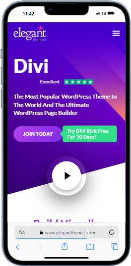
Divi, a versatile drag-and-drop WordPress theme, offers a vast selection of layouts, templates, and complete website packs, making it an ideal choice for anyone looking to build unique and visually responsive websites.
Its modern, adaptable design ensures that your website will look impressive on any device, from desktops to smartphones.
Divi’s standout feature is its user-friendly Divi Builder, a powerful visual editor that allows you to create and customize your site effortlessly. With hundreds of pre-designed website packs optimized for mobile use, it simplifies the process of building responsive websites that captivate and engage visitors.
Additionally, its extensive customization options, including advanced design settings, CSS control, and AI features enable you to tailor your website to your specific needs.
Avada
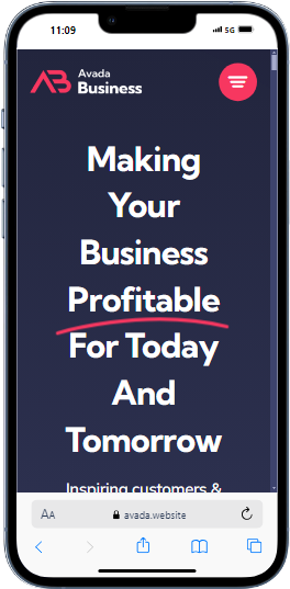
Avada is considered the Swiss army knife of WordPress themes, known for its versatility and ease of use in creating professional, responsive websites. Its robust design options and extensive functionality make it a top choice for professionals, agencies, businesses and creatives looking for both flexibility, and performance in a template.
Avada’s 100% responsive design ensures that your website will look great on any device, offering an optimal user experience on all screen sizes. This theme includes a multitude of design options, catering to a variety of aesthetic and functional needs, making it suitable for virtually any type of website, from corporate sites to creative portfolios.
The theme’s intuitive Fusion Builder offers a drag-and-drop interface, allowing users to effortlessly customize their websites without touching a single line of code. What’s more, Avada comes with plenty of pre-built demos and layout options, allowing users to quickly launch beautiful mobile-optimized websites.
Betheme
Betheme is ideal for those who prioritize efficiency and quality, streamlining the website creation process with remarkable ease.
It goes beyond the typical WordPress theme, offering a complete content management system designed to create exceptional, responsive websites. That’s why it’s so popular with web developers and businesses who want to build high-performance websites quickly.
Betheme features advanced theme options and performance settings that enhance both customization and functionality. Users can easily adapt their websites to meet specific aesthetic and technical standards, ensuring a professional look and optimal performance on all devices.
Its extensive library of pre-built websites and layout options caters to a wide range of sectors and purposes, providing a versatile foundation for any project.
Astra
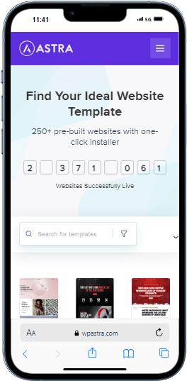
Astra is a highly flexible WordPress theme, perfect for crafting responsive websites that align seamlessly with your specific niche and requirements.
Its intuitive interface caters to both beginners and experienced WordPress users, enabling the easy setup of various website types, from personal blogs and portfolios to e-commerce stores, all without writing a single line of code.
One of Astra’s key strengths is its superb ease of use, coupled with exceptional compatibility with prominent page builders like Gutenberg, Elementor, and Beaver Builder. Its lightweight design and optimized performance contribute to fast loading times and a superior user experience on any device.
Moreover, Astra offers a rich library of pre-built templates and design options, making it simple to build visually appealing and mobile-optimized websites.
Bridge
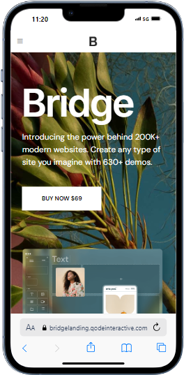
Bridge is a versatile, retina-ready multipurpose WordPress theme that caters to a wide array of users and website types.
Whether you are building a website for creative projects, corporate entities, legal firms, medical practices, or modern portfolios, the theme is designed to meet your diverse needs with ease. Its mobile-friendly design ensures that your website looks stunning and performs flawlessly on any device.
Bridge comes with essential plugins, providing all the tools you need to build high-quality responsive website. These plugins enhance functionality and allow for extensive customization, allowing you to tailor your website to your exact specifications.
With its intuitive interface and powerful features, this WordPress theme empowers you to design professional and engaging responsive websites that stand out.
Enfold
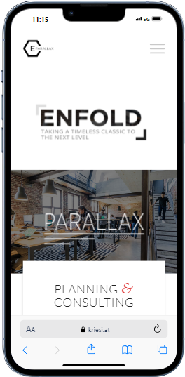
Enfold is a versatile WordPress theme designed for professionals and creatives, offering an intuitive and adaptable solution for presenting work or products seamlessly across all devices.
One of its most remarkable features is its wide range of customization options. Users can easily change layouts, style, colors, and fonts directly from the WordPress admin panel, making it easy to build a website that reflects their unique vision.
Enfold’s powerful features, combined with its ease of use, make it an excellent choice for building, visually stunning, responsive websites. The theme equips you with all the necessary tools to design high-quality, mobile-optimized websites.
Porto
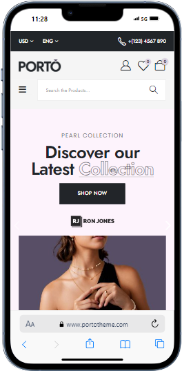
Porto is a versatile, feature-rich WordPress theme that excels at offering extensive configuration options to suit a wide range of needs.
Known for its exceptional WooCommerce capabilities, this theme boasts exclusive skins, layouts, and features designed specifically for online shops, making it an excellent choice for e-commerce websites.
What sets Porto apart is its focus on performance optimization. The theme improves dynamic style handling and server response times, ensuring that your website looks great, and also works seamlessly across all devices.
This mobile-first WordPress theme comes packed with numerous elements and features, allowing users to customize every aspect of their website with ease.
Salient
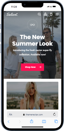
Salient is a robust WordPress theme that empowers users to create professional, mobile-optimized websites effortlessly.
Equipped with the powerful WPBakery editor, it makes content creation easy and intuitive thanks to its drag-and-drop functionality. This makes it ideal for users of all levels, from beginners to experienced developers.
One of Salient’s key strengths is its comprehensive Options Panel, which provides a seamless interface for customizing every element of your website without the need for coding skills.
Additionally, this mobile-first WordPress theme offers an extensive suite of practical features and user-friendly tools. These include advanced design settings, numerous pre-designed templates, and a variety of customization options for layouts, colors, and fonts.
Uncode
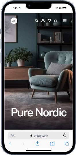
Uncode is a dynamic and pixel-perfect WordPress theme, ideal for creating mobile-optimized websites across various niches.
Renowned as a top WooCommerce theme, it delivers a seamless experience for eCommerce and business websites, making it a favorite among online retailers and entrepreneurs.
One of its most outstanding features is its intuitive website builder, which includes responsive templates that allow users to edit pages effortlessly. This user-friendly interface ensures that anyone, regardless of their level of technical expertise, can create a professional-looking website with ease.
With its extensive customization options, advanced design settings, and robust functionality, Uncode empowers users to build visually stunning, high-performing websites that are fully optimized for mobile devices.
X The WordPress Theme
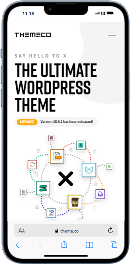
X The WordPress Theme is crafted with insights from industry-leading experts, providing a robust foundation that can be effortlessly enhanced with a wide range of additional plugins.
This theme stands out for its fluid, percentage-based design, which guarantees a consistent and attractive appearance on all screen sizes, including intermediate sizes.
X’s versatility makes it perfect for any project, offering a wide range of pre-designed elements to meet a diverse set of needs. With impressive performance optimization and a rich selection of responsive templates, this theme ensures that your website looks great, and also delivers a smooth and efficient user experience across all devices.
Conclusion
Thank you for exploring our selection of mobile-first WordPress themes designed for a variety of niche projects.
Each theme in this list is designed to help you build high-performing, responsive websites with exceptional design and functionality. We encourage you to try out these themes and determine which one aligns best with your project’s requirements.
Whichever theme you choose, you can be sure you’re getting a complete WordPress solution, fully equipped to support your niche-specific web resource. These themes offer a blend of advanced features and ease of use, ensuring that you can design mobile-optimized websites that stand out.