
Table of Content
Divi, the most popular WordPress theme, with almost 1,000,000 downloads.
It includes the following features :
Datepicker is a graphical user interface widget, which present on a website allows users to select a date or a date range.
It is a component that by default displays a date entry field, and a calendar that appears when you click on the entry field.
In the following lines, I show you step by step how to design datepicker with Bootstrap.
NB : You have at the end of the tutorial, the download link of the bootstrap-datepicker whose image follows
The essential elements required for bootstrap-datepicker
THE FOLLOWING AFTER THIS AD
In the culinary field, to make a crispy pizza, certain ingredients are essential for its success.
The same goes for the realization of our bootstrap datepicker, some key elements are fundamental for it to be functional.
These key elements are: the bootstrap-datepicker plugin, the bootstrap and jquery libraries, and finally a library of icons.
For this tutorial, the icon library we will use is font-awesome.
Knowing these key elements is just the first step in the process.
Call and set up
In this section we will first call the libraries and then see how to set up the bootstrap-datepicker.
For calling the libraries, we have two possibilities.
The first is to call them from a CDN, and the second is to download them and call them locally.
The first option requires to be online for the bootstrap-datepicker to be functional, while the second one does not.
We will use the first option.
I chose this option, to make the page slight.
What’s the point of installing a whole library with dozens of elements, when you only need one.
Well before showing you the code to call the libraries, open your code editor and create an html file.
If it is done, in the html file, call the libraries as in the following code.
<!DOCTYPE html>
<html>
<head>
    <meta charset='utf-8'>
  <title>Bootstrap Datepicker</title>
    <meta name="viewport" content="width=device-width, initial-scale=1, shrink-to-fit=no">
  <!-- Calling the Minified Stylesheet Of the Bootstrap Library -->
  <link href="https://cdn.jsdelivr.net/npm/bootstrap@4.5.3/dist/css/bootstrap.min.css" rel="stylesheet">
  <!-- Calling the Minified Stylesheet ofthe Datepicker plugin-->
  <link rel="stylesheet"  href="https://cdnjs.cloudflare.com/ajax/libs/bootstrap-datepicker/1.9.0/css/bootstrap-datepicker.min.css">
</head>
<body>

    <!-- Extension jquery library -->
    <script src="https://code.jquery.com/jquery-3.5.1.slim.min.js"></script>
    <!-- DATEPICKER minified Script -->
    <script src="https://cdnjs.cloudflare.com/ajax/libs/bootstrap-datepicker/1.9.0/js/bootstrap-datepicker.min.js"></script>
    <!--  Bootstrap minified bundle script file -->
    <script src="https://cdn.jsdelivr.net/npm/bootstrap@4.5.3/dist/js/bootstrap.bundle.min.js"></script>
</body>
</html>
The libraries are in place, we can make our datepicker.
The datepicker consists of a field, where the selected date will be displayed.
We are going to create our field, and to help users know that it is a datepicker field, we are going to attach a calendar icon to the field.
Here is the code for the field’s constitution.
<div class="form-group">
    <div class="input-group">
        <input type="text" placeholder="Choose a date" class="form-control" id="reservationDate">
        <div class="input-group-append"><span class="input-group-text px-4"><i class="fa fa-calendar"></i></span></div>
    </div>
</div>
For our field to be attached to the bootstrap datepicker plugin calendar, we will add the class .datepicker.
This is not all.
For a good positioning of the calendar in relation to the field, we will add the class .date to the field.
Finally, the code of our field is this
<div class="form-group">
    <div class="datepicker date input-group">
        <input type="text" placeholder="Choose a date" class="form-control" id="reservationDate">
        <div class="input-group-append"><span class="input-group-text px-4"><i class="fa fa-calendar"></i></span></div>
    </div>
</div>
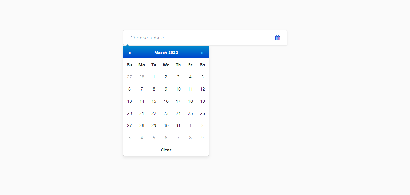
Here is a picture of what we get.

Admittedly, this is not attractive at all, we will center it in the middle using a bootstrap grid.
    <div class="container">
    <div class="row">
        <div class="col-md-6 mx-auto">
            <div class="form-group">
          <div class="form-group">
              <div class="datepicker date input-group">
                  <input type="text" placeholder="Choose a date" class="form-control" id="reservationDate">
                  <div class="input-group-append"><span class="input-group-text px-4"><i class="fa fa-calendar"></i></span></div>
              </div>
          </div>
            </div>
        </div>
    </div>
  </div>
Now it’s clean.

THE FOLLOWING AFTER THIS AD
Activation of the bootstrap datepicker
This is the last step in the process.
After the datepicker has been set up, it must be activated for it to be functional.
The activation is done with the help of a jquery code.
We will create a file named script.js and we will attach it to the html file as in the code below.
    <!-- Script pour activation du datepicker -->
    <script src="script.js"></script>
Now in the script.js file, we will add the activation code of the bootstrap-datepicker plugin which is the following.
$(function () {

    // ACTIVATION DU DATEPICKER
    $('.datepicker').datepicker({
        clearBtn: true,
        format: "dd/mm/yyyy"
    });

});
Now everything is okay, we just made a working bootstrap datepicker.

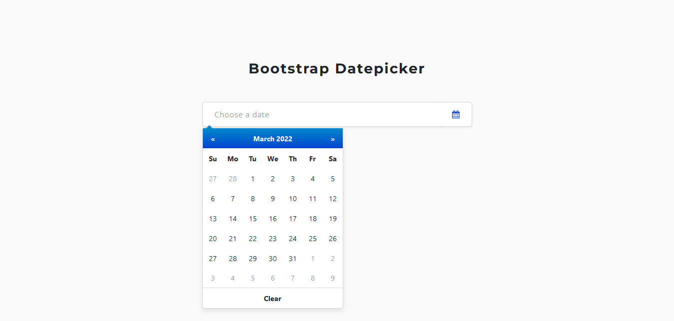
Normally the tutorial is finished, but we will make our datepicker more attractive.
A new look for our bootstrap datepicker
We will customize the datepicker with CSS.
Here is the final result we will achieve.
The customization will be done at two levels:
- First, we will customize the field
- Then we will style the calendar
Let’s create a style.css file and attach it to the html file
  <!-- Feuille de style Personnalisée -->
  <link rel="stylesheet"  href="style.css">
- Customizing the field
For our field, we will redefine the rounding of the border, and remove any effect to the border when the field is clicked.
For the icon attached to the field, its background color will be consistent with that of the field, and the icon will have a blue color.
.input-group {
    border-radius: 5px;
}

input.form-control {
    border-radius: 5px 0 0 5px;
    border: solid 1px rgba(0,0,0,.15);
    border-right: none;
}

input.form-control:focus {
    box-shadow: none;
    border-color: rgba(0,0,0,.15);
}

input.form-control::placeholder {
    font-family: 'Open sans', sans-serif;
    font-size: 15px;
    letter-spacing: 1px;
}

.input-group-append {
    border: solid 1px rgba(0,0,0,.15);
    border-left: none;
    border-radius: 0 5px 5px 0;
}

.input-group-text {
    border-radius: 0 5px 5px 0;
    color: #04c;
    background-color: #fff;
    border: none;
}
- Customize the calendar
For the calendar, we will first position it just below the field. Then, we will air the days of the calendar, and apply a blue background color to the header of the calendar. Then at the foot of the calendar, apply a light gray background color, when the mouse hovers over it.
.datepicker-dropdown {
    box-shadow: 0 5px 10px rgba(0, 0, 0, 0.1);
    margin-top: 102px;
}

.datepicker {
    padding: 0;
}

.datepicker td, .datepicker th {
    width: 2.5rem;
    height: 2.5rem;
    font-size: 0.85rem;
}

.datepicker-dropdown:after {
    border-bottom-color: #08c;
}

.datepicker-days .table-condensed thead tr:nth-child(2), .datepicker-months .table-condensed thead tr:nth-child(2),
.datepicker-years .table-condensed thead tr:nth-child(2), .datepicker-decades .table-condensed thead tr:nth-child(2),
.datepicker-centuries .table-condensed thead tr:nth-child(2) {
    background: linear-gradient(to bottom,#08c,#04c);
    color: #fff;
}
.datepicker-days .table-condensed thead tr:nth-child(2) th:hover, .datepicker-months .table-condensed thead tr:nth-child(2) th:hover,
.datepicker-years .table-condensed thead tr:nth-child(2) th:hover,.datepicker-decades .table-condensed thead tr:nth-child(2) th:hover,
.datepicker-centuries .table-condensed thead tr:nth-child(2) th:hover {
    background: linear-gradient(to bottom,#08c,#04c);
    color: #fff;
}

.datepicker-days .table-condensed tfoot, .datepicker-months .table-condensed tfoot, .datepicker-years .table-condensed tfoot,
.datepicker-decades .table-condensed tfoot, .datepicker-centuries .table-condensed tfoot {
    border-top: solid 1px rgba(0,0,0,.15);
}
We just made our bootstrap datepicker attractive.
Download Bootstrap datepicker custom UI |
Other tutorials available on the blog
How to create a Bootstrap popup easily in 3 simple steps
How to create a Bootstrap Forms easily in 2 simple steps